
Preview Before You Buy: Frame Color Rules for Glasses, Photos, and Art
WallfullyChoose neutral frames when you want versatility, and choose a color on purpose when you want contrast or harmony. For glasses, that means matching your undertone and creating contrast with your features. For art and photos, it means a neutral frame or one that echoes a secondary color in the piece, checked against contrast guidance so everyone can actually see it. A preview tool lets you test either approach before you commit.
TL;DR:
- Black, tortoise, and neutral wood frames are the safest choices for long-lasting versatility and minimal risk of looking outdated.
- Matching eyeglass frames to your skin undertone—silver for cool tones, gold for warm tones—improves overall harmony and style.
- For artwork, neutral frames or those drawing from secondary colors in the piece prevent visual competition and maintain focus on the image.
- Contrast and harmony in framing depend on color schemes: complementary for drama, analogous for cohesion, with proper contrast ensuring label visibility.
- Always test frame colors in grayscale to ensure sufficient luminance contrast for visibility and accessibility in various lighting conditions.
Table of Contents
- Choosing eyeglass frame color for your skin, eyes, hair, and face shape
- Picking frame color for photos and artwork
- Using the color wheel to decide between contrast and harmony
- Making sure your frame and labels are actually visible
- A quick checklist for choosing your frame color
- How we think about frame color at Wallfully
- Order a framed piece with a preview, not a guess
- Where to read more on framing and color
- Sources
- FAQ
Choosing eyeglass frame color for your skin, eyes, hair, and face shape
Start with undertone, not skin color. Cool undertones show blue or pink in the wrist veins and look better in black, silver, rose, or jewel tones. Warm undertones lean green in the veins and suit tortoise, gold, olive, or warm browns. Neutral undertones can wear nearly anything, which is why so many best-selling frames land in that gray-tortoise middle ground.
Eye and hair color give you a second layer of guidance:
- Brown eyes pair well with tortoise, burgundy, or deep green frames that pick up hidden flecks of color.
- Blue eyes pop against warm browns, copper, or amber tones that sit opposite blue on the color wheel.
- Green eyes look sharper in red-brown, plum, or soft gold frames.
- Gray or dark hair tends to read cleaner against black, silver, or deep blue; warm blonde or red hair often suits tortoise or honey tones.
Face shape works on contrast, not matching. A round face usually looks better in angular frames, and a square jaw softens with rounder or cat-eye shapes. Matching your frame shape to your face shape tends to flatten the effect rather than flatter it.
If you want a frame that lasts years, stick to black, tortoise, or crystal; they pair with almost any wardrobe and rarely look dated. If you want a seasonal statement piece, bright color is fair game, but treat it as the second or third pair in rotation rather than your daily driver.
Pro Tip: Hold a frame near your jawline in natural light before deciding. Indoor store lighting shifts warm tones cooler and can make a flattering color look wrong.
Picking frame color for photos and artwork
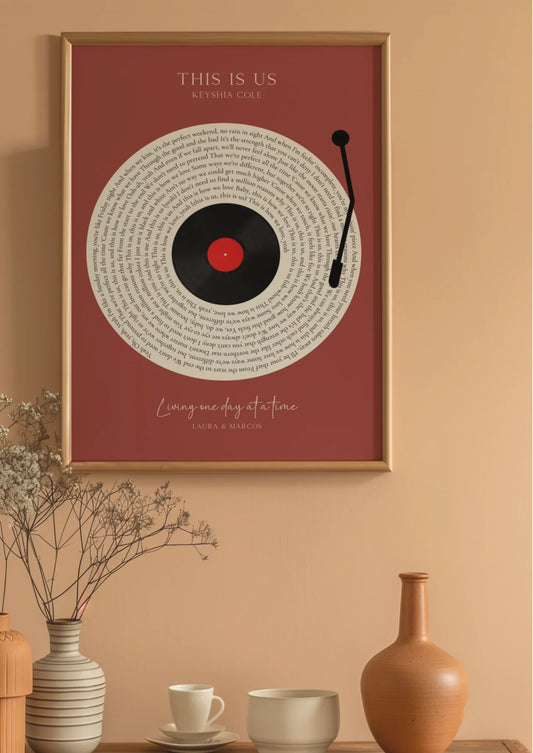
Neutral frames (black, white, or natural wood) are the safest choice because they let the image stay the focal point rather than competing with it, according to framing guidance from South Dakota State University Extension. If you want a colored frame, pull from a secondary color in the piece rather than its dominant hue, since matching the dominant color too closely can flatten the image into the wall.

Matting follows its own logic. A mat generally works best in off-white or a light pastel, and it should not be lighter than the lightest color in the artwork to avoid visually outshining the piece, per the same SDSU guidance. As a general rule, a frame should read darker than its mat and should harmonize with both the picture and the surrounding wall.
A few practical rules to apply when you’re choosing:
- Smaller prints usually take a narrower mat, while larger statement pieces can carry a wider mat without looking disproportionate. Oil paintings and some reproductions are often framed without a mat at all.
- Metallic or warm wood frames tend to suit rooms with brass fixtures or warm lighting, while cooler black or white frames suit modern, minimalist spaces.
If the piece has lasting sentimental or archival value, glazing matters as much as frame color. Use spacers or a window mat so the glazing never touches the photo surface, and choose glazing that blocks a high percentage of UV energy, following the benchmark described in ISO 18902 framing guidance from the Image Permanence Institute. Lighting also changes how a frame color reads day to day; a room’s lighting setup can shift a warm wood frame cooler or wash out a dark frame entirely, so it’s worth checking the piece under the light it will actually hang in.
Using the color wheel to decide between contrast and harmony
Four basic color schemes cover almost every framing decision you’ll make:
- Complementary pairs colors opposite each other on the wheel (blue and orange, red and green) and creates drama, useful when you want a frame to stand out against the wall.
- Analogous uses colors that sit next to each other (blue, teal, green) for a calmer, more cohesive look, useful when you want the frame to disappear into the room.
- Monochromatic stays within one color family at different values, which works well for frames meant to blend with a single-tone wall.
- Neutral schemes rely on black, white, gray, and wood tones, the default choice when you’re unsure or want maximum flexibility.
Color theory guidance from Sessions College notes that value and saturation often matter more than hue itself: a light, low-saturation frame can read as neutral even if it technically carries color, while a highly saturated frame in nearly any hue will command attention. Use complementary pairings when you want the frame to be part of the statement, and analogous or monochromatic pairings when the art or the room should lead.
Making sure your frame and labels are actually visible
Luminance contrast, not color alone, determines whether something is legible. Section 508 accessibility guidance recommends against relying on color-only distinctions and points to WCAG thresholds of 4.5 to 1 contrast for regular text and 3 to 1 for large text as practical checks for labels, placards, or nearby signage.

A quick, free check: convert a photo of your framed piece to grayscale on your phone. If the frame edge disappears into the mat or wall in that grayscale version, the contrast is too low regardless of how the colors look to most viewers.
For color-vision deficiencies specifically, prioritize lightness contrast over color contrast, and add a pattern or text label anywhere color alone is carrying meaning. Testing a piece under a second light source, since fluorescent and warm bulbs shift tones differently, catches problems a single glance won’t.
A quick checklist for choosing your frame color
- Define the goal: decide if you want the frame to pop (contrast) or blend (harmonize) before you look at a single sample.
- Identify your anchor: check your undertone for glasses, or your room’s dominant and secondary colors for art.
- Grayscale test: photograph the proposed frame against your face or wall and convert it to grayscale to check contrast.
- Choose mat and glazing: pick a mat no lighter than the art’s lightest tone, and confirm UV-blocking glazing if the piece matters long term.
- Preview before buying: use a virtual try-on or digital preview to see the final combination before you order.
A few shopping habits help here too: ask for a physical mat swatch when one is offered, confirm the return policy before ordering a bold color, and check the glazing specification rather than assuming “glass” means UV-protected.
Pro Tip: Watch for three common mistakes: a mat lighter than the art’s lightest tone, glazing with a visible color cast, and a frame so saturated it fights with everything else on the wall.
How we think about frame color at Wallfully
Neutral frames are often recommended because they work across a wide range of walls and gift occasions, and preview tools can show how a color option will look before anyone commits.
— Luanda
Order a framed piece with a preview, not a guess
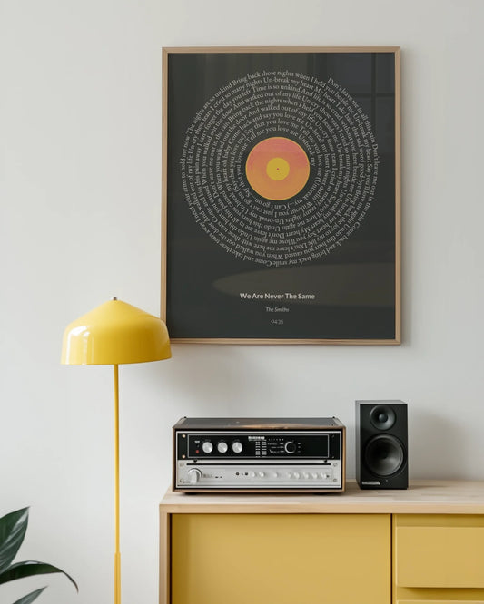
Choosing a frame color for a map, a photo collage, or a lyric print is easier when you can see it first, and that’s the whole point of Wallfully’s preview step. Our Route & Map Posters and Personalized Photo Collage Posters both include framing options you can preview against the actual artwork before paying for anything.

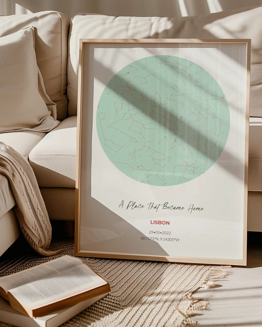
If you’re shopping for a gift rather than your own wall, the Baby Milestones and Star, Moon & Zodiac Maps collections both come with frame-ready formatting, so the color decisions in this guide apply directly. Build your piece, try a neutral frame against a colored one in the preview, and pick the version that actually looks right in your space before you check out.
Where to read more on framing and color
For deeper reading: the SDSU Extension framing guide covers mat and frame basics, Section508.gov covers accessible color use, the IPI framing guide covers UV glazing and conservation, and Sessions College covers color theory fundamentals.
Sources
- The Art of Framing a Picture (extension fact)
- Section508
- Framing guide (Image Permanence Institute / RIT)
- Color theory: a guide for artists and designers (Sessions College)
FAQ
What color should my picture frame be?
A neutral frame in black, white, or natural wood is generally the safest choice because it keeps the artwork as the focal point rather than competing with it, according to SDSU Extension framing guidance. If you want color, pull it from a secondary hue in the piece rather than its dominant color.
What color should my glasses frame be?
Match your frame to your skin’s undertone: cool undertones usually suit black, silver, or jewel tones, while warm undertones suit tortoise, gold, or olive. For lasting versatility, black, tortoise, and crystal frames tend to pair with the widest range of wardrobes.
What is the most popular frame color?
Published sales rankings for eyewear or art frames aren’t publicly listed, but black, tortoise, and natural wood consistently show up as the default neutral choices in framing guidance because they pair with nearly any decor or wardrobe.
What color frames are in style right now?
Trend cycles shift by season and aren’t tracked by a single authoritative source, so there’s no verified current ranking to cite. The more reliable approach is picking a frame based on your undertone or your room’s palette rather than chasing a seasonal color.
How do I choose a mat color for a framed photo?
Choose a mat in off-white or a light pastel, and avoid anything lighter than the lightest color in the photo itself, since that can make the mat outshine the image, per SDSU Extension guidance. The frame itself should generally read darker than the mat.