How to Design Lyric Posters That Look Print-Ready
WallfullyTL;DR:
- Designing lyric posters involves combining song lyrics with typography, imagery, and layout to create meaningful wall art. Proper setup, including using 300 DPI, CMYK color mode, and appropriate bleed, ensures print quality, while restrained typography and simple backgrounds enhance visual impact. Copyright licensing is essential when producing posters for commercial use, with fair use covering personal projects without sale.
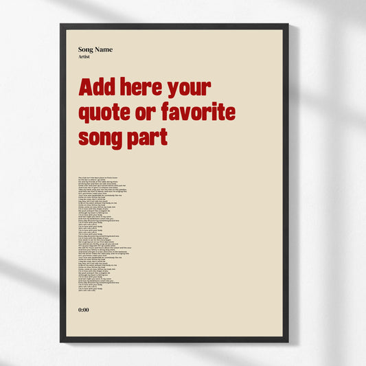
Designing lyric posters is the practice of combining song lyrics with typography, imagery, and layout to produce wall art or gifts that carry genuine personal meaning. Known in print design circles as typographic poster design, this format has become one of the most popular forms of custom wall art because it turns a meaningful lyric into a visual statement. The process requires more than picking a pretty font. You need to think about document resolution, color mode, visual hierarchy, and copyright before a single file goes to print. Tools like Adobe Express, Adobe Illustrator, and InDesign each serve different skill levels, and understanding which one fits your workflow will save you hours of frustration. This guide walks you through every phase, from setup to export, so your finished poster looks as good on the wall as it does on screen.
What are the essential tools and preparation steps for lyric poster design?
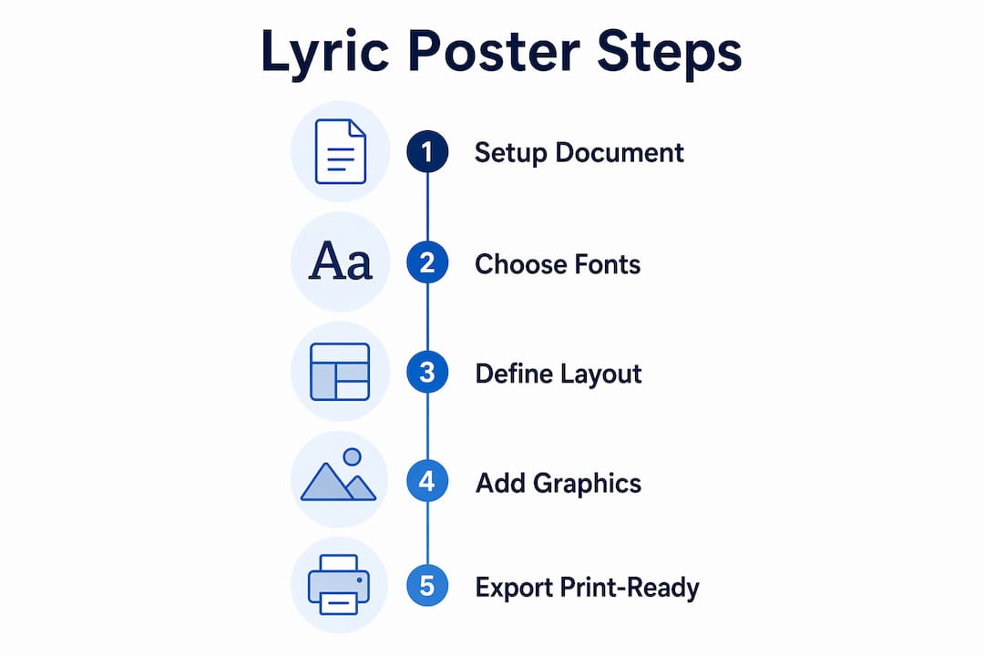
The foundation of any print-quality lyric poster is a correctly configured document. Skipping this step is the single most common reason DIY posters come back from the printer looking blurry, color-shifted, or cropped wrong.

Choosing the right software
Adobe Express is the best starting point for beginners. It offers pre-built templates, drag-and-drop typography, and direct export options without requiring you to understand every print setting manually. For more control, Adobe Photoshop handles raster-based compositions well, while Adobe Illustrator and InDesign are the industry standard for type-heavy layouts because they treat text as vector data, which scales without quality loss.
Document setup: size, resolution, and color mode
Set your document to the exact final print size before you place a single element. Designing at final size guarantees crisp text and image reproduction because upscaling after design degrades quality and causes blurriness at crisp text edges. Resolution must be set to 300 DPI at the outset. Print-ready files require 300 DPI in CMYK color mode, and switching from RGB to CMYK after the fact causes noticeable color shifts, particularly in deep blues and vibrant reds.
Bleed, safe area, and font embedding
- Add a 3mm bleed on all four sides so background graphics extend past the trim line and prevent white edges after cutting.
- Keep all text and key design elements at least 3mm inside the trim line to avoid accidental cropping.
- Embed all fonts in your file before export, or convert text to outlines.
- Avoid using RGB color swatches for any element you intend to print.
- If using AI-generated layout tools, verify that text renders correctly as real typeset fonts, since AI tools can produce fake letterforms that misprint.
Pro Tip: Save your working file in an editable format before converting text to outlines. Once text is outlined, you cannot edit individual characters, so always keep a master copy.
How to create an effective layout and choose typography for lyric posters?
Layout and typography are where most DIY lyric poster projects either succeed or fall apart. Typography in poster design is a problem of hierarchy and contrast, not just font choice. The goal is to guide the viewer’s eye from the most important lyric phrase to supporting text in a natural, deliberate sequence.
Defining your focal lyric phrase
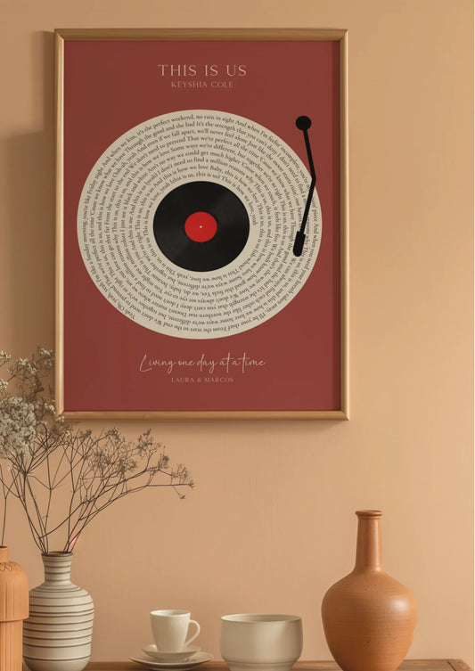
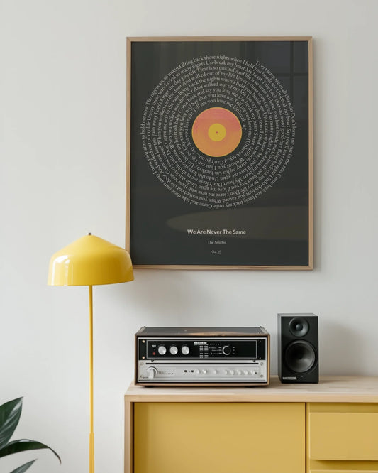
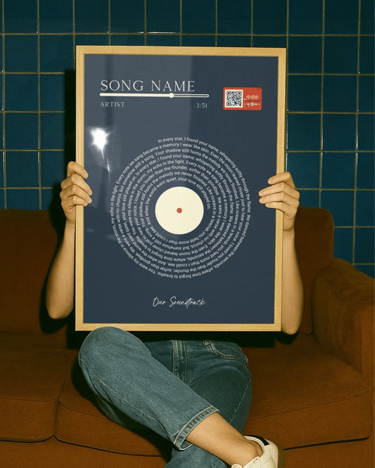
Pick one line or phrase from the song that carries the most emotional weight. That phrase becomes your headline and the visual anchor of the entire composition. Everything else, including the artist name, album title, or additional lyrics, plays a supporting role. This single decision shapes every other layout choice you make.
Applying the rule of thirds
Divide your canvas into a 3x3 grid and place your headline lyric at one of the four intersection points rather than dead center. This creates visual tension and makes the composition feel intentional rather than static. Most professional poster layouts use this grid instinctively, and applying it consciously will immediately improve your designs.
Font pairing and sizing
Pairing a serif font for headlines with a sans-serif for body text enhances contrast and readability. Limit your design to two or three fonts total. More than three creates visual noise that competes with the lyric itself.
| Font role | Recommended style | Example fonts |
|---|---|---|
| Headline lyric | Serif or display | Playfair Display, Bodoni MT |
| Supporting text | Clean sans-serif | Helvetica Neue, Montserrat |
| Accent or attribution | Script or light weight | Great Vibes, Lato Light |
For a 24x36 inch poster, size your headline at 72pt or larger so it reads clearly from five feet away. Body text or secondary lyrics should sit between 18pt and 36pt depending on the amount of copy.
Pro Tip: Avoid using decorative or script fonts for any text block longer than two lines. They are beautiful as headlines but become illegible at smaller sizes or in longer passages.
What image and graphic considerations ensure a high-quality lyric poster?
Images and background graphics give lyric posters their mood, but they are also the most common source of print quality problems. A photo that looks sharp on a laptop screen can print as a blurry mess if it was sourced at screen resolution.
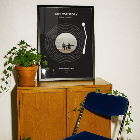
Use images at 300 DPI at the intended print size and never stretch a raster image beyond its native dimensions. Vector graphics, such as geometric shapes, line art, or SVG illustrations, scale to any size without quality loss and are always preferable for decorative elements. Raster images, including photographs, must meet the resolution requirement at the exact size they appear in the layout.
- Source photos from high-resolution stock libraries like Unsplash or Adobe Stock, and always check the file’s pixel dimensions before placing it.
- Maintain the original aspect ratio of every image. Stretching distorts proportions and looks unprofessional.
- Choose images that reinforce the mood of the lyric rather than compete with it. A busy, colorful background behind dense text creates visual chaos.
- Use background removal tools like Adobe Photoshop’s Remove Background feature or remove.bg to isolate subjects and create cleaner, more focused compositions.
- Keep image opacity in check. A photo used as a full-bleed background often works best at 20 to 40 percent opacity so the text remains the dominant element.
Pro Tip: When in doubt, use a solid color or subtle gradient as your background. It prints predictably, keeps costs down, and lets the typography do the work it was designed to do.
For more inspiration on how image choices shape the feel of song lyric wall art, the relationship between visual tone and lyric content is worth studying before you commit to a layout.
What are best practices for finalizing your lyric poster design and preparing for print?
Finalizing a lyric poster correctly is what separates a professional result from a disappointing one. The export stage is where most errors occur, and most of them are avoidable.
- Proofread every word. Read the lyrics against the original source. One wrong word in a lyric poster is immediately noticeable and cannot be fixed after printing.
- Convert text to outlines or embed fonts. Unembedded fonts cause spacing changes and layout breaks when a printer’s system substitutes a missing typeface. Converting to outlines eliminates this risk entirely.
- Confirm your color profile. Open your color settings and verify the document is in CMYK, not RGB. If you designed in RGB, convert the profile and check every color swatch for unexpected shifts before exporting.
- Export as PDF/X-1a or PDF/X-4. These PDF standards are specifically built for print production and preserve color profiles, bleed settings, and embedded fonts in a single file.
- Include crop marks and bleed in your export settings. This tells the printer exactly where to cut and confirms your bleed is active.
- Run a preflight check. Adobe Acrobat Pro and InDesign both include preflight tools that flag missing fonts, low-resolution images, and color profile mismatches before the file leaves your computer.
Pro Tip: Always order a single proof print before committing to a full print run or a large format size. Colors on screen, even on a calibrated monitor, rarely match print output exactly on the first attempt.
What copyright and licensing considerations should you be aware of?
Lyrics are protected intellectual property, and the rules around using them in physical printed form are stricter than most people realize.
Using lyrics for personal, non-commercial projects generally falls under fair use, meaning a poster you make for your own bedroom wall sits in a relatively safe zone. The moment you print lyrics on a product for sale, give copies away as part of a business, or reproduce them in quantity, you enter commercial territory that requires a license. Printing lyrics as physical products requires obtaining a print or lyric license from the relevant music publisher, and this applies even to partial lyrics or a single memorable line.
Key points to keep in mind:
- Copyright ownership of lyrics typically sits with the music publisher, not the recording artist.
- Lyric rights are separate from recording rights and from any branding or trademark associated with the artist.
- Fair use is not a blanket protection. It is a legal defense evaluated case by case, and courts consider whether the use is commercial and how much of the work is reproduced.
- Licensing services like Harry Fox Agency or direct publisher contact are the correct channels for obtaining print licenses.
Intellectual property rights on lyrics apply strictly once they are reproduced in physical form or as commercial products, unlike casual online quoting.
If you are designing lyric posters as gifts for friends and family with no commercial intent, you are working within the spirit of fair use. If you plan to sell them, get the license first.
Key takeaways
Effective lyric poster design requires correct document setup, deliberate typography, print-ready export settings, and an understanding of copyright before any file goes to a printer.
| Point | Details |
|---|---|
| Set up documents correctly | Use 300 DPI, CMYK color mode, and 3mm bleed from the start, not as an afterthought. |
| Typography drives impact | Choose one focal lyric as your headline and limit fonts to two or three for clarity. |
| Images must meet resolution | Only use 300 DPI images at print size; vector graphics are always preferable for decorative elements. |
| Export with precision | Use PDF/X format with embedded fonts, crop marks, and a confirmed CMYK color profile. |
| Know your copyright limits | Personal non-commercial posters fall under fair use; selling lyric prints requires a publisher license. |
Why simplicity is the hardest skill in lyric poster design
I have reviewed hundreds of DIY lyric poster projects over the years, and the pattern is consistent. The ones that fail almost always fail for the same reason: too much happening at once. Three fonts, a busy background, drop shadows on every text element, and a lyric that runs six lines long. The designer was excited, and that excitement crowded out every good instinct.
The posters that genuinely stop people in a room are almost always the simplest ones. One strong lyric. One font pairing that creates contrast. A background that supports rather than competes. White space used deliberately rather than filled out of nervousness.
The technical side of this, the 300 DPI, the CMYK, the bleed settings, is learnable in an afternoon. What takes longer is developing the restraint to leave space in a design. My honest recommendation is to finish a layout, then remove one element. If the poster looks better without it, you made the right call. If it looks worse, put it back. That single editing habit will improve your work faster than any tutorial.
For anyone starting out, the step-by-step tutorial for lyric poster creation on Wallfully’s blog is worth bookmarking. It covers the practical workflow in a way that complements the design principles discussed here. The tools matter, but the eye you develop over time matters more.
— Luanda
Create your lyric poster with Wallfully
Wallfully makes it straightforward to turn a favorite lyric into a print-ready piece of wall art without navigating complex design software. The platform guides you through customization with live previews, so you see exactly how your poster will look before it goes to print. Every order uses high-quality, eco-friendly materials and ships free with a satisfaction guarantee. Whether you are designing personalized lyric prints as a gift for a milestone occasion or adding something meaningful to your own space, Wallfully handles the print production so you can focus on the creative choices that matter. Browse the full collection and start customizing at Wallfully.com.
FAQ
What resolution should a lyric poster be for printing?
Set your document to 300 DPI at the final print size. Designing at a lower resolution and upscaling afterward degrades image and text sharpness.
How many fonts should I use in a lyric poster design?
Limit your design to two or three fonts. Pairing a serif headline font with a clean sans-serif for supporting text creates contrast without visual clutter.
Can I legally print song lyrics on a poster?
Personal, non-commercial lyric posters generally fall under fair use. Printing lyrics on products for sale requires a print license from the music publisher who owns the lyric rights.
What file format should I export my lyric poster in?
Export as a PDF/X-1a or PDF/X-4 file with embedded fonts, CMYK color profile, crop marks, and 3mm bleed included. This format is the print industry standard for reliable reproduction.
What is the difference between CMYK and RGB for poster printing?
CMYK is the color mode used by commercial printers; RGB is used by screens. Designing in RGB and converting at export causes color shifts, particularly in saturated or dark tones, so set CMYK from the start.