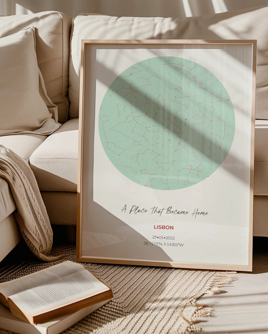

5 Map Color Schemes With Copyable Hex Codes for Map Poster Buyers
WallfullyThe best map color schemes fall into five reliable families: neutral minimalist, muted vintage, vibrant complementary, monochrome black-and-white, and pastel boho. Each one solves a different room problem, from making a small space feel open to giving a gallery wall a shared visual thread. Pick one based on your wall’s lighting and existing decor, then preview it on a tool like Wallfully before you commit to a print.
TL;DR:
- Using low-saturation, controlled palettes with one bold accent prevents posters from looking cluttered or overly busy.
- Choosing warm tones makes a space feel cozier, while cool tones help expand and open larger rooms visually.
- Matching one accent color to existing decor creates harmony, but avoid over-matching to maintain visual interest and texture.
- Providing exact hex codes and reviewing proofs under actual room lighting ensures printed colors match on-screen previews.
- Blue or sage palettes are safest for gifts due to broad color appeal, while black-and-white options fit minimalist interiors as a versatile choice.
Table of Contents
- Five Map Color Palettes You Can Copy Right Now
- How Room, Mood, and Lighting Should Drive Your Colors
- Coordinating Your Map With Existing Decor
- Getting Print Colors to Match What You Saw on Screen
- From Room Photo to Finished Poster: A Simple Workflow
- What Buyers Get Wrong About Map Colors
- Order Your Map Poster With the Right Colors, Confirmed Before You Buy
- Sources
- FAQ
Five Map Color Palettes You Can Copy Right Now
You don’t need a design degree to pick a palette that works. You need five or six hex codes and a sense of where the poster will hang. Here are the families that show up again and again in well-designed spaces, with starting codes you can plug straight into a preview tool.
-
Neutral minimalist:
#F5F1EAbackground,#D6CFC4land,#8A8378labels,#3E3A34outlines. Low saturation, high versatility. Works in almost any room, especially entryways and home offices. -
Muted vintage:
#E8DCC4paper tone,#B98B5Eland,#6E5B4Broads,#7C8A6Ewater. Slightly warm, desaturated, and forgiving. Suits living rooms with wood tones and older homes. -
Vibrant complementary:
#1B3A5Cdeep blue water paired with#D9772Eburnt orange accents. This is a textbook complementary pairing, and the contrast comes from how photoreceptors and afterimages react to opposite hues, which is why it reads as energetic rather than busy. Good for a bold living room or a kid’s room. -
Monochrome black-and-white:
#FFFFFFpaper,#111111linework, one gray midtone at#7A7A7A. No color decision to second-guess, which is exactly the appeal for black and white map posters in modern or minimalist interiors. -
Pastel boho:
#F7E8DCsand,#D9B8A3terracotta,#B7C9C0sage,#E3C7D4blush. Soft saturation throughout. Reads calm and works well in nurseries or reading nooks.
Notice the pattern: every strong palette keeps saturation controlled in three or four of the five colors, then lets one accent do the work. That restraint is what separates a poster that looks curated from one that looks like a screenshot.
How Room, Mood, and Lighting Should Drive Your Colors
Color temperature changes how a room feels and even how far away the walls seem. Warm palettes (terracotta, mustard, brick red) pull a space in and make it feel cozier, while cool palettes (navy, sage, slate) open a room up and push the walls back slightly, based on how color affects perceived distance and mood.
Saturation matters just as much as hue. A small hallway can handle a saturated accent because there’s less wall space for it to dominate. A large living room wall usually looks better with a lower-saturation palette, because bold color multiplied across a big canvas gets loud fast.
- Small rooms: one bold accent color, muted everything else.
- Large walls: keep the whole palette gentle, let scale do the impact.
- Gift orders: lean toward blue tones, since blue tests as the most broadly liked color across cultures, and avoid heavy yellow or yellow-green fills, which consistently rank as some of the least favored.
Pro Tip: When a poster is a gift and you don’t know the recipient’s decor, default to a cool, low-saturation palette with a single blue or sage accent. It’s the safest bet that still looks intentional.
Coordinating Your Map With Existing Decor

Start with an anchor, not the map itself. Look at your room’s dominant color, a couch, a rug, curtains, and pull one or two of those tones directly into the map’s palette. That single shared thread does more to make a poster feel “meant to be there” than matching every color exactly.
If the map is joining a gallery wall, resist the urge to make every frame and every piece identical. Design guidance on gallery walls favors a “common visual language”: vary frame finishes, mix portrait and landscape orientations, combine a large piece with two or three smaller ones, but keep two or three colors consistent across everything.
- Match one accent color, not the whole scheme, to your existing pieces.
- Mix matte black, natural wood, and one metallic frame for texture without clashing.
- Cut back on labels, borders, and decorative flourishes so the location itself stays the focal point, since reducing visual clutter helps viewers actually register what they’re looking at.
Getting Print Colors to Match What You Saw on Screen
Screens display color in RGB light. Printers lay down CMYK ink. The two systems don’t overlap perfectly, which is why a saturated teal that glows on your laptop can arrive slightly duller or shifted toward blue on paper. This isn’t a printing error. It’s physics.
The fix is straightforward: work in exact hex codes whenever a tool allows it, rather than eyeballing a color slider, and always request a preview or proof before the final print runs. Reputable print workflows often involve a CMYK soft proof and a low-resolution PDF photographed under normal room lighting for sign-off before the final run, since color perception genuinely varies between people and under different light sources, and testing under your actual lighting catches mismatches before they’re permanent.
- Provide hex codes, not verbal color descriptions, whenever you can.
- Ask for a proof and view it under the same bulbs that light your actual wall.
- Remember that matte finishes soften saturation slightly, while gloss finishes intensify contrast and can introduce glare under bright lighting.
Print shops that skip proofing entirely are the main reason “the color looked different in person” complaints exist at all.
From Room Photo to Finished Poster: A Simple Workflow
You can go from a blank wall to an ordered poster in four steps, and none of them require design software.
- Photograph your wall or reference room. Look at the dominant tones already there. That’s your anchor color.
- Extract or shortlist a palette. Pulling colors directly from a room photo with a free tool gives you a palette that’s already proven to work in that space, or you can shortlist three candidate palettes by eye if you’d rather compare options side by side. Tools like Google’s Art Palette extractor work similarly for pulling colors from artwork or inspiration photos.
- Enter hex codes into a preview tool, request a soft proof, and check it under your room’s actual lighting before finalizing anything.
- Order once the proof looks right in person, not just on screen.
If a proof comes back too saturated, drop the fill opacity or swap the boldest color for a muted version of the same hue, using a QR code colour and contrast checker to ensure print clarity. If it looks muddy or flat, that usually means too many midtone colors are competing. Cut the palette down to three dominant tones and one accent.
Pro Tip: Take your reference photo in daylight, not under a lamp. Artificial light skews warm and will throw off every color decision downstream.
What Buyers Get Wrong About Map Colors
Most color mistakes come from decorating for the screen instead of the wall. Buyers pick something eye-catching on their phone, and it reads too intense once it’s three feet wide on a living room wall. The other common miss is treating color as purely aesthetic instead of personal. The maps people love most usually trace to a real memory, a honeymoon coastline, a childhood street, not a trending palette. A live preview tool exists precisely to catch that gap before checkout, alongside eco-friendly printing that holds color well over time. For more on tying personal history into a print, see how personalized maps carry emotional weight or browse ways to personalize a map print beyond color alone.
— Luanda
Order Your Map Poster With the Right Colors, Confirmed Before You Buy
This service skips the guesswork that comes with ordering custom wall art blind. You pick your location, drop in the hex codes from the palette you landed on, and see a live preview update in real time, no waiting on a designer’s email or hoping the print matches what you imagined.
The process is simple: choose your map style, set your colors (or start from one of the palette families above), preview the result, request a proof if you want extra certainty, and check out with free shipping. If you’d rather go celestial instead of terrestrial, the Star, Moon & Zodiac Maps collection uses the same preview system. For readers ready to lock in a location-based piece, browse the Route & Map Posters collection and start building your palette now.
Sources
- The scientific reason complementary colors look good together | Smithsonian Magazine
- Gallery wall ideas | Architectural Digest
- How to extract color palettes from photos | Apartment Therapy
FAQ
What’s the safest map color scheme for a gift?
Cool, low-saturation palettes built around blue or sage tones are the safest bet, since blue consistently tests as the most broadly liked color across cultures. Avoid heavy yellow fills, which tend to rank poorly in preference studies.
Should I choose black and white or full color for a map poster?
Black and white works best when you want the map to blend into any room without a color decision, especially in minimalist or monochrome interiors. Full color suits rooms where the map is meant to stand out as a focal point or tie into an existing palette.
How do I make sure the printed colors match what I see on screen?
Provide exact hex codes rather than relying on a color slider, and always request a preview or proof before the final print. The live preview tool lets you check your chosen hex codes against the actual poster layout before you order.
What if my printed map looks too saturated or dull compared to the preview?
Too saturated usually means the fill opacity needs to drop or a bold color needs a muted swap. A dull or muddy result often means too many competing midtones, so trimming the palette to three main tones plus one accent usually fixes it.
Does the service offer a color preview before I order?
Yes, the customization tool shows a live preview as you enter your hex codes and location details, so you can see the finished look before checkout. Pricing for the Route & Map Posters collection is available directly on the site.