Types of Song Lyric Wall Prints: Your 2026 Style Guide
WallfullyTL;DR:
- Song lyric wall prints come in various styles, including typographic, canvas, vinyl, framed, minimalist, and illustrated designs, each offering unique visual and material qualities.
- Choosing the right format depends on the room, size, lyric length, and decor style, with typography and size being critical for readability and impact.
- Careful selection and layout of lyrics, especially focusing on font and spacing, are essential to creating meaningful, visually appealing wall art that resonates emotionally.
Types of song lyric wall prints refer to the distinct formats and styles in which song lyrics are transformed into decorative wall art, including typographic posters, canvas prints, vinyl record-style designs, and framed lyric art. Each format carries its own visual personality, material quality, and personalization potential. The right choice depends on your room, your taste, and whether you’re decorating for yourself or giving a gift that actually means something. This guide breaks down every major style so you can choose with confidence.
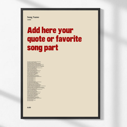
1. Typographic lyric prints: the most popular style
Typographic lyric prints are the most widely recognized format in song lyric decor, defined by their deliberate use of font, spacing, and text arrangement as the primary visual element. The lyrics themselves become the art. There are no background photos, no illustrated characters. Just words, arranged with intention.
The design variations within this category are wider than most people expect:
- Cascading typography: Lines of lyrics flow down the page in varying sizes, creating a visual rhythm that mimics the song’s pacing.
- Script and handwritten fonts: Warm, personal, and well-suited to love songs, wedding anthems, or lullabies.
- Sans-serif modern fonts: Clean and minimal, these work in contemporary interiors with neutral palettes.
- Vintage typewriter fonts: Monospaced, slightly imperfect, and ideal for classic rock or folk lyrics.
Most quality typographic prints use heavyweight fine art paper, with Doingly’s lyric prints specifying 200gsm stock as a standard for professional results. That weight matters because it prevents warping and holds ink color accurately over time. Poor typography layout is the leading reason lyric prints look amateurish, not the song choice itself.
Pro Tip: Choose a font that matches the emotional register of the song. A delicate script on a heavy metal lyric creates visual dissonance that undermines the whole piece.
2. Canvas lyric prints: gallery quality at home
Canvas lyric prints treat song lyrics as fine art by printing them onto stretched canvas, the same surface used in traditional painting. The result is a gallery-style effect with rich color depth, a textured matte surface, and a durability that paper prints cannot match. Canvas does not need a frame, which makes it a strong choice for modern and minimalist interiors.
Personalization options on canvas prints go further than most other formats. Common additions include:
- Names and dates: A couple’s names and anniversary date printed beneath the lyric excerpt.
- Dedications: A short personal message in a secondary font below the main lyric.
- Subtle visual motifs: Thin line illustrations of instruments, constellations, or florals that complement without competing with the text.
Visual styles within canvas lyric art range from stark minimalist text on white or black backgrounds to nostalgic sepia-toned designs that evoke a specific era. Sizing matters significantly here. A canvas that is too small for its wall looks like an afterthought, while one that is too large overwhelms the room. A 50x70 cm canvas works well above a desk or console table, while a 60x90 cm or larger piece suits a bedroom feature wall.
Pro Tip: Always approve a digital proof before final printing. Adjusting typography before printing prevents costly reprints and catches spacing issues that are invisible at thumbnail size.
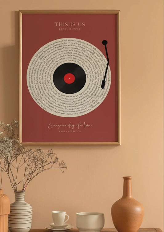
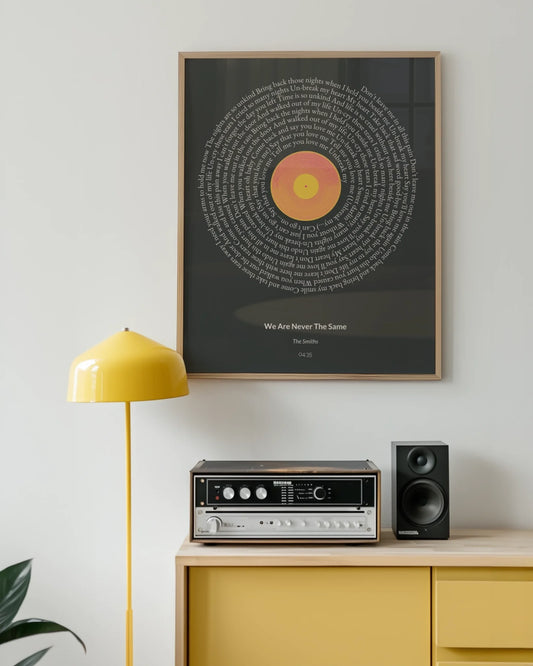
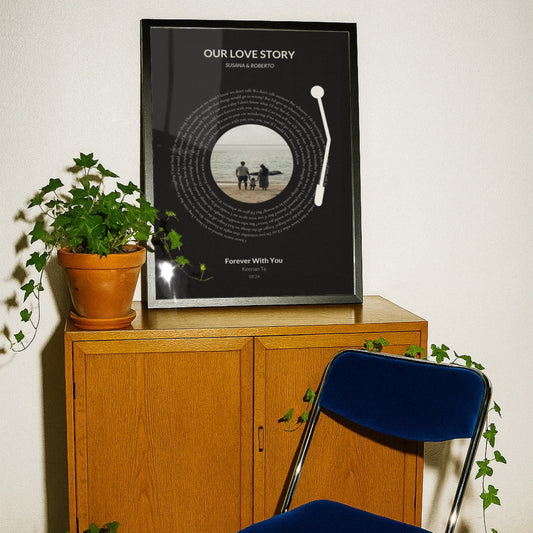
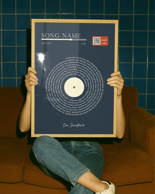
3. Vinyl and record-style lyric posters: retro and collectible
Vinyl-style lyric posters take a fundamentally different approach from typographic prints. Where typographic designs let the words carry the visual weight, vinyl-style designs use imagery, color, and graphic elements as the primary frame, with lyrics playing a supporting role. Think of a stylized record sleeve where the song title and a few key lines appear within a bold graphic composition.
These prints appeal strongly to music collectors and fans who want something that feels closer to memorabilia than home decor. Common features include:
- Circular record motifs with lyrics arranged in concentric rings around a center label.
- Bold color blocking inspired by album artwork from the 1960s through the 1990s.
- Artist name and album title integrated into the layout alongside the lyric excerpt.
The best setting for vinyl-style prints is a music room, home studio, or gallery wall alongside framed album covers and concert photography. They read as collectibles first and decor second, which is exactly what their audience wants. If you are decorating a living room or bedroom with a neutral palette, a typographic or canvas print will integrate more naturally.
4. Framed lyric art prints: classic presentation
Framed lyric art refers to any lyric print, typographic or otherwise, that arrives or is displayed in a physical frame. The frame is not just packaging. It is a design decision that changes how the print reads in a room. Black frames suit monochrome prints, white frames blend into light-colored walls with colored print backgrounds, and natural wood frames soften text-heavy designs and add warmth.
Framed lyric prints are the most gift-ready format because they require no additional work from the recipient. They arrive complete, ready to hang, and visually finished. For anniversaries, weddings, and milestone birthdays, a framed lyric print with a custom dedication reads as a considered, personal gift rather than a generic purchase.
The frame profile also affects perceived quality. A thin, modern profile suits sans-serif typographic prints. A wider, more ornate frame pairs with vintage or script-based designs. Getting this pairing wrong is one of the most common mistakes buyers make when ordering custom lyric wall prints online.
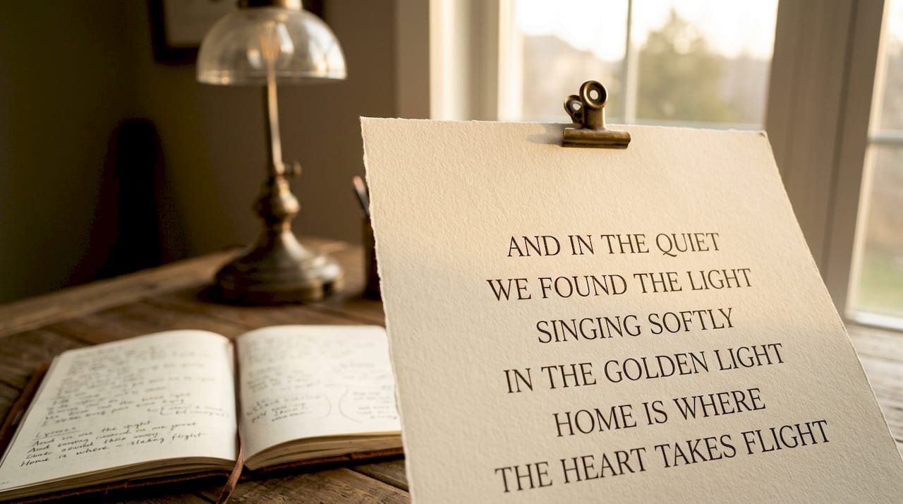
5. Minimalist lyric prints: one line, maximum impact
Minimalist lyric prints strip the design down to a single line or short phrase, printed in a clean font on a plain background. The restraint is the point. One powerful line from a song, given space to breathe on a large sheet of paper or canvas, carries more emotional weight than a full verse crowded onto a small print.
Shorter lyric excerpts consistently deliver more visual impact than full stanzas, and minimalist prints take that principle to its logical conclusion. A single line like “We found love in a hopeless place” or “I will always love you” needs nothing else. The white space around it is part of the composition.
This style works exceptionally well in bedrooms, reading nooks, and home offices where the goal is atmosphere rather than statement. It also photographs well for social media, which has made it one of the fastest-growing lyric wall art styles in 2026.
6. Illustrated lyric prints: art and words combined
Illustrated lyric prints pair song lyrics with original artwork, hand-drawn illustrations, or watercolor imagery. The illustration and the text are designed together, so neither feels like an afterthought. A lyric from a nature-themed folk song might appear alongside a botanical illustration. A love song lyric might be set within a watercolor cityscape.
This format bridges the gap between personalized lyric art and traditional illustration prints. It appeals to buyers who want something visually rich but still personally meaningful. The challenge is balance. When the illustration dominates, the lyric becomes a caption. When the text dominates, the illustration becomes wallpaper. The best illustrated lyric prints treat both elements as equal partners.
Illustrated prints are particularly strong as gifts for new parents, where a lullaby lyric paired with a soft watercolor animal illustration creates something both decorative and sentimental.
7. How to choose the right lyric print for your space or gift
Choosing among the types of lyric wall prints comes down to four practical decisions: room, size, lyric length, and typography style.
Room and viewing distance determine size and font scale. Lyric text reads clearly from roughly 1.5 times the print’s longest dimension, so a 50x70 cm print needs a viewer about one meter away. Hallways, where people pass rather than sit, suit medium portrait prints at eye level. Living rooms and bedrooms, where viewers sit at a distance, need larger formats with bolder typography.
Lyric length affects visual impact directly. Use this as a guide:
- Single line or short phrase: minimalist prints, large format, maximum emotional punch.
- One verse or chorus: typographic or canvas prints, medium format, narrative feel.
- Multiple verses: only works on large canvas with expert layout, otherwise becomes cluttered.
Typography style should match the room’s existing decor. A modern apartment with clean lines calls for sans-serif fonts and monochrome palettes. A warm, eclectic living room suits script fonts and earthy tones. A vintage-inspired space pairs naturally with typewriter fonts and aged paper textures.
For gifts, match the print style to the occasion. Weddings and anniversaries call for elegant script on canvas or framed paper. Birthdays suit bolder, more playful typographic designs. New home gifts work well with a lyric that references place, belonging, or new beginnings.
Pro Tip: For gift occasions like anniversaries, add the date and a short dedication beneath the lyric. It transforms a decorative print into a keepsake.
| Comparison | Best choice |
|---|---|
| Modern minimal interior | Minimalist or sans-serif typographic print |
| Warm, eclectic room | Script canvas print or illustrated lyric art |
| Music collector or fan | Vinyl record-style lyric poster |
| Wedding or anniversary gift | Framed canvas print with names and date |
| Hallway or narrow wall | Medium portrait typographic print, 50x70 cm |
Key takeaways
The most effective lyric wall print combines intentional typography, appropriate sizing for the viewing distance, and a lyric excerpt short enough to read as art rather than text.
| Point | Details |
|---|---|
| Typography drives quality | Poor font and layout choices make prints look amateurish regardless of song choice. |
| Size affects legibility | Match print size to viewing distance: roughly 1.5x the longest dimension for clear reading. |
| Shorter excerpts work better | Single lines or one verse deliver more visual impact than full multi-stanza layouts. |
| Frame choice is a design decision | Black, white, or wood frames each change how a lyric print integrates with a room. |
| Proof before printing | Approving a digital proof prevents spacing and typography errors in the final print. |
Why readability is the most underrated decision in lyric art
I have reviewed hundreds of lyric prints over the years, and the ones that fail almost always fail for the same reason: the buyer chose the song first and thought about the design second. The emotional connection to a lyric is real and valid, but it does not automatically translate into a print that works on a wall.
The prints I find most compelling are the ones where someone made a deliberate choice about what not to include. One line from a song, given room to breathe in a clean layout, does more work than four verses squeezed into a 30x40 cm frame. I have seen beautifully meaningful songs turned into visual noise because no one thought about font size at arm’s length.
My honest advice: treat the typography decision as seriously as the lyric decision. If you are ordering a custom lyric poster, spend as much time choosing the font and layout as you do choosing the lines. The song is the soul of the piece. The design is what makes it art.
The 2026 trend toward larger, bolder minimalist prints is not a coincidence. It reflects a growing understanding that restraint is a design skill, not a limitation.
— Luanda
Create your own personalized lyric print at Wallfully
Wallfully offers a full range of song lyric poster styles, from clean typographic designs to personalized canvas prints with custom names, dates, and dedications. The guided customization process includes a live preview so you can see exactly how your lyric, font, and layout will look before you order. Every print ships free, is produced on quality materials, and comes with a satisfaction guarantee. Whether you are decorating a bedroom, creating a gallery wall, or looking for a gift that carries real meaning, Wallfully’s lyric wall art options give you the tools to get it right the first time.
FAQ
What are the main types of song lyric wall prints?
The main types include typographic lyric posters, canvas lyric prints, vinyl record-style posters, framed lyric art, minimalist single-line prints, and illustrated lyric prints. Each format differs in material, visual style, and how lyrics are presented within the design.
Which lyric print style works best as a gift?
Framed canvas prints with personalized names, dates, and a short dedication work best for gifts like anniversaries and weddings. The complete, ready-to-hang format requires nothing from the recipient and reads as a finished, considered piece.
How do I choose the right size for a lyric wall print?
Lyric text reads clearly from roughly 1.5 times the print’s longest dimension, so match your size to the typical viewing distance in the room. A 50x70 cm print suits hallways and desks; larger formats work better in living rooms and bedrooms.
Should I use a short lyric or a full verse on a wall print?
Shorter lyric excerpts deliver more visual impact than full stanzas. A single powerful line or one chorus gives the design room to breathe and reads as art rather than a block of text.
Does the frame color affect how a lyric print looks?
Yes. Black frames suit monochrome prints, white frames blend with light walls and colored backgrounds, and natural wood frames add warmth to text-heavy or vintage-style designs. Frame choice is a design decision, not just a display preference.