Custom Map Creation Steps for Designers and Creatives
WallfullyTL;DR:
- Creating custom maps involves a structured workflow from tool selection to final export to produce personalized and cohesive designs. Using the appropriate software and organizing data layers prior to styling ensures accuracy, while locking in a color palette early maintains visual consistency and harmony. To achieve professional results, clean geometry errors, properly arrange layers, and export in high quality formats like PDF, converting text to outlines before printing.
Custom map creation steps are the structured workflow every designer and creative needs to produce personalized, meaningful maps for home decor, gifts, or personal projects. The process spans tool selection, basemap setup, layer management, styling, and export, and each stage builds on the last. Tools like QGIS, Google My Maps, and Adobe Illustrator each serve different skill levels and output goals. Knowing which steps to follow, and in what order, is what separates a polished map print from a frustrating afternoon of trial and error.
What tools and materials do you need before starting your custom map project?
Preparation determines how smoothly your map project runs. Choosing the wrong tool for your output format wastes hours, so match your software to your goal before you open a single file.
Here is a quick comparison of the most popular tools for custom map design:
| Tool | Best For | Learning Curve | Cost |
|---|---|---|---|
| QGIS | Print and data-heavy maps | Moderate | Free |
| Google My Maps | Simple personalized maps | Low | Free |
| Canva | Decorative, graphic-style maps | Low | Free/Paid |
| Adobe Illustrator | Advanced design refinement | High | Paid |
| Loquiz | Interactive and game maps | Low to moderate | Paid |
Beyond software, you need base map data. OpenStreetMap is the standard free source for geographic data, and it exports as shapefiles that QGIS reads directly. For print projects, work at 300 DPI from the start. For digital sharing, 72–96 DPI is sufficient.
Key materials to gather before you begin:
- A defined geographic area or address to center your map
- Reference images or mood boards for your color palette
- Any custom icons, logos, or personal photos you want to add
- The final output size (frame dimensions, poster size, or screen resolution)
The most common beginner mistake is trying to learn every software feature before starting. Pick one tool, learn its core functions, and build from there.
Pro Tip: If your goal is a framed wall print, start in QGIS for geographic accuracy, then export to Illustrator for typography and color refinement. If you want a quick personalized gift map, Google My Maps or Canva gets you there faster.
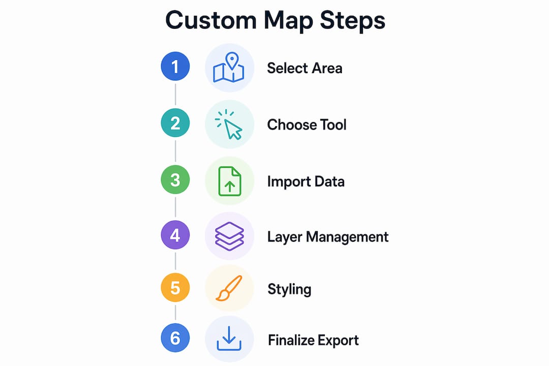
How do you follow the custom map creation steps from basemap to setup?
The early stages of the custom map design process set the foundation for everything that follows. Rushing this phase creates alignment and accuracy problems that are hard to fix later.
Follow these steps to move from a blank canvas to a structured map base:
-
Choose your basemap. OpenStreetMap is the most accessible starting point. Google Maps works for reference, but licensing limits its use in printed products. Load your basemap into QGIS or import it as a background layer in Canva or Illustrator.
-
Set your coordinate reference system (CRS). In QGIS, this step locks your map to real-world geographic coordinates. Skipping it causes layers to misalign. For most North American projects, EPSG:4326 (WGS 84) is the standard starting point.
-
Focus on the three core QGIS areas. QGIS beginners should orient themselves using the Map Canvas, Layers Panel, and toolbars before touching advanced settings. These three areas control everything you see and do.
-
Import your data layers. Shapefiles from OpenStreetMap include roads, water bodies, parks, and building footprints as separate layers. Import each one individually so you can control their visibility and order.
-
Organize your layers by type. Stack layers logically: terrain or background at the bottom, roads in the middle, labels and markers at the top. This stacking order controls what appears in front of what on your final map.
-
Define your map boundaries. Zoom to your area of interest and lock the extent. In QGIS, use the Print Layout tool to set a fixed frame. This prevents your composition from shifting when you add more data.
Layer management is the skill that separates organized projects from chaotic ones. Successful mapmakers consistently name mastering the Layers Panel as the single most important early habit to build.
What are the key techniques for styling and customizing your map design?
Styling is where your map transforms from a data display into a piece of art. The map customization techniques you apply here determine whether your final print feels cohesive and intentional or cluttered and generic.
Start with these core styling principles:
- Lock in your color palette first. Choosing a clear color scheme upfront aligns your map’s look with its purpose before you style a single layer. A muted, vintage palette suits a framed city map gift. A bold, high-contrast palette works for an event or travel print.
- Apply consistent styles to each layer type. Roads should share one color family, water bodies another. Inconsistency across layer types reads as unfinished.
- Add labels with readability in mind. Use one font family with two weights maximum. Place street labels along road paths, not floating above them. Avoid overlapping text at all costs.
- Customize markers and icons. Google My Maps allows custom icons uploaded directly from your files, which is useful for marking personal locations like a first home or a wedding venue.
- Include map context elements. A legend, scale bar, and north arrow add professionalism and help viewers orient themselves. In QGIS Print Layout, these are added as individual items with full style control.
- Use Illustrator for final design refinement. After exporting from QGIS, open the file in Illustrator to adjust typography, fine-tune colors, and add decorative elements that GIS software cannot produce.
For hand-drawn or illustrated maps, consistent light source and shadow density create a convincing sense of terrain and depth. Decide where your light comes from before you draw a single hill or mountain symbol.
You can explore creative map print styles to see how color palette choices translate into finished wall art that works across different interior design styles.
Pro Tip: Limit yourself to three accent colors maximum. More than three pulls the viewer’s eye in too many directions and makes the map feel busy rather than designed.
How do you finalize, export, and troubleshoot your custom map?
Finalization is where most creative projects stall. The steps below move your map from a working file to a print-ready or shareable asset without losing quality.
-
Run a topology cleanup. Before exporting from QGIS, fix geometry errors and remove redundant vertices. Skipping this step causes rendering errors in Illustrator and visible glitches in printed output. Use QGIS’s built-in “Fix Geometries” tool under the Vector menu.
-
Check your layer order one final time. Labels should sit above all feature layers. Water should appear below roads. A misplaced layer order is the most common cause of invisible features in the final export.
-
Choose the right export format. PDFs work best for print, preserving vector quality at any size. PNG and JPEG suit digital sharing, with PNG being the better choice when transparency matters. Export at 300 DPI minimum for any print product.
-
Convert text to outlines in Illustrator. Converting text to outlines is the last step before sending a file to print. This locks your typography so font substitution cannot alter your design on a different system.
-
Save versioned backups. Save a working version and a final version as separate files. If a client or recipient requests a change, you want to return to an editable file, not a flattened export.
Test your map at its actual print size before ordering. A design that looks clean at 50% zoom often reveals label crowding or thin lines that disappear when printed at full scale.
For troubleshooting, the three most common problems are overlapping labels (fix with label placement rules in QGIS), missing layers (check CRS alignment), and washed-out colors in print (convert your color profile from RGB to CMYK before exporting for physical output).
A professional vector map workflow covers nine technical stages from data import through coordinate alignment, topology cleaning, and final Illustrator refinement. That structure applies whether you are making a decorative city poster or a detailed trail map.
How do popular custom map tools compare for creative projects?
Choosing the right tool shapes your entire experience. This comparison covers the tools most relevant to creative and decorative map projects.
| Tool | Ease of Use | Print Quality | Custom Styling | Best Use Case |
|---|---|---|---|---|
| QGIS | Moderate | Excellent | High | Detailed print maps, data layers |
| Google My Maps | Easy | Low | Moderate | Personal location maps, gifts |
| Canva | Very easy | Moderate | Moderate | Decorative graphic maps |
| Adobe Illustrator | Difficult | Excellent | Very high | Final design refinement |
| Loquiz | Easy | Low | Moderate | Interactive and event maps |
QGIS is the strongest choice when geographic accuracy and print quality matter. Google My Maps suits anyone who wants to mark personal locations and share a link or screenshot quickly. Canva works well for designers who want a map-inspired graphic rather than a geographically precise output. Illustrator is not a standalone mapping tool. It is the finishing layer that refines exports from QGIS or other GIS software into polished, print-ready art.
For gift and home decor projects, the most practical workflow combines two tools: one for geographic data and one for design refinement. That combination produces results that look intentional rather than generated.
Key takeaways
The most effective custom map creation process combines the right tool for your output goal, disciplined layer management, and a locked color palette before any styling begins.
| Point | Details |
|---|---|
| Match tool to output | Use QGIS for print accuracy, Google My Maps for quick personal maps, Illustrator for final refinement. |
| Layer management first | Organize and name all layers before styling to keep your project clean and editable. |
| Lock color palette early | Choosing your color scheme upfront prevents visual inconsistency across layers and elements. |
| Topology cleanup before export | Fix geometry errors in QGIS before exporting to avoid rendering glitches in print files. |
| Convert text to outlines last | Always convert typography to outlines in Illustrator as the final step before sending to print. |
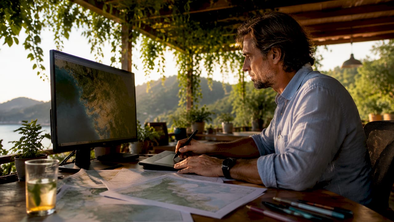
What I have learned from making maps for decor and gifts
The advice I give most often is also the advice most people ignore: start with a rough sketch on paper before opening any software. I have watched talented designers spend three hours adjusting QGIS layer colors before they had a clear picture of what the finished map should look like. A five-minute pencil sketch of your layout, your focal point, and your color zones saves that time every time.
The second thing I have learned is that multiple rough color tests before committing to a final design are not optional for quality work. They are the difference between a map that looks considered and one that looks like a first attempt. Print a small test at 4x6 inches before ordering a full poster. Colors shift between screen and paper, and catching that shift early costs nothing.
The beginner pitfall I see most is over-styling. New mapmakers add gradients, drop shadows, texture overlays, and decorative borders all at once. The result is visual noise. The maps that work as wall art are the ones with restraint. Two or three colors, one font family, and clean lines read as designed. Everything else reads as busy.
If you are making a map as a gift, think about what the recipient will feel when they see it. A map of the street where someone grew up, rendered in a palette that matches their living room, carries more weight than a technically perfect map of a place they have no connection to. The emotional specificity is the point. That is what makes a custom map worth framing.
— Luanda
How Wallfully brings your custom map art to life
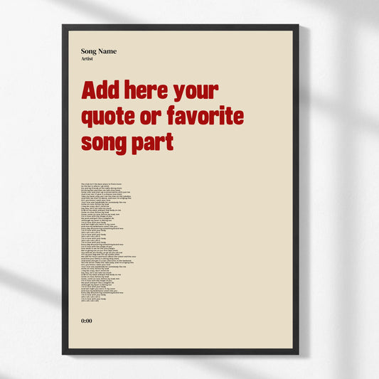
Wallfully specializes in turning meaningful locations into high-quality, frameable wall art. If you have worked through the custom map creation steps above and want a finished print without managing exports, DPI settings, or print profiles yourself, Wallfully’s guided customization process handles the production side. You enter your location, choose a style, and preview your design before it ships. Every print uses eco-friendly materials and arrives with free shipping. For a gift that carries real personal meaning, a custom map print from Wallfully is the most direct path from idea to finished art on the wall. You can also explore the full custom map art workflow to see how the design-to-print process works in detail.
Pair your map with eclectic living room decor ideas to find a display style that fits your space before you order.
FAQ
What are the first steps to create a custom map?
Start by selecting your geographic area and choosing a tool that matches your output goal, such as QGIS for print or Google My Maps for a quick personal project. Then import your base map data, set your coordinate reference system, and organize your layers before any styling begins.
Which software is best for custom map design?
QGIS is the strongest choice for print-quality, geographically accurate maps, while Google My Maps works well for simple personalized projects. Adobe Illustrator is used as a finishing tool after exporting from GIS software, not as a standalone mapping platform.
How do I export a custom map for printing?
Export your map as a PDF from QGIS to preserve vector quality at any print size, and set your resolution to 300 DPI minimum. If you finish the design in Illustrator, convert all text to outlines as the final step before sending the file to a printer.
What is topology cleaning and why does it matter?
Topology cleaning fixes geometry errors and removes redundant data points in your map file before export. Skipping this step causes visible rendering errors in design software and physical print output.
How do I choose a color palette for my map?
Decide on your color scheme before styling any layer, and limit yourself to three accent colors maximum. Match the palette to the map’s purpose: muted tones for vintage-style decor prints, bold contrasts for event or travel maps.