Song Lyric Poster Inspirations for Gifts and Decor
WallfullyTL;DR:
- Choosing a single impactful lyric line under 90 characters enhances emotional resonance and visual clarity in lyric posters.
- Typography, color, and layout must prioritize readability and emotional tone, with personal details adding meaningful context.
Song lyric posters, known in the design world as lyric wall art, are printed pieces that transform a meaningful musical line into a visual statement for your home or as a gift. The best song lyric poster inspirations share one principle: one impactful lyric line, paired with deliberate typography and clean layout, creates more emotional resonance than a full verse ever could. Whether you are decorating a bedroom wall or searching for a wedding gift that actually means something, the choices you make around lyric selection, font, color, and format determine whether the result feels personal or generic. Wallfully specializes in exactly this kind of custom lyric art, and this guide covers every creative decision you need to make it count.
How to select the perfect lyric line for your poster
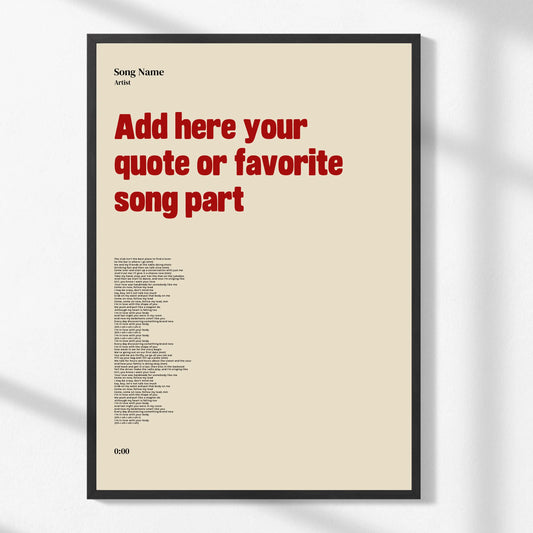
The single most important decision in any lyric poster project is which line you choose. One standout line of 90 characters or fewer gives the design room to breathe and the reader a clear focal point. When a poster tries to fit a full chorus or multiple verses, the text shrinks, the spacing tightens, and the emotional punch disappears.
Most people default to the chorus because it is the most familiar part of a song. That is exactly why you should look elsewhere. Verses capture more specific meaning and avoid the redundancy that makes choruses feel overused on printed art. A bridge line or a second verse often holds the most poetic language in a song, and it will feel more personal to anyone who knows the track well.
For lyric discovery, the platform Musixmatch provides officially licensed lyrics and works well alongside AI tools like OpenAI to programmatically select one line that fits strict character and aesthetic constraints. This approach is especially useful if you are designing multiple posters or want to be confident the lyric text is accurate.
Legal awareness matters here too. Personal use posters are generally safe under fair use principles, but printing lyrics for commercial sale requires a proper print license from the rights holder. If you are making a poster for your own wall or as a one-off gift, you are in low-risk territory. If you plan to sell printed lyric art, the legal picture changes significantly.
- Keep the lyric line under 90 characters for clean layout
- Prioritize verses and bridges over repeated chorus lines
- Use Musixmatch to verify accurate, official lyric text
- Confirm personal versus commercial use before printing
Pro Tip: Read the lyric line aloud before committing to it. If it sounds complete and meaningful on its own, without needing the rest of the song for context, it will work on a poster.
Creative typography and layout ideas for lyric posters
Typography is not decoration on a lyric poster. It is the message. Readability drives lyric poster design more than any graphic element, because the text itself is the focal point. A beautiful font that is hard to read at five feet defeats the entire purpose of the piece.

Font size and spacing deserve as much attention as font choice. A single lyric line set in a 48-point serif font with generous line spacing reads clearly from across a room. The same line set in a 24-point decorative script with tight tracking becomes a puzzle. For standard poster sizes between 16x20 and 30x40 inches, shorter text with ample spacing consistently outperforms dense layouts in both legibility and visual appeal.
Color palette choices shape the emotional tone of the piece before the reader processes a single word. Black text on white or cream stock reads as modern and clean. Deep navy or forest green backgrounds with white lettering feel intimate and warm. Muted palettes with soft sage, dusty rose, or warm gray work well in bedroom and living room settings because they complement rather than compete with existing decor.
White space is not empty space. It is the visual silence that makes the lyric feel considered and intentional. Centering a single line with equal margins on all four sides is the simplest layout that works every time.
- Serif fonts like Garamond or Playfair Display suit romantic or classic lyrics
- Sans-serif fonts like Helvetica or Futura work for modern, minimalist designs
- Script fonts add warmth but should be reserved for short lines only
- Black-and-white palettes photograph well and age without looking dated
Pro Tip: Print a test version on standard paper before ordering a final print. What looks balanced on a screen often needs font size or spacing adjustments at actual poster dimensions.
Top 6 popular song lyric poster variations and styles
Different creative approaches produce very different results, and knowing the main styles helps you match the design to the occasion and the room.
1. Minimalist single-line posters
One lyric line, centered, in a clean font on a white background. This is the most versatile style because it works in any room and pairs with any decor. It also photographs cleanly for social media, which matters if the poster is a gift the recipient will want to share.
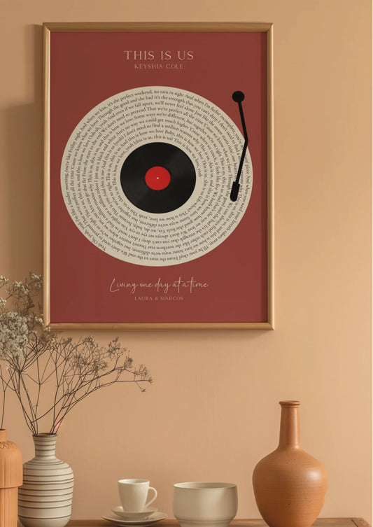
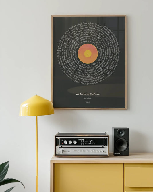
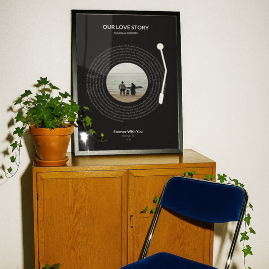
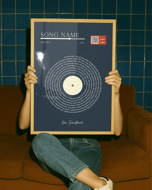
2. Vintage typography and vinyl record themed posters
These designs incorporate retro typefaces, aged textures, and circular layouts that echo vinyl record labels. They work especially well for classic rock, soul, or jazz lyrics. The visual context of the vinyl aesthetic signals the era of the music before the reader even processes the words.
3. Handwritten or script font posters
Script fonts simulate handwriting and add a personal, intimate quality to lyric art. They work best for love songs, wedding songs, or lyrics tied to a specific person. The key is choosing a script that remains legible at poster scale. Fonts like Pacifico or Great Vibes are widely used because they balance personality with readability.
4. Illustrated lyric posters
These pair the lyric line with a simple illustration, such as a mountain range, a city skyline, or a botanical element, that connects thematically to the song. The illustration should support the lyric, not compete with it. Illustrated styles work well as personalized home decor because they feel more like art than a print.
5. Collage and mixed media lyric art
Collage styles layer the lyric over photography, sheet music, or textured paper backgrounds. This approach suits music educators, collectors, or anyone who wants a more complex visual narrative. The risk is clutter. The lyric must remain the dominant element even when the background is busy.
6. Digital and AI-generated lyric posters
AI tools now generate background visuals, color palettes, and layout suggestions based on the mood of a lyric. Platforms that connect Spotify data with Musixmatch and OpenAI can produce a gallery-ready design in minutes. This style suits tech-forward gift-givers and anyone who wants a unique result without graphic design experience.
| Style | Best for | Key design feature |
|---|---|---|
| Minimalist single-line | Any room, any occasion | Clean font, white background |
| Vintage vinyl | Classic rock, jazz, soul | Retro type, circular layout |
| Handwritten script | Weddings, love songs | Personal, intimate font |
| Illustrated | Home decor, art lovers | Thematic illustration |
| Collage / mixed media | Collectors, music educators | Layered textures |
| AI-generated | Tech-forward, unique gifts | Algorithm-driven design |
How to personalize lyric posters for gifts and special occasions
A lyric poster becomes a genuinely meaningful gift when the lyric connects directly to a shared memory or milestone. The song from a first dance, the track that played on a road trip, the album that got someone through a hard year. These specifics are what separate a lyric poster from a generic print.
For weddings and anniversaries, the first dance song is the obvious starting point, but the most memorable posters often use a lesser-known line from that song. Pair the lyric with the wedding date and the couple’s names set in a smaller font below the main text. This adds context without cluttering the design. Wallfully’s lyric print design guide covers exactly how to incorporate these personal details without overwhelming the layout.
For birthdays, consider the song that defined a year or era for the recipient. A lyric from a song released in their birth year, or from an album they played on repeat during a formative period, carries a depth of meaning that a generic birthday card cannot match.
Format choices affect how the gift is received and displayed:
- Framed prints arrive ready to hang and feel complete as a gift
- Canvas prints add texture and work well in living rooms and bedrooms
- Unframed prints give the recipient flexibility to choose their own frame
- Vinyl decals work for renters who cannot put holes in walls
Presentation matters as much as the print itself. A lyric poster rolled in a kraft paper tube with a handwritten note explaining why you chose that specific line turns a beautiful object into a story. That story is what the recipient will remember and repeat when someone asks about the piece on their wall.
Key takeaways
The most effective lyric posters use a single line under 90 characters, set in a legible font with generous spacing, and personalized to a specific memory or occasion.
| Point | Details |
|---|---|
| One lyric line wins | Limiting text to one line under 90 characters maximizes readability and visual impact. |
| Skip the chorus | Verses and bridges hold more specific meaning and feel more personal on printed art. |
| Typography is the message | Font choice and spacing determine whether the lyric reads clearly from across a room. |
| Personal use is low risk | Home decor and one-off gifts fall under fair use; commercial printing requires licensing. |
| Personalization creates meaning | Adding a date, name, or occasion transforms a print into a lasting, story-driven gift. |
Why the lyric you skip is usually the right one
I have looked at hundreds of lyric poster designs, and the pattern is consistent. The posters that stop people mid-scroll are almost never built around the chorus. They use the line that only a real fan of the song would recognize. That specificity is what makes someone feel seen when they receive it as a gift.
Typography is where most first-time designers underestimate the work. A font that looks elegant in a mockup can become unreadable at 24x36 inches if the spacing is wrong. I have seen beautiful script fonts completely collapse at large print sizes because the designer never tested a physical proof. The print-ready design checklist from Wallfully addresses this directly, and it is worth reviewing before you finalize any design.
The copyright question makes people more anxious than it needs to. For personal use and gifting, the risk is genuinely low. The line to watch is commercial sale. If you are making one poster for your sister’s birthday, you are not in legal jeopardy. If you are opening an Etsy shop selling lyric prints, visual display of lyrics triggers intellectual property considerations that require proper licensing.
The best lyric posters I have seen share one quality: they look like someone made a decision. Every element, the lyric, the font, the color, the size, was chosen deliberately. That intentionality is what makes a piece of wall art feel like it belongs in a room rather than just hanging in one.
— Luanda
Create your own lyric poster with Wallfully
Wallfully makes it straightforward to turn a meaningful lyric into a print-ready piece of wall art, whether you are decorating your own space or ordering a gift for someone else.
Wallfully’s customization process lets you add the lyric line, artist name, song title, and personal details like a date or name, then preview the result before ordering. Every print ships free and is produced on high-quality, eco-friendly materials. The song lyric poster collection covers design options from minimalist to illustrated styles, so you can match the aesthetic to the room or the person. For more creative starting points, the unique lyric poster ideas guide walks through seven distinct approaches for personalized decor. Every order comes with a satisfaction guarantee, so the only decision left is which lyric to choose.
FAQ
What makes a good lyric for a poster?
A good poster lyric is one complete thought, under 90 characters, that reads meaningfully without the surrounding song for context. Verses and bridges tend to work better than chorus lines because they carry more specific imagery.
Is it legal to print song lyrics for personal use?
Personal use and gifting fall under fair use principles and carry low legal risk. Commercial sale of lyric prints requires a print license from the rights holder.
What size should a lyric poster be?
Standard sizes between 16x20 and 30x40 inches work well for single-line lyric designs. Larger formats give the text more visual presence, while smaller sizes suit gallery walls and desk displays.
Which font style works best for lyric posters?
Serif fonts like Playfair Display suit romantic or classic lyrics, while sans-serif fonts like Futura work for modern designs. Script fonts add warmth but should only be used for short lines that remain legible at scale.
Can I add personal details like a date or name to a lyric poster?
Yes, and doing so significantly increases the emotional value of the piece. Adding a date, name, or location in a smaller font below the main lyric line provides context without competing with the primary text.