7 Top Poster Design Tips for Personalized Wall Art
WallfullyTrying to create personalized wall art that actually fits your space can be overwhelming. Too many posters end up feeling cluttered, unreadable, or simply out of place with the rest of your room. If you want your custom print to make a lasting impression, every detail matters—from color schemes to font choices and layout balance.
You will discover practical solutions that professional designers use to maximize visual harmony, clarity, and personal meaning. Proven guidelines from scientific poster research show how the right mix of colors, font sizes, and white space creates art that is both memorable and easy to read.
Get ready to uncover specific strategies that transform basic prints into standout pieces. Each item in the list breaks down key steps to elevate your wall art using actionable design principles backed by expert recommendations.
Table of Contents
- Choose The Right Color Scheme For Your Space
- Use Bold Fonts For Maximum Impact
- Balance Text And Images For Clarity
- Make Personal Details Stand Out
- Keep Layout Simple And Uncluttered
- Preview Designs Before Finalizing
- Select Quality Materials For Lasting Prints
Quick Summary
| Key Insight | Explanation |
|---|---|
| 1. Choose a Strategic Color Scheme | Use colors that enhance readability and evoke desired emotions while considering room decor. |
| 2. Use Bold Fonts for Clarity | Select clear, bold typography to create visual hierarchy and ensure readability. |
| 3. Balance Text and Images Effectively | Maintain an ideal composition of text, images, and white space for optimal engagement. |
| 4. Highlight Personal Details | Make significant elements stand out through bold typography and strategic positioning. |
| 5. Simplify Layout for Impact | Prioritize essential information and embrace white space to create a clean, uncluttered design. |
1. Choose the Right Color Scheme for Your Space
Creating the perfect personalized wall art starts with selecting a color scheme that transforms your space and speaks to your unique style. Your poster’s color palette isn’t just about looking good—it’s about creating an emotional connection and visual harmony in your room.
Color selection matters more than you might think. Scientific poster design guidelines emphasize the importance of strategic color choices that enhance readability and visual appeal. Consider these key principles when choosing your poster’s color palette:
- Contrast is King: Select colors that create clear, readable visual distinctions
- Mood Matters: Different colors evoke different emotional responses
- Room Context: Consider your existing decor and wall colors
Professional designers recommend using a light background with dark text to maximize readability. This approach ensures your personalized wall art remains clear and engaging from across the room.
Choose colors that tell your story without overwhelming the visual space.
To select the perfect color scheme, consider these practical steps:
- Examine your room’s existing color palette
- Pick 2-3 complementary colors
- Use color wheel techniques to find harmonious combinations
- Test color samples in your actual space before finalizing
Remember that color can dramatically impact perception. Warm colors like reds and oranges create energy and excitement. Cool colors like blues and greens promote calmness and relaxation.
Pro tip: Use the 60-30-10 design rule: 60% dominant color, 30% secondary color, and 10% accent color for a balanced and professional look.
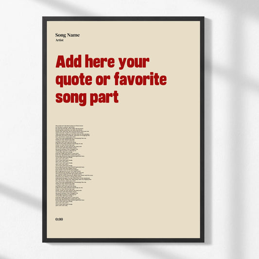
2. Use Bold Fonts for Maximum Impact
The secret to creating a poster that grabs attention lies in your font choice. Typography isn’t just about legibility—it’s about making a powerful visual statement that draws people in and communicates your message instantly.
Scientific poster design guidelines recommend strategic font selection to maximize visual impact. Bold typography can transform an ordinary poster into an extraordinary piece of wall art.
When selecting fonts for your personalized poster consider these critical principles:
- Readability is Paramount: Choose fonts that are clear and easy to read
- Limit Font Varieties: Stick to 1-2 font types for a clean look
- Size Matters: Use larger font sizes for key information
Bold fonts create visual hierarchy and guide the viewer’s eye across your design.
For maximum effectiveness choose sans-serif fonts like:
- Century Gothic
- Helvetica
- Gentona
- Arial
The goal is to create visual hierarchy and clarity. Your title should be significantly larger and bolder than supporting text. Research recommends using 48-point or larger fonts for titles to ensure they capture immediate attention.
Pro tip: Create contrast by pairing a bold headline font with a lighter supplemental font to maintain visual interest and readability.
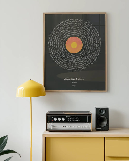
3. Balance Text and Images for Clarity
A stunning poster is like a visual symphony where text and images dance together in perfect harmony. Creating an impactful design means understanding how to distribute your visual elements strategically.
Poster design guidelines recommend a precise balance of visual components to maximize engagement. Think of your poster as a carefully curated visual experience.
The ideal composition breaks down into these key proportions:
- 40% Reserved for Text: Include your title and key information
- 30% Dedicated to Graphics: High-resolution images that support your message
- 30% White Space: Breathing room that prevents visual overwhelm
Visual hierarchy matters more than cramming in every detail.
To achieve optimal clarity consider these practical steps:
- Select high-resolution graphics
- Use concise bullet points instead of dense paragraphs
- Choose images that directly complement your text
- Maintain consistent spacing between elements
Contextual Imagery is crucial. Scientific poster recommendations emphasize using graphics that visually reinforce your narrative rather than simply decorating the space.
Remember that white space isn’t empty—it’s a powerful design element that guides the viewer’s eye and prevents visual fatigue.
Pro tip: Use a grid system when designing to ensure consistent alignment and balance between text and image elements.
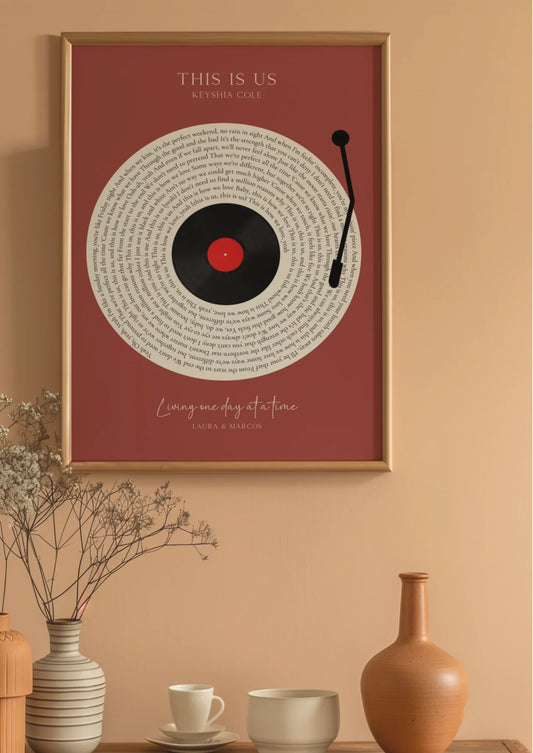
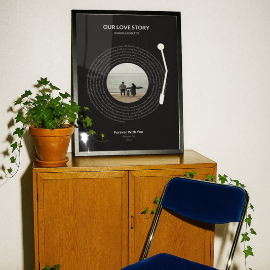
4. Make Personal Details Stand Out
Personal details transform an ordinary poster into a meaningful piece of art that tells your unique story. Your personalized wall art should celebrate the moments and memories that matter most to you.
Poster design guidelines emphasize the importance of highlighting key personal information using strategic typography and placement. Think of these details as the heartbeat of your design.
When showcasing personal elements consider these critical strategies:
- Bold Typography: Use larger font sizes for significant details
- Strategic Positioning: Place personal information prominently
- Color Contrast: Make important details visually pop
Personal details are the soul of your custom artwork.
Specific ways to make personal details memorable include:
- Highlight anniversary dates in bold
- Use special fonts for names and significant years
- Create visual hierarchy with size and placement
- Integrate meaningful symbols or icons
Emotional Storytelling happens through intentional design. Selecting the right way to display personal information can turn a simple poster into a cherished keepsake that resonates deeply with its recipient.
Pro tip: Create visual drama by using a mix of font weights and sizes to draw attention to the most meaningful personal details.
5. Keep Layout Simple and Uncluttered
A cluttered poster is like a noisy room that overwhelms your senses. The most powerful designs speak softly but confidently through clean sophisticated simplicity.
Poster design guidelines emphasize the critical importance of white space and minimalist layouts. Think of your design as a visual breathing space where every element has purposeful intention.
Key principles for maintaining a clean layout include:
- Prioritize Essential Information: Cut anything unnecessary
- Embrace White Space: Allow visual elements room to breathe
- Create Clear Hierarchical Structure: Guide the viewer’s eye strategically
Simplicity transforms good design into great communication.
Steps to achieve an uncluttered design:
- Start with a light background
- Use one consistent font style
- Limit color palette to 2-3 complementary tones
- Remove decorative elements that don’t serve a purpose
Negative Space Matters. Scientific poster recommendations suggest dedicating approximately 30% of your design to white space to reduce viewer fatigue and improve comprehension.
Remember that restraint in design creates elegance. Every visual element should have a clear reason for existing.
Pro tip: Before finalizing your design, step back and ask yourself if each element truly contributes to the story you want to tell.
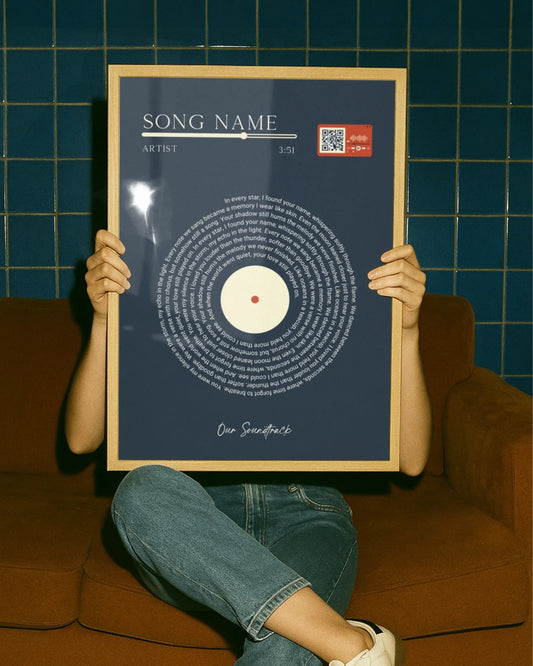
6. Preview Designs Before Finalizing
Design previews are your secret weapon in creating flawless personalized wall art. Like a final dress rehearsal before a performance your poster design needs a careful once over to ensure everything looks perfect.
Poster design guidelines emphasize the critical importance of thorough design review before printing. Think of previewing as your quality control checkpoint.
Why previewing matters most:
- Catch Subtle Errors: Identify design inconsistencies
- Verify Color Accuracy: Ensure true color representation
- Check Overall Composition: Validate visual balance
A quick preview can save you from costly reprints and disappointment.
Steps for an effective design preview:
- View design at actual print size
- Check text readability from different distances
- Verify image resolution and clarity
- Review personal details for accuracy
Visual Harmony Matters. Scientific poster recommendations suggest developing and reviewing designs several weeks in advance to allow time for refinements.
Consider using digital preview tools that simulate how your poster will look in different lighting and from various viewing angles.
Pro tip: Print a draft version on standard paper to get a realistic sense of how your final poster will appear and make necessary adjustments.
7. Select Quality Materials for Lasting Prints
Your personalized wall art is an investment—and like any great investment it deserves premium materials that preserve its beauty for years to come. The quality of your print’s materials directly impacts its longevity and visual appeal.
Poster design guidelines emphasize the critical importance of selecting high-quality printing materials that maintain vibrancy and durability. Your poster isn’t just a decoration it’s a memory captured in visual form.
Key considerations for material selection:
- Paper Weight: Heavier stocks provide more substantial feel
- Finish Options: Matte reduces glare while glossy enhances colors
- Image Resolution: Higher quality ensures crisp details
Superior materials transform a simple print into a lasting treasure.
Material selection steps:
- Verify paper weight (recommended 200-300 gsm)
- Check ink quality and color fastness
- Consider protective coatings
- Evaluate environmental resistance
Color Preservation Matters. Professional printing ensures your memories remain vibrant and true to their original essence.
Consider factors like UV resistance and archival quality when making your selection. These technical details determine how beautifully your poster will age.
Pro tip: Request material samples before final printing to physically assess texture color reproduction and overall quality.
Below is a comprehensive table summarizing the key principles, strategies, and recommendations presented in the article to create effective personalized wall art designs.
| Key Aspect | Description | Key Considerations |
|---|---|---|
| Color Scheme | Establishes harmony and evokes emotions through strategic use of colors. | Use contrast, consider room decor, adhere to the 60-30-10 design rule. |
| Typography | Enhances readability and visual impact with deliberate font choices. | Opt for bold fonts, limit font varieties, size text appropriately. |
| Balance of Elements | Arranges text, visuals, and white space for clear communication. | Maintain 40% text, 30% graphics, and 30% white space. |
| Highlighting Personal Details | Infuses design with meaningful personalization for emotional resonance. | Use bold text, strategic positioning, and complementary colors. |
| Simplicity in Layout | Focuses on sophistication through a minimalist approach to design elements. | Embrace white space, prioritize essential information, and limit colors. |
| Design Preview | Conduct a thorough final review to ensure quality and consistency. | Check text readability, color accuracy, and image resolution. |
| Print Materials | Uses high-quality materials to enhance longevity and visual appeal of prints. | Evaluate paper weight, coating finishes, and print durability. |
This table encapsulates the steps and methodologies provided in the article for crafting personalized wall art that aligns with both aesthetic and functional objectives.
Bring Your Personalized Wall Art to Life with Expert Tips and Quality Prints
Struggling to balance bold fonts, vibrant colors, and personal details for a stunning poster design It can be challenging to create personalized wall art that truly captures your story while maintaining clarity and elegance. This article’s top tips highlight the importance of thoughtful color schemes, clean layouts, and the perfect balance of text and images for a memorable design experience.
Turn those design ideas into reality with Personalized Wall Art – Custom Posters & Prints for any Occasion. Our platform guides you through an easy customization process with live previews ensuring your colors, fonts, and personal details stand out beautifully on high-quality eco-friendly materials. Whether celebrating milestones or gifting special moments you can rely on Wallfully’s expert printing and satisfaction guarantee. Visit Wallfully.com now to start creating your unique wall art that speaks your story and transforms your space.
Frequently Asked Questions
How do I choose the right color scheme for my personalized wall art?
Choosing the right color scheme involves selecting 2-3 complementary colors that resonate with your personal style and the existing decor of your room. Start by examining your room’s current color palette and test color samples directly in your space to see how they blend.
What fonts should I use to ensure maximum impact in my poster design?
Opt for bold sans-serif fonts like Helvetica or Arial for clear readability and visual impact. Limit yourself to 1-2 font types and use larger sizes for key information to create a visual hierarchy that guides the viewer’s eye.
How can I balance text and images effectively in my poster?
Aim for a layout that allocates 40% for text, 30% for graphics, and 30% for white space. Use concise bullet points instead of dense paragraphs and choose high-resolution images that complement your text for a harmonious design.
What should I do to make personal details stand out on my poster?
Highlight personal details by using bold typography and strategic placement to draw attention. Consider making significant information, like names or dates, larger and using colors that create a visual contrast to ensure they pop.
How can I keep my poster layout simple and uncluttered?
Maintain a clean layout by prioritizing essential information and embracing white space. Before finalizing, review your design to ensure every element has a clear purpose and contributes to the overall visual clarity.
Why is it important to preview designs before printing?
Previewing your design helps catch subtle errors and verify that the color accuracy is as expected. Always view your design at actual print size and check for readability to avoid costly mistakes in the final print.