
10 Ways to Personalize Map Prints for Home or Gifts
WallfullyTL;DR:
- Personalized map prints evoke emotional connections by highlighting meaningful locations and thoughtful design choices. Selecting the right place, color palette, typography, and finishing details ensures a personalized and impactful display. These maps make memorable gifts for special occasions, with quality prints designed to last for decades.
Personalizing map prints means transforming a geographic image into a piece of art that carries real emotional weight. The best custom map art ideas go far beyond picking a city. They combine location choice, color palette, typography, symbols, and framing into a single cohesive design that tells your story. Whether you want unique map prints for your living room wall or a gift that will genuinely move someone, the ways to personalize map prints covered here will get you there.
1. Ways to personalize map prints: start with the right location
The single most important decision in any personalized map decor project is the location. Effective personalized map art focuses first on the emotional significance of the location before any design detail. That principle separates a print people hang for years from one that ends up in a drawer.
Think beyond obvious choices like your current city. Consider these location types:
- Birthplace or hometown. The street grid of where someone grew up carries instant recognition and nostalgia.
- First home together. A neighborhood map of where a couple first lived together works as a wedding or anniversary gift.
- Travel destination. A city you visited on a honeymoon, a solo trip, or a family vacation becomes a permanent memory on the wall.
- Meeting point. The specific intersection or park where two people met is a detail that makes a recipient stop and stare.
Location specificity also affects the map’s visual detail. A neighborhood zoom shows individual streets and landmarks. A city view shows districts and major roads. A regional or country view trades street detail for geographic context. Match the zoom level to the story you want to tell.
Pro Tip: If you are gifting the print, ask the recipient’s close friend or family member for a meaningful address rather than guessing. That extra research turns a good gift into an unforgettable one.
2. Color palettes that match mood and decor
Color is the fastest way to shift a map print from generic to personal. Consumers prefer map personalization that coordinates with their home decor style rather than defaulting to standard cartographic blue and green. That preference is worth taking seriously when you design your own map print.
Here are four palette approaches worth considering:
- Warm neutrals. Cream, tan, and terracotta tones work in rustic, farmhouse, or Scandinavian interiors. They feel lived-in and calm.
- Monochrome. A single color in varying shades, typically navy or forest green, reads as sophisticated and works in modern or minimalist rooms.
- Vintage sepia. Brown tones with aged paper textures reference antique cartography. They suit traditional or eclectic spaces and pair well with wooden frames.
- Bold and graphic. High-contrast black and white or a single vivid accent color suits contemporary interiors and makes a strong visual statement.
The mood of the memory should guide your choice. A map of a beach town where you spent summers as a child calls for something warm and sun-bleached. A map of a city you associate with ambition and energy might suit a sharper, more graphic treatment.
Pro Tip: Pull a color from your existing furniture or wall paint and match your map palette to it. Most online customization tools let you input hex codes or choose from curated palettes, so this is easier than it sounds.
3. Typography choices that add character
Typography is often the most overlooked element in custom map art ideas. The font you choose signals the era, mood, and personality of the piece before anyone reads a single word.
Serif fonts like Garamond or Playfair Display reference traditional cartography and feel timeless. Sans-serif fonts like Futura or Helvetica read as clean and modern. Script fonts add a handwritten warmth that works well for romantic occasions like weddings or anniversaries. Whatever you choose, readability matters. A beautiful font that is hard to read at normal viewing distance defeats the purpose.
Text placement is equally important. Most personalized map prints include a title line above the map, a subtitle or date below, and sometimes coordinates in small type at the bottom. Keeping text minimal lets the map itself carry the visual weight. One strong headline and one supporting line is almost always better than three or four lines of text competing for attention.
4. Adding symbols, landmarks, and personal icons
Custom icons and symbols are where map prints shift from art to storytelling. Personalization features can include symbols, landmarks, coordinates, and graphic elements integrated into the map composition without overwhelming the geographic information.
Practical ways to use symbols include:
- A heart or pin icon placed on the exact spot where something meaningful happened.
- Wedding rings or floral motifs layered subtly into the design for anniversary or wedding gifts.
- Custom coordinates printed below the map title in small, clean type. Coordinates add a precise, almost secret quality that rewards the person who knows what they mean.
- Landmark silhouettes representing a building, bridge, or natural feature tied to the location.
The key to making these elements work is restraint. One or two well-placed symbols strengthen the composition. Five or six competing icons turn a map into a cluttered collage.
Pro Tip: Use coordinates in decimal degrees format (e.g., 40.7128° N, 74.0060° W) rather than degrees-minutes-seconds. It reads cleaner at small sizes and looks more contemporary.
5. Vintage and artistic finishes
A vintage treatment changes the entire feel of a map print without changing the underlying geography. Aged paper textures, faded ink effects, and hand-drawn line styles all reference the golden age of cartography and give a print a sense of history and weight.
Modern artistic finishes go the other direction. Watercolor washes, geometric line art, and minimalist outlines strip the map down to its essential shapes. These styles work especially well for city maps where the street grid itself is visually interesting. MyRetroPoster offers bespoke cartographic artwork with collaborative design, printed on high-quality matte art paper with museum-grade inks. That level of finish makes a real difference when the print is displayed at large sizes.
The finish you choose should match both the location’s character and the room where the print will hang. A vintage-style map of Paris fits a different wall than a clean geometric map of Tokyo.
6. Choosing the right size and paper quality
Size and paper quality determine whether a map print looks like art or like a printout. Map prints range from A4 to A0, and the right choice depends on the display space and the level of geographic detail in the design.
| Format | Best for | Paper recommendation |
|---|---|---|
| A4 (8×11 in) | Desk display, small gallery walls | Archival matte, 200 gsm or higher |
| A3 (11×17 in) | Bedroom accent wall, shelf display | Archival matte or giclée |
| A2 (16×23 in) | Living room feature wall | Giclée on fine art paper |
| A1 (23×33 in) | Statement piece, large open walls | Giclée, heavyweight fine art paper |
| A0 (33×47 in) | Grand entryways, commercial spaces | Museum-quality giclée only |
Giclée printing uses archival pigment inks that resist fading for decades. Archival matte paper holds fine detail well and avoids glare. Both options cost more than standard printing, but the difference in longevity and visual quality is significant for something displayed permanently on a wall.
7. Framing options that complete the look
The frame is the last design decision and one of the most visible. A wrong frame choice can undercut an otherwise strong print. A right one makes the whole piece feel intentional.
Minimalist black or white frames work with almost any map style and keep the focus on the print itself. Natural wood frames add warmth and suit vintage or rustic treatments. Floating frames, where the print appears to hover inside the frame with a visible gap, work well for modern and graphic styles. For a more casual display, mounting the print on foam board or using a clip frame keeps costs low while still looking deliberate.
If the print is a gift, consider ordering it already framed. Wallfully offers a guided customization process with previews, so the recipient sees exactly what they are getting before it ships.
8. Star maps for special dates
Star maps are one of the most emotionally specific forms of personalized map decor. Capricorn Press creates personalized star maps using accurate astronomical data, with customers providing the date, time, and location to generate a chart of the exact night sky at that moment. The result is a print that captures a specific second in time, not just a place.
Star maps work for birthdays, wedding nights, the night a child was born, or any date that carries weight. Adding a short personal message below the chart turns the print into a complete keepsake. The combination of scientific accuracy and personal meaning is what makes star maps consistently popular as gifts.
9. Multi-map displays for travel memories
A single map print tells one story. A collection of map prints tells a life. Grouping three to five maps of places you have traveled, lived, or loved creates a wall display that is both visually striking and deeply personal.
Custom map wall art ideas for travel memory display work best when the prints share a consistent visual style. Use the same color palette, font, and frame across all prints so the collection reads as a unified set rather than a random assortment. A grid arrangement on a large wall or a staggered gallery layout both work well. Label each print with the city name and year to give viewers context.
10. Occasion-specific personalization for gifts
Personalized map prints make unique gifts for weddings, anniversaries, housewarmings, and milestone birthdays because they reflect meaningful places and moments rather than generic sentiment.
- Weddings: A map of the venue location or the city where the couple met, with the wedding date as the subtitle.
- Anniversaries: The neighborhood where a couple first lived together, printed in a palette that matches their home.
- Housewarmings: A street map centered on the new address, with a small pin icon marking the front door.
- Milestone birthdays: A map of the city where the person was born, styled to reflect the era of their birth year.
Online tools like Lime & Lou, Mapiful, and Craft & Oak make it straightforward to build these prints with color, layout, and typography controls in a browser. The process from concept to checkout typically takes under 30 minutes.
Key takeaways
The most meaningful personalized map prints combine a location with genuine emotional significance with deliberate design choices in color, typography, and finish.
| Point | Details |
|---|---|
| Location is the foundation | Choose a place tied to a real memory or milestone, not just a city you like. |
| Color should match mood and decor | Coordinate your palette with the room and the emotional tone of the memory. |
| Symbols add story without clutter | Use one or two icons or coordinates to deepen meaning without overwhelming the map. |
| Size and paper quality matter | Giclée printing on archival paper ensures the print looks strong and lasts for decades. |
| Occasion shapes the design | Weddings, anniversaries, and housewarmings each call for different location and style choices. |
Why emotional resonance is the real design brief
I have looked at hundreds of personalized map prints over the years, and the ones that genuinely move people share one quality: the location was chosen with intention. The prints that fall flat are almost always the ones where someone picked a city because it looked good on a map, not because it meant something.
The design details matter, but they are secondary. A well-chosen location in a mediocre color palette will outlast a beautifully designed print of a place that means nothing to the recipient. That is the uncomfortable truth most design guides skip over because it is harder to sell than a color wheel.
My advice is to spend more time on the location decision than on any other element. Write down three to five places that carry real weight for the person you are making this for. Then ask which one they would recognize instantly and feel something about. That is your location. Everything else, the palette, the font, the frame, serves that choice.
Map prints are also more versatile as gifts than most people realize. They work for people who are hard to shop for because they are specific without being presumptuous. A book or a candle says “I guessed.” A map of the street where someone grew up says “I paid attention.”
— Luanda
Create your own personalized map print with Wallfully
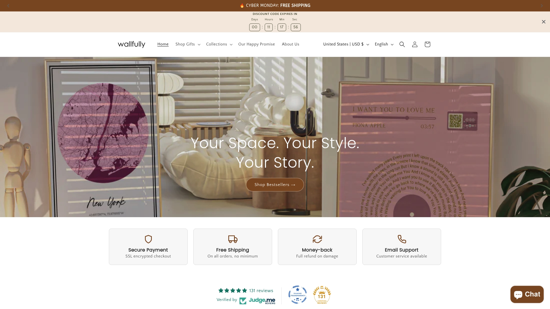
Wallfully makes it straightforward to turn any of these ideas into a finished print you can hang or give. The platform guides you through location selection, color palette, typography, and size with live previews at every step. Every order ships free and is backed by a satisfaction guarantee, so there is no risk in trying something specific and personal. Browse the personalized city map poster collection to see styles and sizes, or start with a street map with a pin for a clean, modern look at any location you choose. Wallfully prints on eco-friendly materials with archival inks, so the result holds up as long as the memory it represents.
FAQ
What makes a map print truly personalized?
A truly personalized map print combines a location tied to a real memory with deliberate design choices in color, typography, and added elements like coordinates or symbols. The location choice carries more emotional weight than any design detail.
What size should I order for a living room wall?
A2 (16×23 in) or A1 (23×33 in) works well as a living room feature piece. Match the size to the wall space and choose giclée printing on fine art paper for the best visual result at larger formats.
Can I add text or a personal message to a map print?
Yes. Most customization platforms let you add a title, subtitle, date, coordinates, or a short personal message. Keep text to one or two lines so it supports the map rather than competing with it.
Are personalized map prints good wedding gifts?
Personalized map prints are strong wedding gifts because they can mark the venue location, the city where the couple met, or another place with shared meaning. Adding the wedding date as a subtitle makes the print a permanent keepsake.
What is the difference between archival matte and giclée printing?
Archival matte paper holds fine detail and avoids glare, making it well suited for smaller prints. Giclée printing uses pigment-based inks on heavyweight fine art paper and is the standard for large-format prints meant to last decades without fading.