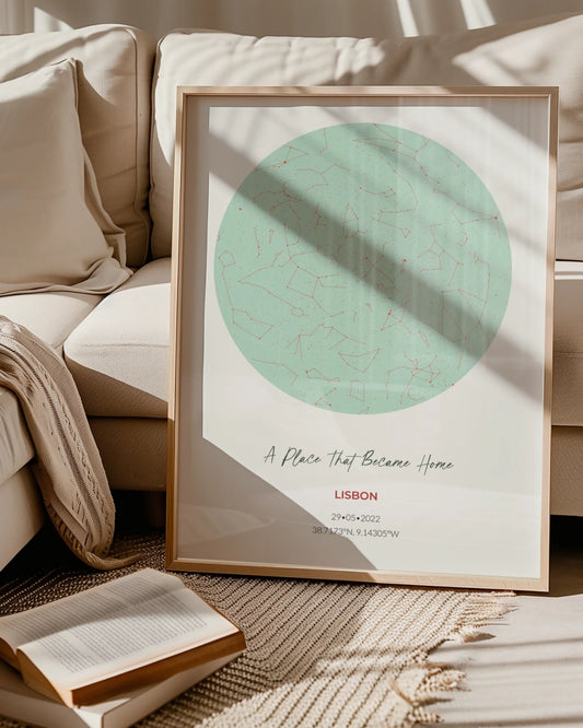

Two Thirds of Your Sofa: Living Room Poster Size You Can Preview
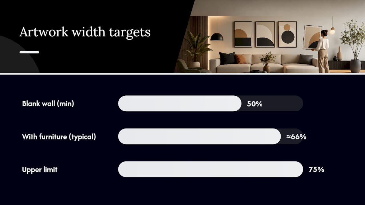
WallfullyMost living rooms need artwork in one of four ranges: small (8x10 to 11x14) for shelves and side tables, medium (16x20 to 18x24) for accent walls, large (24x36) for sofa focal points, and oversized (30x40 and up) as a statement piece on a wide wall. The rule that decides which bucket you land in: your artwork should measure roughly two-thirds to three-quarters of the furniture below it, or fill 50% to 75% of a blank wall’s width.
TL;DR:
- Most living rooms benefit from posters that measure between 16x20 and 24x36 inches, fitting with furniture and wall proportions based on the two-thirds rule.
- For larger statement pieces, posters in the 30x40 to 40x60 range are ideal for wide walls or above long sectionals, especially in open-plan spaces.
- When measuring, use the width of the furniture or wall, then calculate two-thirds to three-quarters of that dimension to find the optimal artwork size.
- Mocking up the artwork with painter’s tape or paper templates before hanging helps avoid sizing mistakes and ensures proper visual balance.
- Room lighting, decor style, and viewing distance significantly influence the best poster size, with natural light favoring detailed finishes and informal layouts supporting grouped smaller prints.
Table of Contents
- Standard Poster Sizes at a Glance for Living Rooms
- How Do You Pick the Right Poster Size for Your Wall?
- Where Should You Hang Art on a Living Room Wall?
- How Do You Plan a Gallery Wall Layout?
- What Print and Framing Details Matter Before You Order?
- How Wallfully Makes Sizing Easier to Get Right
- Does Room Lighting Change What Poster Size Works?
- How Does Room Style Influence Poster Size Choices?
- Does Where You Sit Change the Ideal Poster Size?
- Why the Two-Thirds Rule Beats Guessing on Poster Size
- See Your Poster Size on Your Wall Before You Order
- Sources
- FAQ
Standard Poster Sizes at a Glance for Living Rooms
Once you know the target width from the two-thirds rule, matching it to an actual product gets easy because US poster sizing sticks to a predictable set of numbers. Standard sizes cluster into small, medium, large, and oversized bands, and each one has a natural job in a living room.
- 8x10 and 11x14: Best for bookshelves, entry consoles, or as part of a grouped arrangement. Too small to anchor a sofa on its own.
- 16x20 and 18x24: The workhorse range for accent walls, reading nooks, or above a loveseat. Readable from across a mid-sized room.
- 24x36: The most common choice for a sofa-anchor piece in a standard living room. This is where movie posters and gallery prints typically top out before “oversized” territory begins.
- 27x40: A near-cousin of 24x36, common in theatrical print stock, and worth checking if you’re framing a vintage-style piece.
- 30x40 and 40x60: Statement pieces for wide walls, open-plan living rooms, or above long sectionals.
Portrait orientation usually suits a single tall wall or a narrow gap between windows. Landscape works better above a sofa or console, where width matters more than height. Square formats (common with photo collages and some star map prints) split the difference and forgive an imperfect wall.
If your wall or furniture measurement lands between two standard sizes, don’t force a fit. A custom dimension, ordered through a poster size guide with clear frame matchups, beats stretching an 18x24 print to cover a gap it wasn’t made for.
How Do You Pick the Right Poster Size for Your Wall?
Sizing artwork is arithmetic, not guesswork. Four steps get you from a bare wall to an order you won’t regret.
- Measure the anchor. Grab a tape measure and get the width of whatever sits below or near where the art will hang: your sofa, a mantel, a console table, or the blank wall itself if there’s no furniture reference.
- Calculate the target width range. Multiply that measurement by 0.66 and again by 0.75. An 84-inch sofa gives you a target width of roughly two-thirds to three-quarters of that length for the artwork. For a blank wall with no furniture cue, use 0.50 to 0.75 instead, which is the range designers use to avoid a wall looking bare or overcrowded.
- Decide: single piece or grouping. A room with a long viewing distance, like an open-plan living space, reads better with one large piece. A cozier room or a reading corner can carry a grouped arrangement instead, especially if you want to mix sizes.
- Mock it up before you commit. Cut paper templates or use painter’s tape to outline the exact footprint on the wall, including any frame and mat. This step catches sizing mistakes before they become drilled holes.
Here’s the math in practice: say you have a 72-inch sofa. Your target width is roughly two-thirds to three-quarters of that length. A single 40x60 print may be a bit wider than the target range unless centered on a longer sectional, while a 24x36 piece may be narrower than ideal. A 30x40 vertical or a pair of 16x20 prints hung side by side with a small gap could approximate the target width.
Pro Tip: Buy painter’s tape in a color that contrasts with your wall before you start mocking upsizes. White tape on a white wall is nearly invisible from across the room, and you’ll misjudge the scale.
Where Should You Hang Art on a Living Room Wall?
Placement rules are less flexible than size rules, mostly because the human eye is unforgiving about height.
- Center height: Aim for the visual center of your artwork to land around 57 to 60 inches from the floor, which mirrors museum hanging standards most people find comfortable at a standing glance.
- Adjust for context: In a room with mostly seated viewing, like around a sectional, you can drop the center a few inches lower since eye level shifts when seated.
- Spacing above furniture: Leave a few inches between the top of a sofa, console, or mantel and the bottom edge of the frame to keep the artwork visually connected without appearing cramped or disconnected.
- Centering choices: Center the art on the furniture piece below it for a balanced look, or offset it deliberately toward a lamp or side table if the wall has an asymmetrical layout worth acknowledging.
- High ceilings: A single tall vertical print, or a piece hung slightly higher than the 60 inch guideline, helps fill vertical space without looking like it’s floating in a void.
How Do You Plan a Gallery Wall Layout?
A gallery wall only works if you plan it as one shape, not a scattering of separate prints. The total footprint, frames included, should hit the same 50% to 75% wall width or two-thirds to three-quarters furniture width rule that applies to a single piece.
- Set your total width first. Decide the overall footprint before picking individual print sizes, using the same furniture or wall math from the sizing method above.
- Pick a template. A pair of 16x20 prints, a triptych of three 24x36 pieces, or a 3x2 grid of smaller prints are all proven layouts that scale to most living room walls.
- Standardize spacing. Keep gaps between frames at 2 to 3 inches. Anything wider starts to read as separate pieces rather than one composition.
- Match frame and mat width. Consistency here does more visual work than matching every print’s subject matter.
- Mock up mixed orientations. If you’re combining portrait and landscape prints, lay out paper templates on the floor first. It’s the fastest way to catch an awkward gap before you’re patching nail holes.
For small living rooms specifically, tighter groupings with narrower spacing tend to read cleaner. A gallery wall layout guide for compact spaces walks through templates sized for smaller footprints without the composition looking pinched.
What Print and Framing Details Matter Before You Order?
Getting the size right on paper doesn’t guarantee the print looks sharp on the wall. A few technical checks prevent the most common disappointments.
- Resolution: For enlargements, confirm the source image supports your target print size, roughly 300 dpi at final dimensions for the sharpest result, since interpolating a low-resolution image past its limit shows up as softness or pixelation once it’s on the wall.
- Aspect ratio: Match your image’s native ratio to the print size, or plan a deliberate crop rather than letting a lab crop it for you. A pixel-to-inch aspect ratio reference helps you avoid losing a subject’s edges.
- Frame and mat allowance: Add the frame and mat width to your print’s finished size when you’re measuring wall fit, not just the image dimensions alone. A 16x20 print in a wide mat and frame can easily occupy a 22x26 footprint.
- Finish for glare: Matte finishes hold up better in rooms with strong natural light or a window facing the artwork; glossy finishes can throw distracting reflections in that same spot.
- Proof before you commit: Guided preview tools that show the crop and frame footprint before checkout catch mismatches that a flat product photo won’t reveal.
Custom sizing is often the safer call whenever your wall measurement falls awkwardly between two standard options, rather than forcing a crop that cuts off part of the image.
How Wallfully Makes Sizing Easier to Get Right
Cropping mistakes are the single most common regret with personalized posters, and they’re avoidable. A guided customization tool can show a live preview of your song lyric print, star map, or photo collage at the exact dimensions you’re ordering, so you see the final crop and framing footprint before checkout rather than after the package arrives.
Prints ship on eco-friendly materials, checkout runs on secure encryption, and shipping is free on every order, often backed by a satisfaction guarantee if the final piece doesn’t match what you previewed. That preview step matters most on custom pieces, like a star map sized for a specific anniversary date or a photo collage meant to fill a particular wall gap, where a bad crop is expensive to fix after printing.
Luanda covers home decor and personalized gifting for Wallfully, focusing on practical sizing and layout guidance for custom wall art.
Does Room Lighting Change What Poster Size Works?
Light changes how big a poster reads on the wall, sometimes more than the actual dimensions do. A dim corner swallows detail in a busy 16x20 print, while the same piece in a sunlit spot near a window reads crisp from across the room.
Rooms with strong natural light, especially south-facing or west-facing living rooms with large windows, can support darker, more detailed prints at almost any size because the light does the work of revealing texture and contrast. Dim rooms, or ones lit mostly by warm lamp light in the evening, tend to favor larger prints with bolder color blocks and simpler compositions, since fine detail gets lost when the ambient light is low.
Glare is the other half of the equation. A glossy finish near a window that gets direct afternoon sun will throw reflections that make the piece hard to view from a normal seating angle, no matter how well sized it is. Matte finishes solve this in bright rooms, which is worth deciding before you order rather than after you’ve hung the piece and noticed the glare from the couch.
If your living room has uneven lighting, brighter near the window and darker toward an interior wall, consider that gradient when placing multiple pieces. A gallery wall spanning both zones may need slightly larger prints on the darker end to read at the same visual weight as the smaller pieces catching direct light.
How Does Room Style Influence Poster Size Choices?
A minimalist or modern living room usually calls for restraint: one large, well-placed piece does more for the room than five smaller ones competing for attention. The clean lines of contemporary furniture pair naturally with a single oversized print, in the 30x40 to 40x60 range, that acts as the room’s visual anchor rather than one element among many.
Maximalist, eclectic, or collected styles flip that logic. A gallery wall of mixed sizes, mixed frames, and mixed subject matter fits a room that’s already layered with texture, pattern, and personal objects. This is also the more budget-friendly route, since a grouping of smaller prints often costs less than one oversized statement piece while covering a comparable amount of wall.
Traditional living rooms, especially ones built around a mantel or built-in shelving, tend to favor symmetry: a single centered piece above the mantel, or a matched pair flanking a focal point. Bohemian or vintage-inspired spaces lean toward asymmetry and mixed framing, where a slightly offset placement or an unmatched pair of frames actually reads as intentional rather than sloppy.
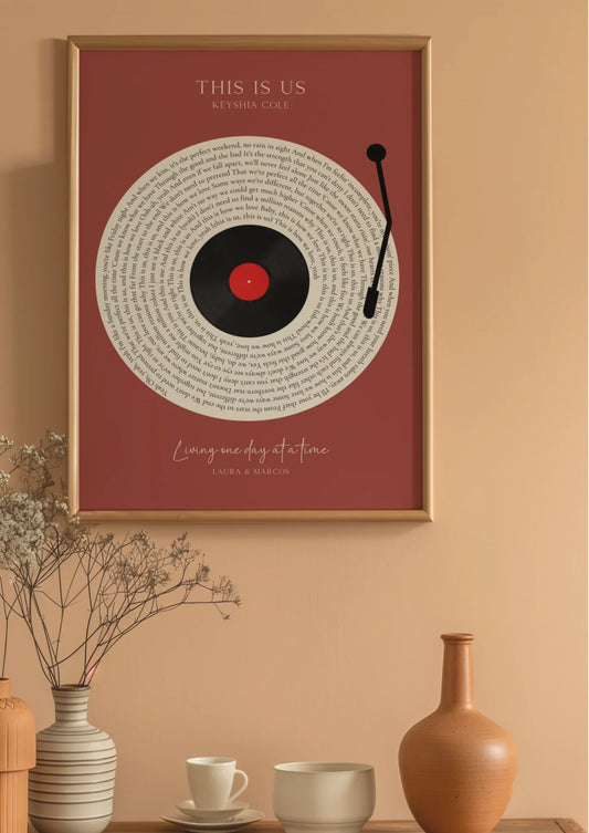
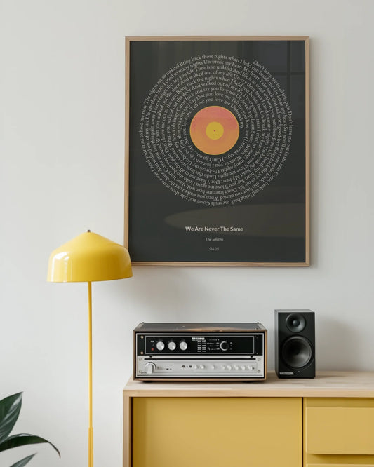
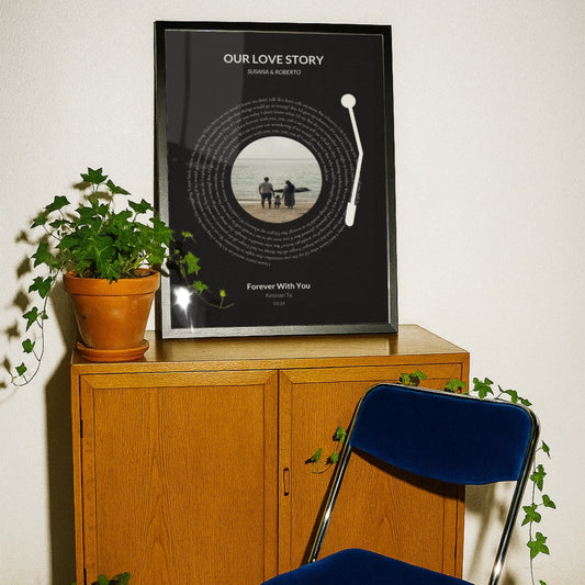
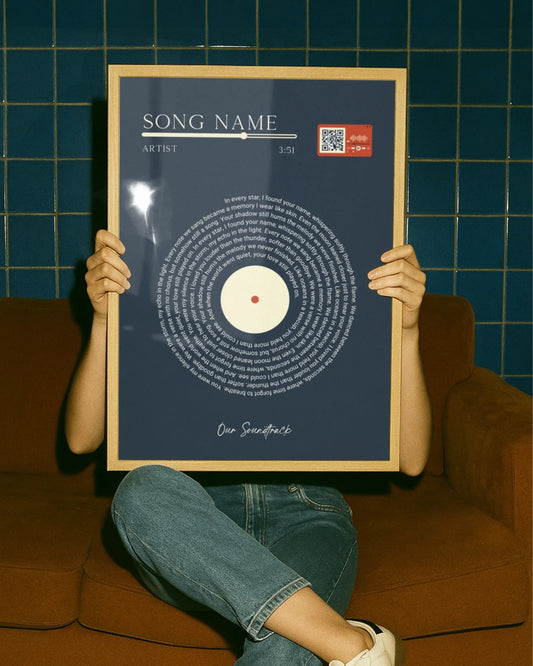
Theme matters too, not just style. A song lyric print or milestone piece tends to work best at a personal, closer-viewing size, like 11x14 or 16x20, placed where it invites someone to walk up and read it. A map or star map commemorating a location or date can go larger, since the visual impact of the design still lands even from across the room.
Does Where You Sit Change the Ideal Poster Size?
Viewing distance changes what size actually looks right, independent of the furniture-width math. A poster sized correctly by the two-thirds rule can still feel too small if the room forces viewers to sit unusually far from the wall, and too large if the seating is close.
Open-plan living rooms, where the sofa might sit 12 feet or more from the accent wall, benefit from sizing up. Larger prints create more visual impact across greater viewing distances, while a modestly sized piece can look lost or undersized once it’s competing with that much open floor and ceiling.
Smaller rooms, or seating arranged close to the wall, like a reading nook or a compact apartment living room, call for the opposite adjustment. A large statement print in a tight space can feel like it’s looming, while smaller or grouped prints let a viewer take in detail without craning their neck or stepping back.
Typical room use matters as much as square footage. A living room used mainly for background TV watching doesn’t need artwork sized for close inspection, since nobody’s standing three feet from the wall reading fine detail. A room built around conversation, where people sit facing each other near the art, rewards a piece with more detail worth noticing up close, even if the room itself isn’t huge.
Why the Two-Thirds Rule Beats Guessing on Poster Size
The biggest mistake people make with living room artwork isn’t picking an ugly print. It’s sizing by instinct instead of by the furniture in front of them. Most living rooms end up with art that’s noticeably too small, a single 16x20 piece adrift above a nine-foot sectional, because buyers pick a size that looked fine on a screen without measuring anything first.
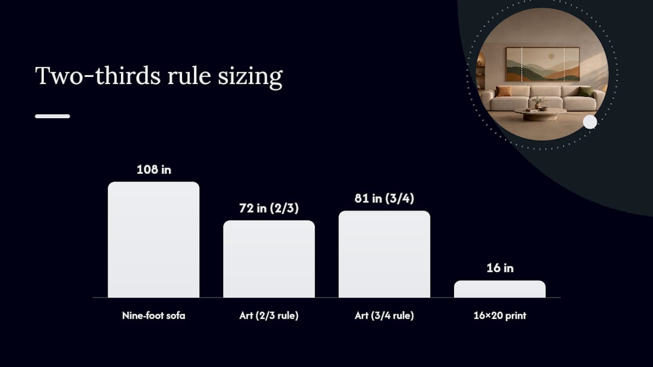
Conventional decorating advice tends to oversimplify this into “go big” or offer vague size charts with no connection to your actual room. Neither helps much. The two-thirds to three-quarters rule works because it ties the decision to a number you can measure in thirty seconds, and it scales correctly whether your sofa is 60 inches or 96 inches wide.
If there’s one habit worth adopting from everything here, it’s the mockup step. Paper templates and painter’s tape cost nothing and catch the mistakes that size charts alone can’t. Prioritize the measurement and the mockup before you fall in love with a specific print size, and the rest of the decision gets a lot easier.
— Luanda
See Your Poster Size on Your Wall Before You Order
Sizing math gets you close, but nothing beats seeing the actual print, at actual scale, on your actual wall before you commit. A guided preview can show your custom song lyric print, star map, or photo collage sized and cropped exactly as it will print, so you catch a mismatch before checkout instead of after the box arrives.
Whether you’ve measured out a 24x36 for your sofa wall or a 40x60 for an open-plan statement piece, the preview tool lets you confirm the framing footprint and crop match what you had in mind. If you’re moving or shipping an oversized finished piece afterward, a specialist art mover can help protect it in transit. Start your custom design and preview it on your own wall at Wallfully.
Sources
- Standard Poster Sizes - Complete Guide
- Guide to wall art size
- Living room wall art sizing & hanging guide
- Poster Size Guide: Dimensions, Frames, Best Uses
FAQ
Is 24x36 too big for a poster?
Not for a living room. A 24x36 print is one of the most common sofa-anchor sizes and fits most standard sofas in the 72 inch range using the two-thirds rule.
Is a 40x60 poster big?
Yes, 40x60 sits at the top of the oversized category and works best as a single statement piece on a wide wall or above a long sectional.
Is 11x14 considered a poster?
Yes, 11x14 falls in the small standard size range, best suited for shelves, side tables, or as one piece within a grouped gallery arrangement rather than a solo sofa anchor.
Is 18x24 a common poster size?
Yes, 18x24 is one of the most widely produced standard sizes and works well as accent-wall art or above smaller furniture like a loveseat or console table.
What size poster should I use above my sofa?
Measure your sofa’s width and multiply by 0.66 and 0.75. Sofa width multiplied by these factors points you toward artwork sized roughly two-thirds to three-quarters of that length, whether that’s one large piece or a grouped arrangement adding up to that total.