
Step by Step Gift Poster: Your Complete 2026 Guide
WallfullyTL;DR:
- A custom gift poster is a personalized print designed with deliberate choices in size, paper, and layout. It holds emotional value, showcasing meaningful content like photos, dates, or lyrics in a polished way. Proper materials, restraint in design, and correct file preparation ensure a professional and memorable gift.
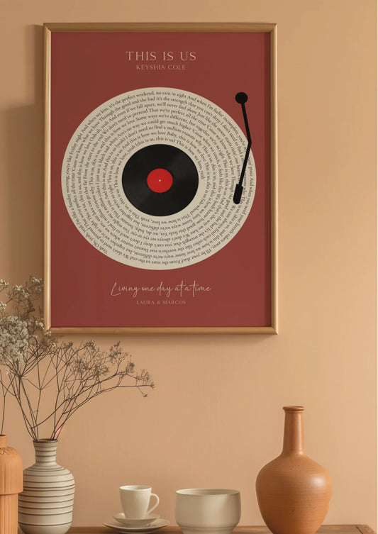
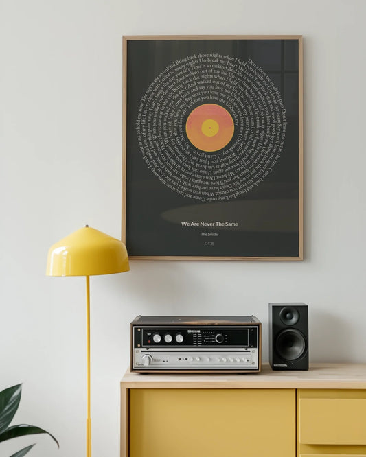
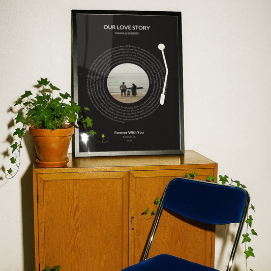
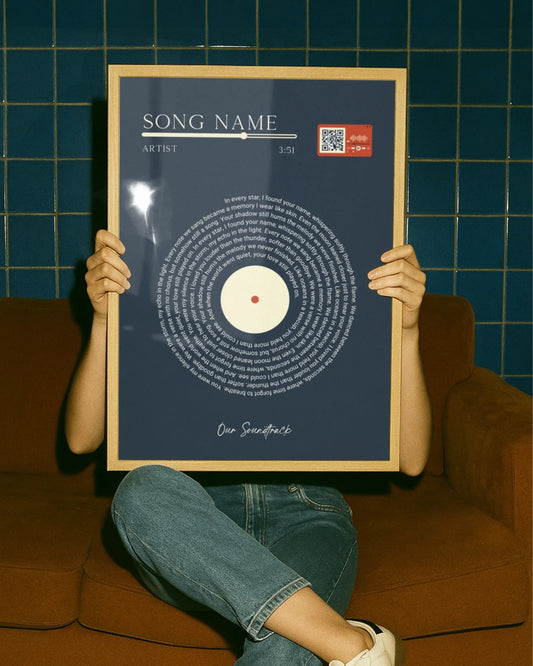
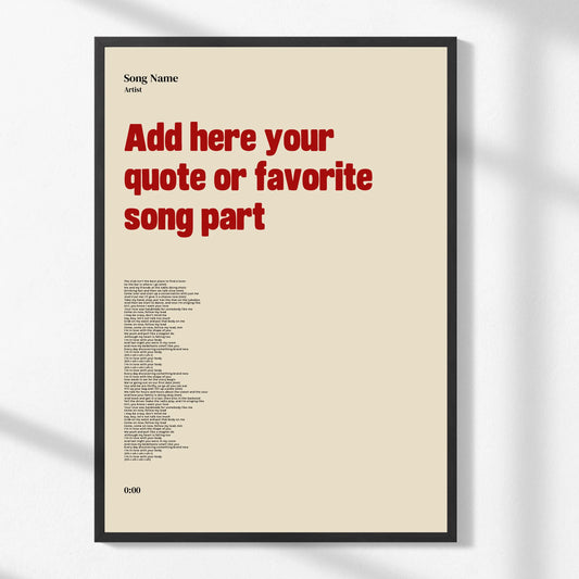
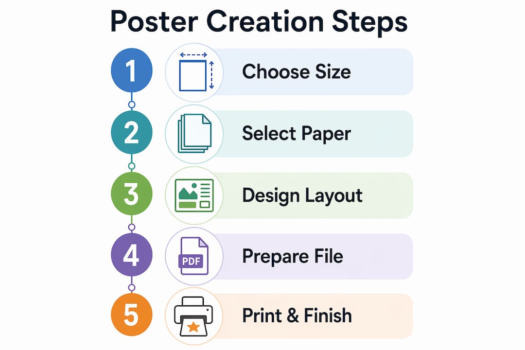
A step by step gift poster is a custom-designed print built through deliberate choices in size, paper weight, layout, and print preparation to create a personalized and memorable gift. Unlike a generic store-bought card, a well-made custom poster carries real emotional weight. It can display a song lyric, a meaningful date, a favorite map location, or a photo collage. This guide covers every stage of the process, from gathering your materials to finishing and wrapping the final print, so you walk away with something genuinely gift-worthy.
What materials and tools do you need for a step by step gift poster?
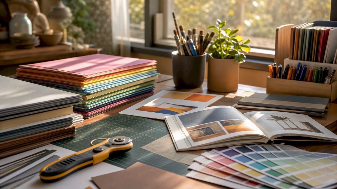
The right materials determine whether your poster looks polished or amateurish. Gather everything before you start designing.
Poster sizes and their best uses
Poster size shapes how your design feels. A small 8x10" print works for a desk or bedside table. A 16x20" or 18x24" print reads well on a living room wall. Sizes like 24x36" are bold statement pieces, best reserved for large rooms or gallery-style displays.
| Size | Best use | Viewing distance |
|---|---|---|
| 8x10" | Desk, shelf, small frame | 1–3 feet |
| 11x14" | Bedroom wall, gift framed | 2–4 feet |
| 16x20" | Living room accent | 3–6 feet |
| 18x24" | Feature wall, milestone gift | 4–8 feet |
| 24x36" | Large room, bold statement | 6+ feet |
Paper weight and finish
Paper weight directly affects how your poster holds up over time. Posters below 170gsm tend to curl or sag, especially in larger sizes. That curl undermines the gift’s presentation the moment it comes out of the tube. For indoor gift posters, 170gsm gloss is the minimum. A weight of 200–250gsm gives a noticeably premium feel and holds flat without framing.
Finish matters too. Matte paper reduces glare in brightly lit rooms. Satin sits between matte and glossy and works well in most home settings. Glossy paper makes colors pop but shows fingerprints easily.
Design tools and image resolution
You need a design tool that exports print-ready files. Adobe Illustrator and Adobe Photoshop are the professional standards. Free browser-based tools with template libraries also work well for beginners. Whatever tool you use, set your canvas to the final print size at 300 DPI resolution from the start. Resizing a low-resolution file later produces blurry results that no printer can fix.
Pro Tip: Set your document to the correct size and resolution before placing any images. Changing these settings after you have added elements often degrades quality.
How do you design your gift poster with creativity and clarity?
Good poster design is not about adding more. Restrained designs with generous white space create a professional feel and integrate better into a recipient’s home. The goal is a layout that looks intentional, not crowded.
Establish a focal point and hierarchy
Every strong poster has one dominant element. That element is the first thing the eye lands on. It could be a large photo, a bold name, or a single meaningful date. Everything else on the poster should support that focal point, not compete with it.
Text hierarchy works the same way. Use three levels at most: a headline, a subheading, and supporting detail. Mixing too many font sizes creates visual noise. Stick to one or two typefaces. A clean serif paired with a simple sans-serif is a reliable combination for gift posters.
Use the squint test
The squint test is a fast, effective check that many first-time designers skip. Step back from your screen and squint until the design blurs slightly. The main focal point should still be visible. If the design disappears into gray noise, the layout is too cluttered and needs simplification.
Here are the core design principles to apply:
- One focal point. Choose a single dominant element and build the layout around it.
- Limit fonts. Use no more than two typefaces per poster.
- White space is not wasted space. Margins and breathing room make the design feel considered.
- Color palette. Limit yourself to three or four colors. Pull them from the main photo if you are using one.
- Aspect ratio. Verify that your photo’s aspect ratio matches the poster size to avoid awkward cropping or unintended borders.
Templates vs. starting from scratch
Template libraries simplify design by offering coordinated color palettes and typographic layouts already optimized for print sizes. For most gift-givers, a well-chosen template is the faster and safer path. Starting from scratch makes sense only if you have a very specific vision and some design experience. If you use a template, customize it enough that it feels personal rather than generic. Swap in the recipient’s name, a meaningful date, or a photo that carries real significance.
Pro Tip: Before finalizing your design, print a small test copy on a home printer. Colors and proportions often look different on paper than on screen.
How do you prepare your poster file for professional printing?
File preparation is where most DIY gift posters fail. A beautiful design printed from a poorly prepared file produces washed-out colors, blurry text, and trimmed-off edges.
Resolution and viewing distance
300 DPI at final print size is the gold standard for sharp poster printing. That standard applies to posters viewed at close range, such as an 8x10" or 11x14" print on a desk or wall. For larger posters viewed from across a room, 100–150 DPI can be acceptable. The rule is simple: the closer the viewer stands, the higher the resolution needs to be.
File format and color mode
Follow these steps to prepare a print-ready file:
- Convert to CMYK color mode. Screens display in RGB, but printers use CMYK. Converting to CMYK before exporting prevents unexpected color shifts, especially in deep blues and vivid reds.
- Add a bleed area. Set a 0.125" bleed margin around all four edges. This extra border ensures that trimming the poster does not cut into your design.
- Set safe margins. Keep all critical text and images at least 0.125" inside the trim line. Anything closer risks being cut off.
- Embed or outline your fonts. Exporting as a PDF with outlined fonts prevents font substitution at the printer, which can shift your layout unexpectedly.
- Export as PDF or TIFF. These formats preserve quality and are universally accepted by professional print services.
- Request a digital proof. Most professional printers offer a proof before the final run. Always review it before approving the order.
For a deeper look at the ordering process, Wallfully’s guide on ordering personalized posters online walks through each step clearly.
What are the best ways to finish, package, and gift your poster?
The presentation of a gift poster matters as much as the design. A beautifully printed poster handed over in a crumpled tube loses its impact immediately.
Finishing options
Paper weight and finish affect how the poster looks on the wall. For gift posters that will be displayed without a frame, 200gsm or heavier stock holds flat and looks intentional. Matte finish works best in rooms with strong natural light, since it eliminates glare. Satin finish is the most versatile choice for home decor gifts. Glossy finish suits photo-heavy designs where color vibrancy is the priority.
Framing add-ons at the time of ordering save the recipient the hassle of finding a matching frame. Many printing services offer this option. If you order a frame separately, measure twice. A poster that does not fit its frame is a frustrating gift to receive.
Packaging and presentation
- Flat packaging. A rigid mailer or cardboard sandwich keeps the poster flat and prevents creases. This is the best option for hand-delivering a gift.
- Tube packaging. A sturdy poster tube protects the print during shipping. Roll the poster loosely, printed side out, to reduce crease risk.
- Presentation box. A flat gift box with tissue paper elevates the unboxing experience significantly.
- Personal note. A handwritten card explaining the meaning behind the poster adds emotional context that the design alone cannot convey.
- Ribbon or wax seal. A simple ribbon tied around a rolled poster, or a wax seal on the envelope, signals care and effort before the recipient even sees the print.
For creative wrapping ideas that work well with poster gifts, the gift presentation tips from DressMeUpNY offer practical, party-tested suggestions.
Pro Tip: If you are shipping a poster, always use a tube at least two inches wider than the poster’s rolled diameter. Tight rolls cause permanent creases that ruin the print.
Key takeaways
A well-made gift poster requires the right paper weight, a clean design with a single focal point, and a properly prepared print file to deliver a result that looks professional and feels personal.
| Point | Details |
|---|---|
| Paper weight matters | Use at least 170gsm for indoor posters; 200–250gsm gives a premium, flat finish. |
| Design with restraint | One focal point, two typefaces, and generous white space produce the strongest results. |
| Prepare files correctly | Export in CMYK at 300 DPI with 0.125" bleed margins to avoid printing errors. |
| Use the squint test | Squint at your design to confirm the focal point is still visible when details blur. |
| Package with care | Flat rigid mailers prevent creases; a handwritten note adds meaning to the gift. |
Why simplicity is the hardest part of making a great gift poster
Designing a gift poster looks easy until you are staring at a blank canvas with a hundred ideas and no clear direction. I have seen this pattern repeat constantly: the first draft is overcrowded. There is a photo, three quotes, a date, a location, and two different font styles all competing for attention. The instinct is to include everything meaningful. The result is a poster that communicates nothing clearly.
The single best lesson I have learned is to pick one thing the poster is about. Not five things. One. If it is a wedding anniversary, the poster is about the couple’s names and the date. Everything else is decoration. That constraint feels limiting at first. In practice, it produces designs that recipients actually hang on their walls rather than store in a drawer.
First-timers also underestimate how much the paper and print quality change the final impression. A stunning design printed on thin, curling paper looks cheap. The same design on 200gsm matte stock looks like something from a gallery. The print is part of the gift. Treat it that way.
For anyone who wants to see what a well-executed personalized poster looks like before committing to a DIY project, browsing birthday poster ideas on Wallfully gives a strong sense of what clean, focused design looks like at print quality.
— Luanda
Custom gift posters made easy with Wallfully
Creating a custom gift poster from scratch takes time, design skill, and access to professional printing. Wallfully handles all three.
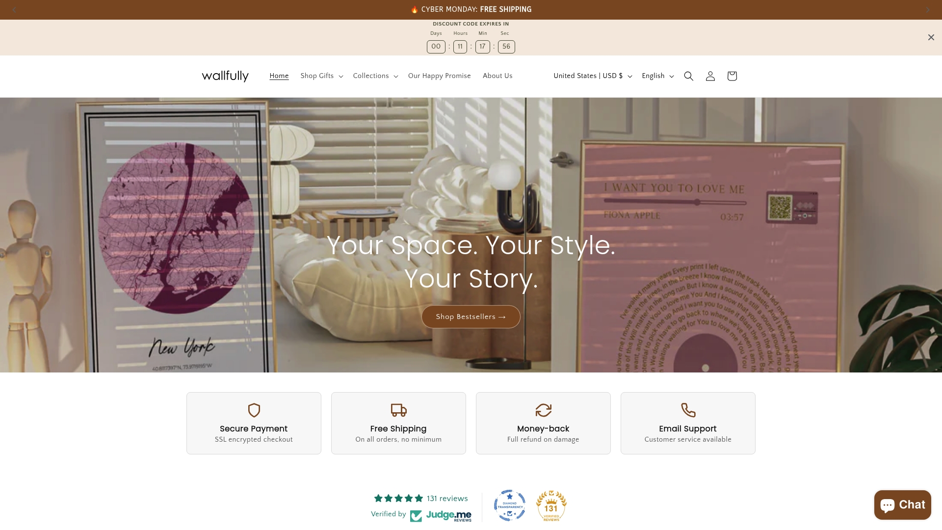
Wallfully’s platform lets you build personalized posters around song lyrics, maps, photo collages, zodiac signs, and milestone dates, all through a guided customization process with live previews. Every order ships free and is backed by a satisfaction guarantee. The printing uses eco-friendly materials, so the quality holds up over time. Whether you are making a birthday gift, a wedding present, or a “just because” surprise, Wallfully’s custom poster collection gives you a print-ready result without the technical headaches. You can also explore more ideas through Wallfully’s guide on gifting personalized wall art for additional inspiration.
FAQ
What size should a gift poster be?
The best size depends on where the recipient will display it. An 11x14" or 16x20" print works well for most home settings and fits standard frames.
What resolution does a gift poster need for sharp printing?
300 DPI at final print size is the standard for close-up viewing. Larger posters viewed from a distance can use 100–150 DPI without visible quality loss.
What file format should I use when submitting a poster for printing?
Export your poster as a PDF or TIFF with CMYK color mode, embedded or outlined fonts, and a 0.125" bleed margin to avoid trimming errors.
What paper weight is best for a gift poster?
Use at least 170gsm for indoor display. A weight of 200–250gsm gives a more durable, premium finish that holds flat without framing.
How do I make a DIY gift poster look professional?
Limit your design to one focal point, use no more than two fonts, and apply the squint test to confirm the layout reads clearly at a glance.