How to preview personalized prints before you buy
WallfullyTL;DR:
- Previewing personalized prints allows you to visualize how the final product will look, preventing disappointment upon arrival.
- Using appropriate file formats, resolution, and soft proofing tools like Apple Preview ensures accurate color and detail simulation before printing.
You’ve found the perfect personalized wall art idea, customized every detail, and you’re about to hit “order.” But here’s the nagging question: will it actually look like that when it arrives? Learning how to preview personalized prints is the step most gift shoppers skip, and it’s exactly why so many end up disappointed when the package arrives. This guide walks you through the practical tools, techniques, and habits that let you visualize your custom design with confidence, so the print your recipient unwraps is every bit as meaningful as you imagined.
Table of Contents
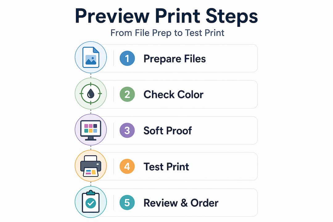
- How to preview personalized prints: gathering your tools and preparing your files
- Using Apple Preview on Mac for accurate soft proofing
- Simulating print output with Adobe Acrobat Pro’s Output preview
- Best practices before ordering: templates, test prints, and viewing conditions
- Common preview mistakes and how to avoid them
- Why mastering print preview is the ultimate gift shopper’s edge
- Explore personalized wall art options and preview tools at Wallfully
- Frequently asked questions
Key Takeaways
| Point | Details |
|---|---|
| Use product templates | Product-specific templates help ensure correct file size, DPI, and bleed for personalized prints. |
| Soft proof on Mac | Apple Preview’s soft proof feature simulates print colors accurately without changing files. |
| Leverage Acrobat Pro | Adobe Acrobat Pro’s Output preview checks PDF print output to catch production problems early. |
| Match lighting conditions | View previews in lighting like the final display area to judge colors correctly. |
| Order test prints | Test prints are a reliable way to confirm your personalized art looks great before full orders. |
How to preview personalized prints: gathering your tools and preparing your files
Before you can accurately preview custom prints, you need the right files and tools in place. Think of this step the way a photographer thinks about lighting before a shoot. Without the right setup, even the best design will look wrong.
The first thing to sort out is your file format. PNG or JPEG with sRGB color profile are the formats most print providers accept and reproduce most accurately. sRGB is the standard color space for screens and most consumer printers, so using it keeps your colors consistent from your monitor to the final print.
Resolution matters just as much. For personalized wall art, the sweet spot is 150 to 300 DPI (dots per inch, meaning how many dots of ink the printer lays down per inch of paper). Higher DPI means sharper detail. For a large canvas, 150 DPI is often enough. For a small, detailed milestone print with tiny text and fine lines, use 300 DPI to avoid pixelation.
Here’s a quick reference for the specs you need before previewing:
| Spec | Minimum | Recommended |
|---|---|---|
| Resolution | 150 DPI | 300 DPI |
| File format | JPEG | PNG |
| Color profile | sRGB | sRGB |
| Bleed area | Per template | Per template |
One often-overlooked step in custom prints preparation is downloading your print provider’s product template before you finalize your design. Printful, for example, recommends product-specific templates to make sure your sizing, bleed (the extra edge of image that gets trimmed or wrapped), and DPI are all correct before you ever hit preview.
Key tools to have ready:
- Apple Preview (Mac, free) for quick soft proofing
- Adobe Acrobat Pro for detailed output simulation
- Your print provider’s downloadable product templates
- A color-calibrated monitor, or at least one you’ve set to the correct brightness and contrast
Pro Tip: Before previewing, set your monitor brightness to match the ambient light in the room where the print will hang. A print that looks rich and dark on a bright screen can appear flat and muddy in a dim bedroom.
For a deeper look at what affects high-quality print output, getting familiar with how the printing process handles color is time well spent.
With the right tools and files ready, you can now move to previewing your personalized prints accurately.
Using Apple Preview on Mac for accurate soft proofing
Soft proofing sounds technical, but it’s simply making your screen simulate how a specific printer or device will reproduce your image’s colors, without actually changing your file. Apple Preview on Mac has this built in, and most people have no idea it’s there.
Here’s how to use it, step by step:
- Open your image file in Apple Preview.
- Go to View in the menu bar and select Soft Proof with Profile.
- Choose the ColorSync profile that matches your printer or print service. If you don’t have a specific one, choose Generic RGB Profile as a starting point.
- Study how the colors shift. Blues often shift slightly, and rich reds can appear more muted under certain printer profiles.
- If you plan to review the file repeatedly, go to Tools > Assign Profile to attach a color profile permanently to that file for future previews.
As Apple’s support documentation explains, using Soft Proof with Profile applies the device’s ColorSync profile to your image view so you can see the simulated output without making any permanent changes to the file. That last part matters. You’re not editing anything. You’re just seeing through the printer’s eyes.
“The room you preview in is as important as the software you preview with. A warm, incandescent light makes your print look warm. A cool LED makes it look cooler. Neither is wrong; they’re just different from each other.”
Matching your viewing environment to where the print will actually live is one of the most overlooked tips for checking print designs accurately. If the print is going in a cozy, dimly lit living room, don’t judge it under fluorescent office lighting.
Pro Tip: If you’re ordering a personalized print as a gift and you know the recipient’s home, try to preview the design under lighting that matches their space. Even a rough approximation gives you far better color judgment than a bright studio monitor.

For more on how to preview personalized art at home in different lighting scenarios, that resource walks through practical room-by-room setups.
Now that you understand how to use Apple Preview for accurate previews, let’s explore another powerful tool that enhances print output simulation.
Simulating print output with Adobe Acrobat Pro’s Output preview
If you’re working with PDF files or need a more technical preview, Adobe Acrobat Pro’s Output preview gives you granular control. It’s built for print professionals, but gift shoppers preparing high-stakes orders, think wedding gifts or anniversary art, will find it genuinely useful.
Adobe Acrobat Pro’s Output preview lets you catch print-production issues by switching between Separations and Color Warnings views, giving you a level of inspection that no basic preview tool can match.
Here’s what to look for once you’re inside Output preview (All tools > Use print production > Output preview):
- Separations view: Breaks your image into individual ink layers (Cyan, Magenta, Yellow, and Black). You can toggle each layer on and off to see how the inks will actually build the final image.
- Color warnings: Flags areas of your image that fall outside the printer’s gamut (the range of colors it can reproduce). Highlighted areas are colors the printer will substitute, which can shift your design noticeably.
- Ink coverage check: High ink saturation (over 300%) can cause smearing or slow drying. This view shows you where that risk exists.
- Object Inspector: Hover over any part of your image to verify its resolution. This catches low-resolution areas you might not see on screen.
| Feature | What it checks | Why it matters |
|---|---|---|
| Separations | Individual ink layers | Confirms correct ink build |
| Color warnings | Out-of-gamut colors | Prevents unexpected color shifts |
| Ink coverage | Total ink percentage | Avoids smearing or saturation issues |
| Object Inspector | Resolution per element | Catches hidden low-resolution spots |
For a personalized song lyric poster or a custom map print with fine detail, running through these checks before ordering can prevent the kind of disappointment that comes from a washed-out color or a pixelated place name. The art design guide covers how design choices interact with print output in practical terms.
Besides software previews, preparing your files with templates and performing test prints further ensures your personalized prints turn out beautifully.
Best practices before ordering: templates, test prints, and viewing conditions
Even the best software preview has a gap between screen and paper. Here’s how to close it.
Use your print provider’s exact template. Every product, whether it’s a 16x20 poster or an 8x10 milestone print, has a specific bleed, safe zone, and trim line. Designing inside those boundaries prevents text from being cut off at the edge and keeps your personalized details where they belong.
Order a test print when the stakes are high. For a wedding anniversary gift or a custom piece celebrating a milestone, ordering a test print before your final order is not overthinking it. It’s good practice. A single test print costs a fraction of what a reorder costs, financially and emotionally.
Match lighting to the final display location. Apple’s own guidance specifically calls out viewing environment lighting as a key factor in accurate preview perception. A print that will hang in a hallway lit by warm Edison bulbs should be judged under warm light, not under a bright daylight lamp.
“The difference between a gift that lands perfectly and one that misses is often not the design itself. It’s whether the giver took twenty minutes to preview it properly.”
Comparison: previewing approaches by use case
| Situation | Best preview approach |
|---|---|
| Casual gift, quick order | On-platform preview tool |
| Detailed or large format art | Apple Preview soft proofing |
| PDF with complex design layers | Adobe Acrobat Pro Output preview |
| High-stakes occasion gift | All of the above, plus a test print |
Pro Tip: When reviewing a test print, take it to the room where the final piece will hang and hold it against the wall at the right height. Natural in-context viewing reveals proportion, brightness, and color fit that no screen can replicate.
Following these preparation and preview strategies greatly increases your confidence with personalized art gifting, and the wall art shopping workflow outlined at Wallfully is designed around exactly these steps.
Common preview mistakes and how to avoid them
Even shoppers who know to preview their files make a handful of predictable errors. Here’s what to watch for.
Trusting your monitor without soft proofing. Your screen shows colors in a way no printer can exactly replicate. As Apple’s support documentation confirms, mismatched lighting conditions and uncalibrated monitors skew perceived colors significantly. Soft proofing bridges that gap.
Previewing under the wrong light. If you’re designing a print for a warm, dim bedroom and you review it under bright natural daylight, you’ll make color corrections that look wrong in the final setting. Always preview under the light that matches the destination.
Ignoring DPI until it’s too late. A file that looks crisp at 72 DPI on screen can print looking blurry or pixelated. Always check your DPI before finalizing, not after the proof arrives.
Skipping the test print for important orders. This is the most expensive mistake in personalized gifting. The sentiment attached to a custom print, a wedding date, a set of coordinates, a meaningful song lyric, makes it irreplaceable. A failed print on a meaningful occasion stings in a way that a regular retail return doesn’t.
Mismatched color profiles. Sending a file with an Adobe RGB or CMYK color profile to a print provider set up for sRGB results in washed-out or overly saturated colors. Always confirm your color profile matches what your provider expects.
Pro Tip: Before you place your final order, check whether the print you’re ordering as a gift is for a personalized art piece for a wedding or a similarly high-emotion occasion. If yes, treat it as a high-stakes print and use every verification step, not just the on-platform preview.
The personalized wall art gift workflow covers occasion-specific considerations that affect how strictly you should apply these checks.
Why mastering print preview is the ultimate gift shopper’s edge
Here’s the opinion most print guides won’t tell you: the preview step is not about avoiding mistakes. It’s about owning the outcome.
When you spend time learning how to visualize personalized prints properly, you stop being a passive shopper hoping for the best and start being the person who knows exactly what’s going to arrive. That shift matters more than any guarantee or return policy.
There’s a real financial argument here too. Returns on personalized items are complicated. Many providers don’t accept them if the design itself was correct but you didn’t like how it looked. A proper preview workflow is your actual protection.
But the deeper argument is sentimental. A personalized print given as a gift carries meaning that a standard item can’t. A song lyric from a first dance, a map of the city where someone was born, a zodiac print with a specific name and date. When that piece looks exactly right, it lands. When it doesn’t, the missed shot is harder to explain than a wrong shirt size.
Mastering the steps in this guide, from file prep to soft proofing to test prints, gives you the confidence to order last-minute without panic. That confidence is particularly valuable for gift shoppers who often find themselves choosing personalized art close to a deadline.
Following the wall art gifting process with a preview mindset is what separates a thoughtful, perfectly landed gift from one that almost made it.
Explore personalized wall art options and preview tools at Wallfully
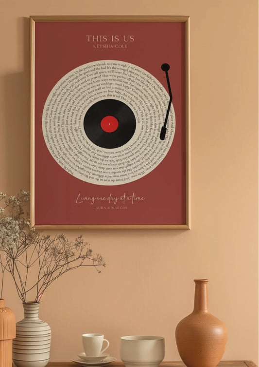
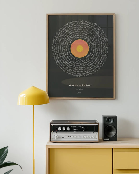
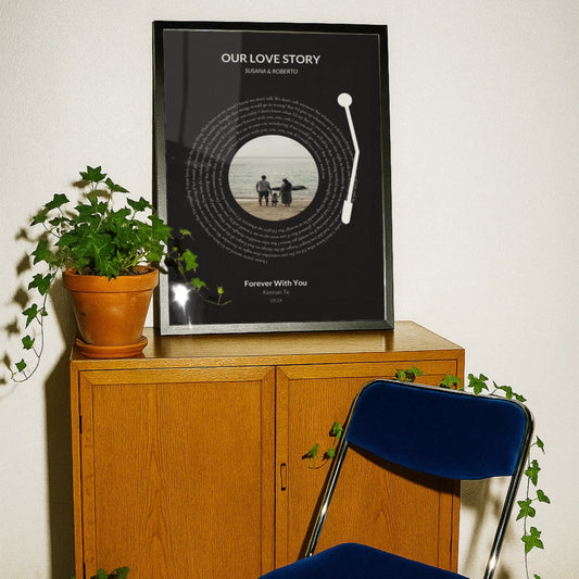
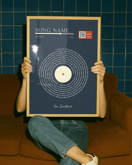
Every technique in this guide exists to get you to one place: a print you’re proud to give. At Wallfully, the customization process is built with preview tools that let you see your design before you order, whether you’re creating a song lyric poster, a custom map, a zodiac print, or a photo collage.
Wallfully’s platform walks you through each personalization step with a live preview so you can check names, dates, locations, and layout before anything goes to print. Every order includes free shipping and a satisfaction guarantee, and if you need help with file preparation or color choices, customer support is there to guide you through it. For special occasions, from anniversaries to weddings to milestone birthdays, Wallfully makes it easy to order with confidence.
Frequently asked questions
How can I preview my personalized print to ensure colors will look right?
Use Apple Preview’s soft proof feature to simulate printer color profiles and view the result under lighting that matches where the print will hang for the most accurate color judgment.
What resolution should I use for personalized wall art prints?
Aim for 150 to 300 DPI depending on print size. Printful recommends 300 DPI for small, detailed items where fine text and sharp lines matter most.
Is ordering a test print necessary before placing a full print order?
For high-stakes gifts, yes. A test print confirms color, size, and design accuracy, and Printful strongly advises a test run before full production to avoid surprises.
Can I trust the colors I see on my monitor to match my printed personalized art?
No. Monitor colors are unreliable without calibration, and mismatched lighting conditions shift color perception significantly. Soft proofing tools give a far more accurate prediction.
What file formats and color profiles are best for personalized prints?
Use PNG or JPEG files with the sRGB color profile. Printful recommends sRGB for the best color compatibility and reproduction accuracy across most print providers.