How typography transforms wall art and your space in 2026
WallfullyTypography shapes how you feel about wall art before you even read the words. Fonts carry emotional weight and influence consumer decisions within milliseconds, triggering neural responses similar to facial expressions. Sharp, angular typefaces communicate sternness while rounded fonts evoke friendliness. This article reveals how strategic font choices transform your living space from simply decorated to emotionally resonant, guiding you through the psychology, principles, and practical applications of typography in personalized wall art.
Table of Contents
- Why Typography Matters Beyond Aesthetics In Wall Art
- Choosing Fonts: Typography Styles And Their Emotional Effects
- Mastering Typographic Principles To Enhance Your Wall Art
- Applying Typography To Personalize And Transform Your Living Space
- Enhance Your Space With Personalized Wall Art From Wallfully
- Frequently Asked Questions
Key takeaways
| Point | Details |
|---|---|
| Emotional impact | Fonts trigger immediate emotional responses that shape how viewers perceive and connect with wall art before reading content |
| Memory enhancement | Serif fonts boost recall by 9% and increase perceived credibility by 18% compared to other typefaces |
| Design principles | Readability, hierarchy, and spacing determine whether typography communicates clearly or overwhelms your space |
| Personalization power | Strategic font choices reflect individual style and transform rooms into meaningful, story-driven environments |
| Practical application | Matching typography scale, arrangement, and style to room dimensions creates cohesive emotional narratives |
Why typography matters beyond aesthetics in wall art
Typography functions as the silent voice of your wall art, communicating tone and feeling before viewers process the actual message. This phenomenon occurs because typography shapes audience perception and emotional responses through visual cues that our brains interpret automatically. When you walk into a room, your neural pathways react to typographic forms the same way they respond to human expressions. Angular, geometric fonts activate the same brain regions associated with stern or serious faces, while soft, rounded letterforms trigger responses linked to friendliness and approachability.
Consumers make emotional judgments about wall art within 50 milliseconds of viewing, and font choice drives these snap decisions even before content comprehension begins. This split-second evaluation determines whether a piece feels welcoming, authoritative, playful, or sophisticated. Typography establishes the emotional foundation that colors every subsequent interaction with your wall art, making it a critical design element rather than mere decoration.
The relationship between typography and wall art and mood extends beyond initial impressions to shape ongoing emotional experiences within your space. Fonts guide how viewers navigate visual information, establish hierarchy, and construct meaning from the text they encounter. This guidance happens subconsciously, creating a seamless experience when executed well or generating confusion and discomfort when poorly implemented.
Typography performs several key emotional functions simultaneously:
- Conveying mood through weight, spacing, and style choices that align with intended atmosphere
- Building identity by creating recognizable visual patterns that reflect personal or brand values
- Enhancing memory through distinctive letterforms that improve information retention
- Guiding eye flow with strategic placement and sizing that directs attention naturally
- Establishing hierarchy that signals importance and relationships between different text elements
Consider this fundamental truth about typographic communication:
The brain hears the tone of form before it understands the meaning of words.
This principle explains why two identical messages in different fonts generate completely different emotional responses. A motivational quote in elegant script evokes refinement and aspiration, while the same words in bold sans serif suggest determination and directness. Your wall art’s typography writes the emotional script that viewers experience, making font selection as crucial as the message itself.
Choosing fonts: typography styles and their emotional effects
Understanding how specific font categories influence perception empowers you to select typefaces that align with your desired emotional outcomes. Each typographic style carries distinct psychological associations developed through centuries of use in different contexts, from formal documents to advertising campaigns. These associations operate below conscious awareness, making them powerful tools for shaping space atmosphere.
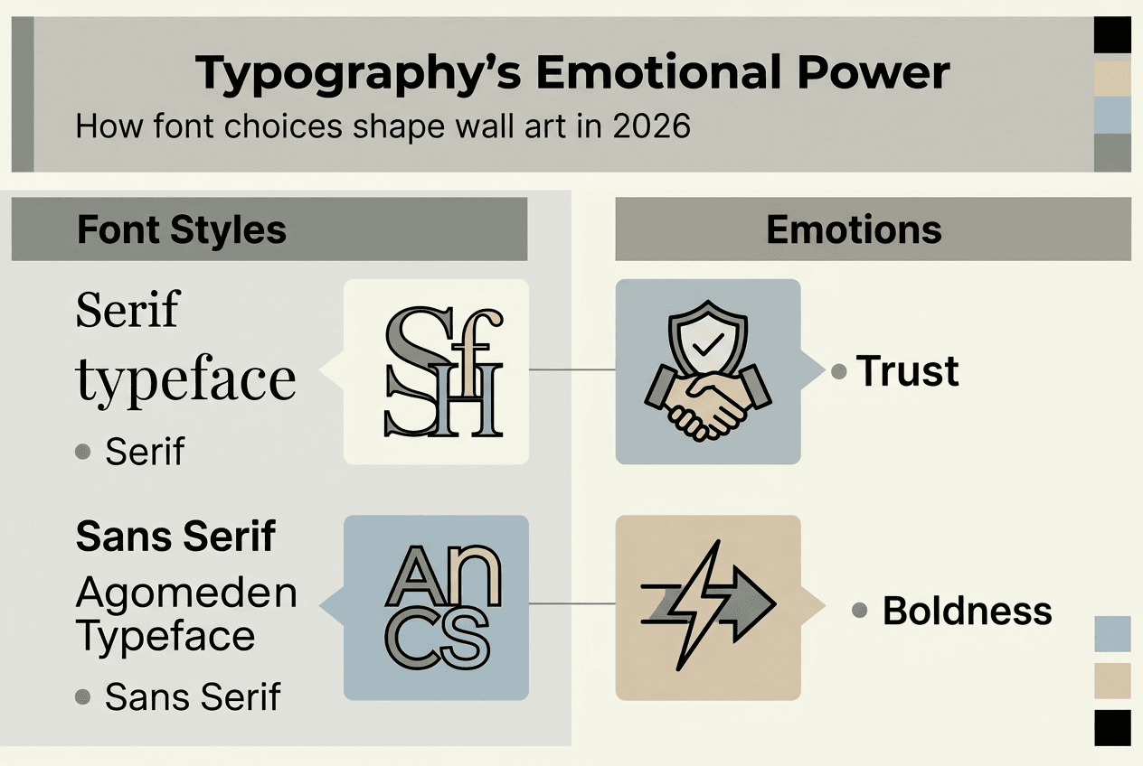
Serif fonts feature small decorative strokes at letter endings, creating a traditional, trustworthy appearance that improves recall by 9% compared to sans serif alternatives. The same research reveals serif typography boosts perceived credibility by 18%, making these fonts ideal for wall art featuring quotes, affirmations, or historical references. The subtle embellishments guide the eye along reading paths while communicating permanence and authority.
Sans serif fonts eliminate decorative elements, presenting clean, modern letterforms that suggest clarity and forward thinking. These typefaces work exceptionally well in contemporary spaces where minimalism and simplicity define the aesthetic. Their straightforward appearance reduces visual complexity, allowing messages to communicate directly without historical or cultural baggage. Sans serif typography pairs naturally with modern furniture, neutral color palettes, and open floor plans.
Ornate and decorative fonts create immediate visual impact through elaborate styling that commands attention and bolsters visual memory by 24%. These typefaces excel at establishing brand identity and creating memorable first impressions, though they require careful application to maintain readability. Research suggests slightly harder to read fonts may actually boost information retention by forcing viewers to process content more deliberately, but this advantage disappears when difficulty crosses into frustration.
Vintage typography triggers nostalgia and emotional connection even among viewers who never experienced the referenced era. These fonts tap into collective cultural memory, evoking specific decades or movements through distinctive styling. A 1950s script font communicates different values than 1920s art deco lettering, allowing you to align wall art with specific emotional landscapes.
| Font style | Emotional effects | Readability | Typical uses |
|---|---|---|---|
| Serif | Trust, tradition, credibility, stability | High for body text | Quotes, formal messages, literary references |
| Sans serif | Modernity, clarity, simplicity, approachability | Very high | Contemporary spaces, minimalist designs |
| Ornate | Luxury, uniqueness, visual impact, memorability | Moderate to low | Decorative pieces, brand statements |
| Script | Elegance, personality, warmth, intimacy | Low to moderate | Personal messages, romantic themes |
The role of wall art in home decor depends heavily on achieving balance between stylistic expression and functional communication. Understanding how typography perception branding operates helps you make informed choices that serve both aesthetic and emotional goals.
Pro Tip: Test your font choice by viewing it from the actual distance where people will see your wall art. A typeface that looks beautiful up close might lose impact or readability from across the room, undermining your design’s emotional effectiveness.
Mastering typographic principles to enhance your wall art
Applying fundamental design principles ensures your typography choices translate into effective emotional communication rather than visual confusion. Readability and legibility represent distinct but related concepts that determine how easily viewers process your wall art’s message. Readability addresses how comfortably the eye moves through text, while legibility focuses on how quickly individual letters can be recognized and distinguished.
Optimal line length falls between 45 and 75 characters, creating comfortable reading rhythms that prevent eye strain and maintain engagement. Leading, the vertical space between text lines, should typically measure 120% to 145% of font size to provide adequate breathing room. Kerning, the horizontal space between individual letters, requires adjustment based on specific letter combinations to maintain visual consistency. These technical specifications might seem minor, but they dramatically impact whether typography feels inviting or exhausting.
Typographic hierarchy shapes perception and comprehension by establishing clear visual relationships between different text elements. Effective hierarchy creates a roadmap that guides viewers through your wall art’s message in the intended sequence, emphasizing key points while supporting secondary information. This organization happens through strategic manipulation of several factors working in concert.
Key hierarchy elements include:
- Scale differences that signal relative importance through size variation
- Weight contrasts using bold, regular, or light versions of the same typeface
- Color and contrast that draw attention to priority elements
- Spacing adjustments that group related items and separate distinct concepts
- Placement decisions that leverage natural reading patterns and visual flow
- Case variations alternating between uppercase, lowercase, and mixed approaches
- Texture differences achieved through different font styles or decorative elements
| Typography factor | Optimal range | Impact on readability |
|---|---|---|
| Line length | 45 to 75 characters | Prevents eye fatigue, maintains engagement |
| Leading | 120% to 145% of font size | Provides visual breathing room |
| Kerning | Adjusted per letter pair | Ensures consistent visual rhythm |
| Hierarchy levels | 3 to 4 distinct levels | Creates clear information structure |
| Contrast ratio | Minimum 4.5:1 | Ensures legibility across lighting conditions |
The role of design in personalized art extends beyond surface aesthetics to encompass these functional considerations that determine whether your wall art successfully communicates its intended message and emotional tone.
Top tips for enhancing readability and hierarchy:
- Limit your design to three or four distinct typographic levels to avoid visual chaos
- Maintain consistent spacing systems that create predictable visual patterns
- Use color strategically to reinforce rather than replace hierarchical structure
- Align text elements to invisible grids that organize information logically
- Test readability at the intended viewing distance before finalizing designs
Pro Tip: The most common typography mistake involves cramming too much text into limited space, which destroys both readability and emotional impact. When in doubt, edit ruthlessly and increase letter spacing to let your message breathe.
Applying typography to personalize and transform your living space
Translating typographic principles into practical wall art decisions requires understanding how font choices interact with room dimensions, existing decor, and intended emotional outcomes. Typography selection sets the foundational tone for your space, with serif fonts adding traditional warmth while sans serif options inject contemporary freshness. This choice impacts aesthetic and emotional effect significantly, altering how visitors perceive and respond to your environment.
Lettering scale adjusts room mood through visual weight and presence. Large, bold typography commands attention and makes definitive statements, perfect for feature walls or spaces where you want to establish strong personality. Smaller, delicate letterforms invite intimacy and contemplation, working well in personal spaces like bedrooms or reading nooks. The same message in different scales creates entirely different spatial experiences.
Font arrangement creates flow and guides emotional narratives through deliberate placement and composition. Centered text suggests formality and balance, while asymmetric layouts communicate energy and modernity. Vertical text arrangements draw the eye upward, making rooms feel taller, while horizontal orientations emphasize width and stability.
Follow these steps to personalize your wall art with typography:
- Define your mood and message by identifying the specific emotional response you want to evoke in the space
- Choose suitable fonts that align with your identified mood, considering both style associations and practical readability
- Apply hierarchy principles to emphasize key words or phrases that carry your message’s emotional core
- Match typography size and spacing to room scale, ensuring visibility and impact from typical viewing distances
- Review and refine your design for both readability and emotional resonance before final production
Consider emotional triggers your typography choices activate:
- Nostalgia through vintage or retro typefaces that reference specific eras
- Luxury via elegant scripts or refined serif fonts with sophisticated spacing
- Energy using bold, dynamic letterforms with strong contrast and movement
- Calm through gentle, rounded fonts with generous spacing and muted colors
- Authority via traditional serif typography with formal composition
Integrating typography with existing furnishings and color schemes creates cohesive storytelling that reinforces your space’s emotional narrative. Typography engages audiences on deeper levels when it dialogues with surrounding design elements rather than competing against them. A rustic wood frame might call for vintage typography, while sleek metal fixtures pair naturally with modern sans serif fonts.
The ability to transform spaces with personalized wall art depends on understanding how typography functions as a bridge between individual expression and environmental design. Your font choices tell visitors who you are and what you value before any conversation begins. This silent communication shapes first impressions and ongoing comfort levels within your space.
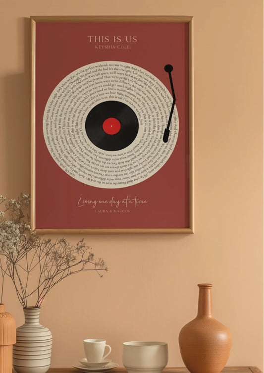
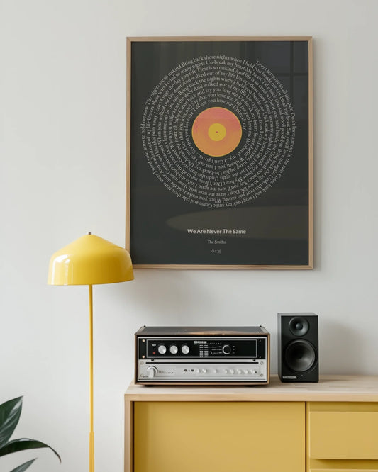
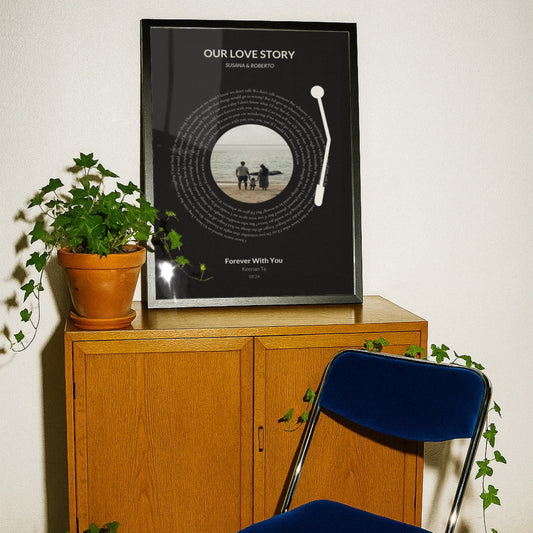
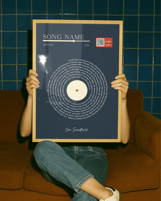
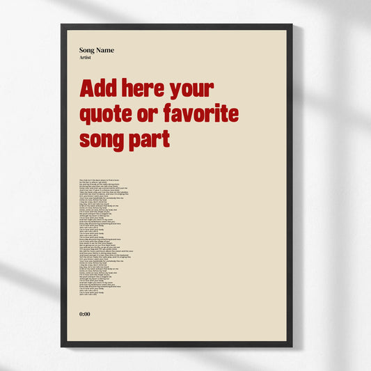
Exploring essential types of personalized wall art reveals how typography adapts across different formats and purposes, from song lyrics to motivational quotes to family names. Each application demands specific typographic approaches that honor both the content’s meaning and the space’s functional requirements. Typography transforms wall art from passive decoration into active participants in your home’s emotional ecosystem, creating meaningful, memorable environments that reflect your authentic self.
Enhance your space with personalized wall art from Wallfully
Now that you understand how typography shapes emotional responses and transforms living spaces, you’re ready to apply these insights through personalized wall art that reflects your unique style. Wallfully specializes in customizable prints that let you control every typographic detail, from font selection to layout composition. Their platform makes it simple to experiment with different typefaces and arrangements until you discover the perfect combination that communicates your intended mood.
Browse curated collections featuring song lyrics, meaningful quotes, milestone celebrations, and custom messages, all designed with thoughtful typography that enhances rather than overwhelms. The guided customization process includes real-time previews, ensuring your final piece achieves the readability, hierarchy, and emotional impact you envision. Explore ideas for personalized wall art and discover how strategic typography choices elevate ordinary spaces into extraordinary environments. Learn more about wall art home decor insights to deepen your understanding of design principles that create lasting emotional connections.
Frequently asked questions
What is the role of typography in wall art?
Typography sets the emotional tone and influences how viewers perceive and connect with wall art before they consciously read the message. Font choices trigger immediate neural responses similar to facial expressions, shaping first impressions and ongoing emotional experiences within your space.
How does font choice affect readability in wall art?
The right font improves readability through appropriate letter spacing, line length, and visual hierarchy that guides the eye naturally. Serif fonts boost recall by 9% and credibility by 18%, while optimal leading and kerning prevent eye strain and maintain engagement across viewing distances.
Why is typographic hierarchy important in wall art design?
Typography hierarchy organizes text visually through scale, weight, color, and spacing variations that signal relative importance. This structure guides viewer attention and comprehension, creating clear pathways through your message that enhance both understanding and emotional impact.
Can typography really personalize my living space?
Personalized typography reflects individual style by communicating specific values, moods, and narratives that align with your identity. Strategic font choices transform wall art from generic decoration into meaningful storytelling that shapes room atmosphere and creates authentic connections with visitors.
What typography mistakes should I avoid in wall art?
Avoid cramming too much text into limited space, which destroys readability and emotional impact. Other common errors include ignoring viewing distance when selecting font size, mixing too many typefaces, neglecting proper spacing, and choosing style over legibility without strategic purpose.
Recommended
- Why Wall Art Is Trending in 2025: Personalization and Impact
- Best-Selling Wall Arts: Personalization Trends for 2026
- 7 Popular Wall Art Styles to Personalize Your Space
- Role of Wall Art in Home Decor – Transforming Spaces
- 2025 Trends in Graphic Wear: Expression and Impact – ChillStitchApparel
- Modern home decor trends: 2023 edition – San Rocco Italia