
Protect Gift Photos in 60 Seconds: Portrait vs Landscape Poster
WallfullyLandscape wins for wide scenes, group shots, and anything hanging over a sofa or bed; portrait wins for single subjects, narrow walls, and tall architecture. The real rule is simpler than either label: match the shape of your image to the shape of your wall, then check the fit with a preview before you order. A customization tool that lets you flip orientation and see the crop instantly settles most doubts in under a minute.
TL;DR:
- Measure the wall and consider furniture placement before choosing between portrait or landscape to ensure proper fit and visual balance.
- Match the image’s subject and aspect ratio to its orientation, as wide scenes suit landscape while single subjects fit better in portrait.
- When gifting, prioritize cropping faces and key details within the printable area and use previews to verify layout before ordering.
- Larger landscape prints tend to be more expensive due to framing and material costs, but price primarily depends on overall size, not orientation.
- Orientation impacts emotional perception, with landscape conveying calmness and breadth, while portrait emphasizes focus and verticality.
Table of Contents
- Quick Checklist: Landscape or Portrait in 60 Seconds
- How the Image Itself Decides the Orientation
- What Size and Placement Rules Actually Say
- Buying a Personalized Poster as a Gift
- Mixing Orientations on a Gallery Wall
- Final Checklist Before You Click Buy
- Does Orientation Change How a Poster Feels?
- Do Portrait and Landscape Posters Cost Different Amounts?
- Does Orientation Affect Image Quality?
- Luanda’s Design Note
- Create Your Portrait or Landscape Poster With Wallfully
- Sources
- FAQ
Quick Checklist: Landscape or Portrait in 60 Seconds
Grab a tape measure and look at the wall before you touch your photo editor. Orientation decisions go wrong far more often from skipping this step than from picking the “wrong” format.
- Measure the wall. Is it wider than it is tall, or the reverse? That alone answers most cases.
- Check the furniture underneath. A sofa, headboard, or console table pulls you toward landscape; a slim hallway or the space between two windows pulls you toward portrait.
- Look at your subject. A skyline, a wedding party, or a road-trip map read better wide. A single face, a lighthouse, or a family name tree reads better tall.
- Think about viewing distance. In a small room, viewers stand close, so a portrait piece with less width can still feel substantial.
- For gifts, hedge toward flexibility. If you don’t know the recipient’s wall, a medium landscape print over a console or credenza fits more homes than a tall narrow piece looking for a hallway.
Pro Tip: If you’re stuck between the two, order the orientation that keeps faces and text fully inside the frame rather than the one that “looks more artistic.” A well-cropped face beats a dramatic empty margin every time.
How the Image Itself Decides the Orientation
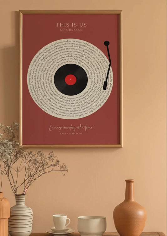
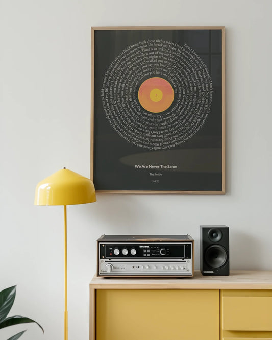
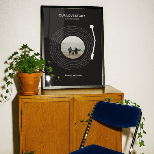
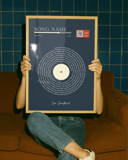
Some photos and designs have a built in direction, and fighting it produces awkward crops that no amount of clever framing fixes. Landscape wins for wide vistas, city skylines, road-trip maps, panoramic collages, and group photos where you need everyone’s shoulders in frame. Portrait wins for single-subject shots, tall architecture, and milestone pieces like a baby’s growth chart, where the vertical line of the subject matches the vertical line of the print.
Aspect ratio matters just as much as the portrait-or-landscape label. A 4:5 print behaves differently than a 2:3 print, even though both are technically “portrait.” Design guidance on aspect ratio and cropping confirms that forcing a photo into the wrong ratio usually means losing part of the subject, not just adding blank space.
- Landscape-friendly subjects: panoramic collages, road maps, group portraits, skylines, wide song lyric layouts with long lines of text.
- Portrait-friendly subjects: single portraits, star and zodiac charts, baby milestone timelines, narrow architecture like a lighthouse or a tower.
- Check the preview. Before checkout, use Wallfully’s personalized poster preview to see exactly how your subject sits inside the chosen orientation, including where names, dates, or lyrics land.
What Size and Placement Rules Actually Say
Interior designers rely on a handful of measurements that take the guesswork out of hanging a poster, and the same numbers apply whether you’re buying custom art or a mass-market print.
- Follow the two-thirds to three-quarters rule. Artwork hung above a sofa, bed, or console should span roughly two-thirds to three-quarters of that furniture’s width. A typical sofa suggests a poster wide enough to cover roughly two-thirds to three-quarters of its width, which almost always means landscape.
- Center the piece around eye level. Most designers hang the center of the artwork between 57 and 60 inches from the floor, adjusting down a few inches when it sits above low seating.
- Mock up the size before you commit. Tape sheets of newspaper or kraft paper to the wall in your intended dimensions and live with it for a day. This single step catches more sizing mistakes than any online calculator.
Landscape pieces stretch a room horizontally and tend to make a wall feel calmer and wider, a point backed by research on landscape wall art placement. Portrait pieces do the opposite: they pull the eye upward, which is why vertical formats work so well in narrow spaces like stairwells and hallways. For sizing above a specific piece of furniture, Wallfully’s guide to living room poster sizing and bedroom poster sizing walks through both scenarios with real measurements.
Buying a Personalized Poster as a Gift
Gift orders carry a risk regular purchases don’t: you’re guessing at someone else’s wall. When the recipient’s space is unknown, protect the parts of the design that matter most rather than chasing the “correct” format.
- Protect faces and key details first. If a crop has to sacrifice something, it should never be the recipient’s face, a route line on a map, or the key line of a song lyric.
- Ask, if you can. A quick text asking whether the gift is going above a bed, a desk, or a narrow entryway wall saves a return.
- Use the preview tool before ordering. Previewing crop and text placement at final size catches the most common personalized poster mistakes, including names running too close to the edge.
- Factor in framing. A wide mat or thick frame border effectively shrinks the visible art and shifts the piece’s proportions, so a borderline choice between portrait and landscape can tip one way once you add a frame.
Pro Tip: When customizing a baby milestone poster or a star map for someone else, order the size one notch larger than feels necessary. A frame’s mat eats more visual space than most people expect.
Mixing Orientations on a Gallery Wall
Combining portrait and landscape pieces on one wall works when it follows a structure, and falls apart when it doesn’t. Start with one anchor piece, usually your largest print, and build the rest of the arrangement around it rather than placing pieces at random.
- Pick an anchor first. A single large landscape or portrait piece gives the eye a starting point.
- Keep spacing consistent. Tight clusters use 2 to 4 inches between frames; looser, more gallery-style layouts use 6 to 10 inches.
- Align a shared axis. Line up either the tops, the centers, or the bottoms of your pieces so the mixed orientations don’t fight each other.
- On staircases, let portrait pieces cascade with the steps and save landscape pieces for the landing, where a horizontal wall segment naturally fits a wider frame.
Designers generally treat this as an intentional layout exercise, not a random mix, choosing an anchor piece and building outward with consistent spacing rather than hanging frames as they arrive.
Final Checklist Before You Click Buy
A handful of things catch buyers off guard right at checkout, usually because they were focused on the image and forgot the practical details.
- Zoom the preview to 100%. Check that no face, name, or line of text sits too close to the edge of the crop.
- Re-measure your wall. Confirm the final dimensions still match the width and height rules you started with.
- Match material to the room. A heavier frame or matte finish reads differently depending on orientation. Wallfully’s breakdown of posters versus prints explains how finish affects the final look.
- Confirm production and shipping timelines, especially for gifts tied to a specific date.
- Read the return and satisfaction policy before finalizing, not after.
Pro Tip: Order gift posters at least ten days ahead of the occasion. Custom printing and shipping both add time that a same-day online order doesn’t.
Does Orientation Change How a Poster Feels?
Yes, and the effect is bigger than most buyers expect. Landscape pieces read as calm and expansive because they echo the horizon line the eye is used to scanning left to right. Portrait pieces read as more intimate or dramatic because they pull attention upward, the same effect that makes a cathedral ceiling feel taller than it measures.
This isn’t just decorating theory. Orientation research on emotional response ties landscape formats to a sense of breadth and rest, while portrait formats suggest focus and vertical emphasis. A wide family photo collage feels relaxed and inclusive. The same photos cropped into a tall, narrow strip suddenly feel more like a spotlight on one moment.
That’s why forcing a photo into the “wrong” shape does more than waste space. It fights the emotional read the image was built to give. A group photo squeezed into portrait format often ends up with awkward negative space above heads, which quietly undercuts the warm, gathered feeling the photo was supposed to capture. Match the format to the feeling you want on the wall, not just the shape of the wall itself.
Do Portrait and Landscape Posters Cost Different Amounts?
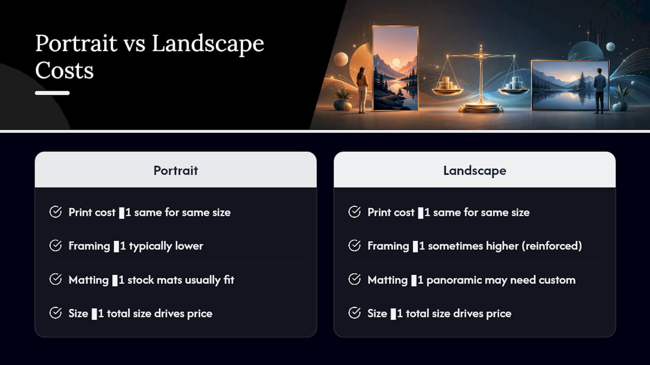
Printing costs for portrait and landscape posters are largely the same at a given size. A 16 by 20 inch print costs roughly the same to produce whether it’s oriented tall or wide, since the paper area and ink coverage are nearly identical.
Framing is where costs can diverge. Wider landscape frames sometimes require heavier or reinforced backing to prevent bowing across a longer horizontal span, which can push frame pricing up slightly compared to a portrait frame of similar total size. Custom mat cutting for panoramic or extra-wide landscape layouts can also cost more than a standard portrait mat, since panoramic ratios often fall outside stock frame sizes and require a made-to-fit option.
The bigger cost factor is total size, not orientation. A large landscape piece spanning most of a sofa’s width will almost always cost more than a small portrait accent piece, simply because it uses more material. If budget is the deciding factor, choosing a smaller portrait or square format over an oversized landscape piece is the more meaningful lever, not the orientation label itself. Wallfully’s guide to poster sizing and frame charts breaks down how size tiers affect price more than shape does.
Does Orientation Affect Image Quality?
Resolution requirements shift with orientation because you’re stretching pixels across different dimensions, not because one orientation is inherently sharper. A photo shot at 4000 by 3000 pixels prints cleanly as an 8 by 10 inch portrait but needs upscaling or careful cropping to fill a wide 20 by 16 inch landscape frame without softening.
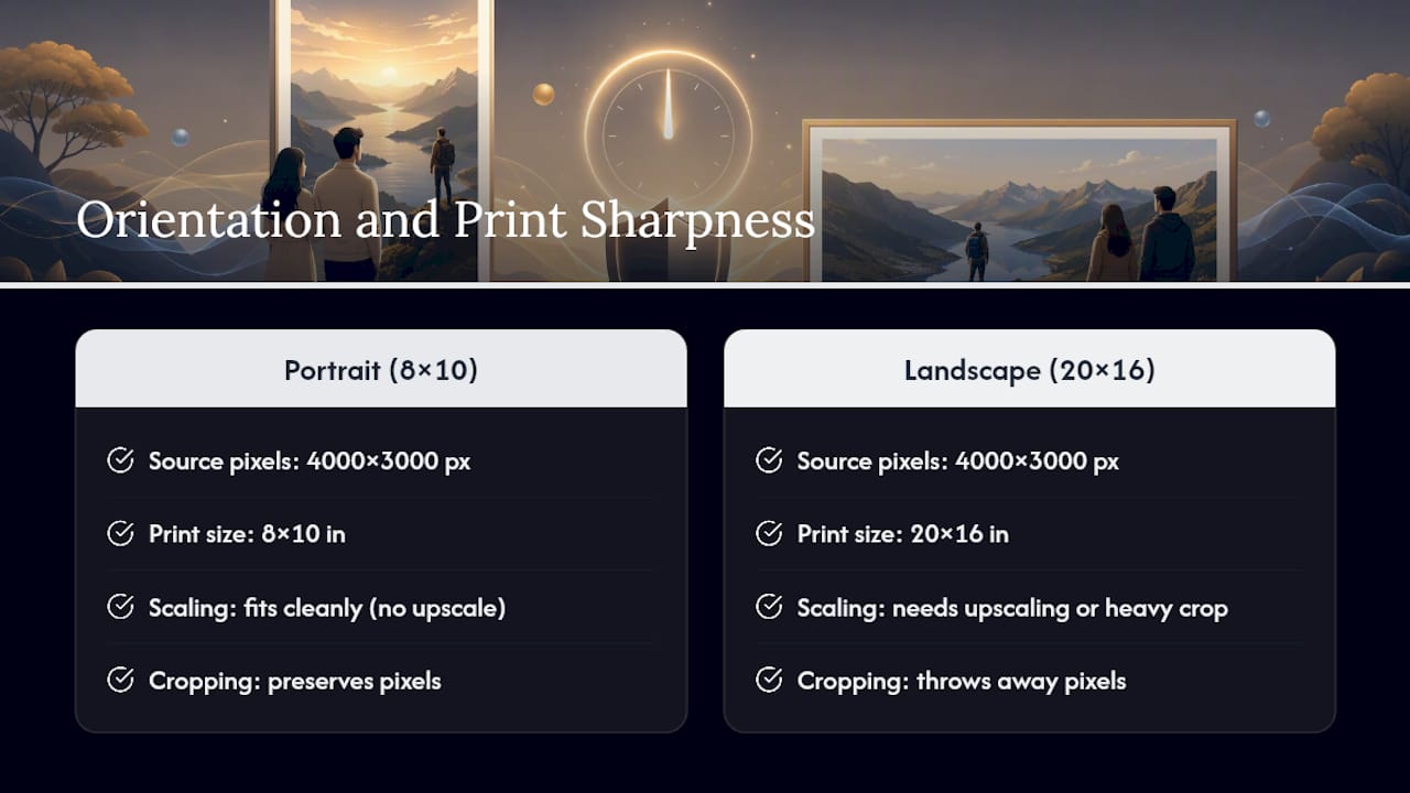
The safest habit is shooting or sourcing images at the highest resolution available, then deciding orientation afterward based on what the crop preserves. Cropping a wide landscape photo down to a tight portrait section throws away pixels you can’t get back, so if you already know you want portrait, frame the original shot that way when possible rather than fixing it later.
Text-heavy posters, like song lyric prints or milestone timelines, carry an added wrinkle: text needs to stay sharp at final print size, and stretching a design meant for one orientation into another can blur or misalign lettering. This is exactly why previewing at full size before ordering matters more for text-based designs than for pure photography. A blurry background is forgivable; blurry text on a gift isn’t.
Luanda’s Design Note
The rule I keep coming back to is this: read the subject first, match it to the wall, then preview before you buy. Framing and matting will shift how a piece reads more than people expect, so don’t finalize dimensions until you’ve seen the framed mockup, not just the raw print. If you’re still unsure, run it through Wallfully’s preview tool and skim a few customer reviews for the same product line. Seeing how the crop and text landed for someone else’s order is often the fastest way to trust your own choice.
— Luanda
Create Your Portrait or Landscape Poster With Wallfully
A guided preview feature lets you see whether your crop, text, or route line survives the print. You pick the subject, flip between portrait and landscape inside the customization tool, and see the exact final layout, including margins and text placement, before you pay. Orders ship with eco-friendly printing and a satisfaction guarantee, so a sizing mistake doesn’t become a stuck-with-it problem.
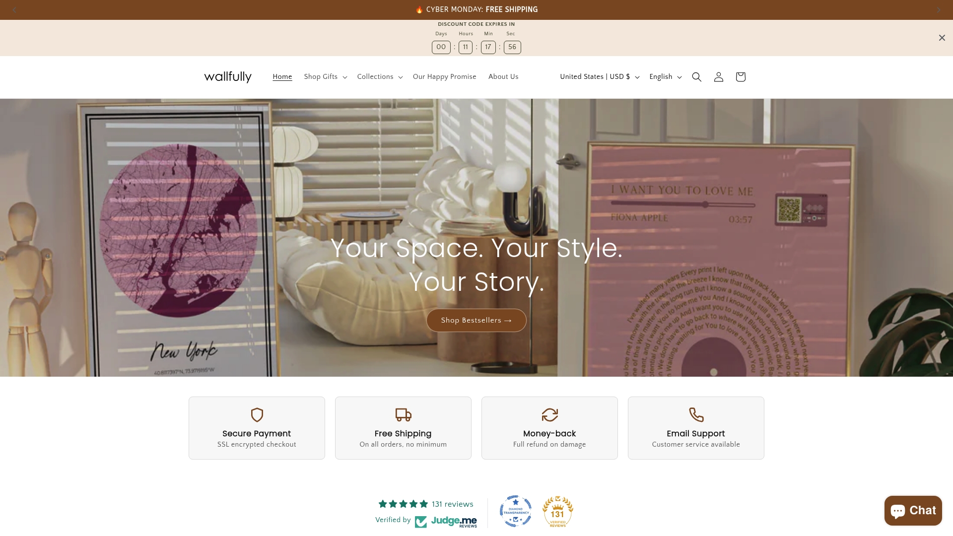
If you’re working with a group photo or a family collage, the Personalized Photo Collage Posters collection handles both orientations depending on how many faces you’re fitting in. Planning a route or travel map as a gift, browse Route & Map Posters and preview how the path reads in each format. For a single milestone or a name and date, the Baby Milestones line is built around the vertical emphasis portrait formats give best. Start a design now, toggle the orientation in the preview, and confirm it looks right before you check out.
Sources
- Landscape vs Portrait Wall Art – Choosing the Right Orientation
- Horizontal or Vertical Wall Art? Read the Wall First
- The Real Rules for Hanging Wall Art: Height & Scale — The Journal | Maison Perrin
- Landscape vs. Portrait Layouts: Choosing the Right Orientation - Canvas Street
FAQ
What’s the Main Difference Between Portrait and Landscape Posters?
Portrait posters are taller than they are wide and suit narrow walls, stairwells, and single subjects. Landscape posters are wider than tall and work best over sofas, beds, or consoles, and for wide scenes like group photos and panoramic maps.
Can I Mix Portrait and Landscape Posters on the Same Wall?
Yes, as long as you anchor the layout with one dominant piece and keep spacing consistent, typically 2 to 4 inches for tight clusters or 6 to 10 inches for looser arrangements. Aligning a shared top or center line keeps mixed orientations from looking scattered.
What Size Poster Should I Buy for Above My Sofa?
Aim for artwork that spans roughly two-thirds to three-quarters of your sofa’s width, which typically favors a landscape format.
How Does Wallfully Help Me Choose the Right Orientation?
Wallfully’s customization tool lets you preview your design in both portrait and landscape before ordering, showing exactly how faces, routes, or text land in the final crop. Pricing for each collection, including map posters and song lyric prints, is listed on the product page.
What If I’m Not Sure Which Orientation the Gift Recipient Needs?
Choose the orientation that keeps the subject’s face, key text, or route intact rather than the one that looks best empty. When in doubt, a medium landscape piece fits over more furniture types than a tall, narrow portrait piece.