
Best Wall Art Compilations to Transform Your Home
WallfullyTL;DR:
- A wall art compilation is a curated group of artworks arranged on a wall to create a cohesive visual statement. The best displays feature an anchor piece, consistent spacing of 2 to 3 inches, and centered placement at 57 to 60 inches from the floor. Mixing frame styles, sizes, and personal elements adds interest and authenticity to the arrangement.
A wall art compilation is a curated grouping of artwork arranged together to form a single, cohesive visual statement on a wall. The best wall art compilations do more than fill empty space. They anchor a room’s personality, reflect the people who live there, and create an emotional response the moment you walk in. Whether you’re decorating a living room or searching for a meaningful personalized gift, understanding how professional display standards and personal style work together is the difference between a wall that looks finished and one that looks unforgettable.
What defines the best wall art compilations
Every strong compilation starts with an anchor piece. The anchor piece should be roughly 50% larger than the other pieces in the grouping and hung first, at the center of the arrangement. Every other piece orbits around it visually. Without this focal point, the eye has nowhere to land, and the whole grouping reads as clutter.
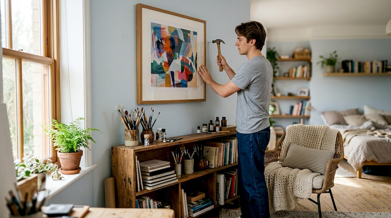
Spacing is the next non-negotiable. The professional standard is 2 to 3 inches between frames. Gaps wider than 4 inches make frames look isolated from each other. Gaps under 1.5 inches look cramped. Consistent spacing is what signals intention and turns a random collection of prints into a deliberate composition.
Hanging height matters just as much as layout. Center the entire arrangement at 57 to 60 inches from the floor, which aligns with average eye level. This rule holds even in rooms with high ceilings. Art hung too high feels disconnected from the furniture and the people in the room.
- Anchor piece: Hang it first, at center, roughly 50% larger than supporting pieces.
- Spacing: Keep gaps at 2 to 3 inches between every frame.
- Height: Center the full arrangement at 57 to 60 inches from the floor.
- Furniture clearance: Leave 6 to 10 inches between the bottom frame and the top of a sofa or console.
- Width proportion: The total compilation width should be roughly two-thirds the width of the furniture below it.
- Frame consistency: Stick to one or two finish families, such as black and natural wood, to unify mixed pieces.
Pro Tip: Before buying a single frame, measure your wall and the furniture below it. A compilation that is too wide or too narrow for its anchor furniture will look off no matter how good the individual pieces are.
Popular layout styles and how to choose one
The layout you choose shapes the entire mood of the compilation. Four styles dominate home decor right now, and each suits a different wall type and personality.
-
Grid layout. Even rows and columns with identical frames and consistent spacing. This style reads as modern, calm, and precise. It works best in spaces with clean lines, like a home office or a minimalist bedroom. The trade-off is that it demands exact measurement. One frame even slightly off-center breaks the whole effect.
-
Salon style. Mixed frame sizes arranged organically across a large wall. Salon style is favored for a “collected over time” aesthetic. It tolerates imperfections better than a grid and rewards personality over precision. This is the right choice if you want a wall that feels lived-in and layered.
-
Asymmetric cluster. A dominant anchor piece with supporting pieces arranged around it in an organic but guided pattern. This style is the most versatile. It works in living rooms, hallways, and bedrooms. The anchor piece does the heavy lifting, and the surrounding pieces add context without competing.
-
Horizontal line. A single row of frames at the same height, running along a wall. This layout suits long, narrow walls in hallways or dining rooms. It creates a clean, gallery-like feel without requiring a large wall surface.
-
Staircase layout. Frames follow the diagonal line of a staircase, stepping up or down with the architecture. This is the most specific layout, designed for stairwells, but it is also one of the most dramatic when done well.
Ceiling height, wall shape, and room style all influence which layout fits. A tall, narrow wall calls for a vertical cluster. A wide, low wall suits a horizontal line or a wide grid. When in doubt, match the layout’s energy to the room’s existing style. A minimalist space calls for a grid. A warm, eclectic room calls for salon style.
How to mix frames, art styles, and colors effectively
Mixing frames and art styles is where most people either create something genuinely interesting or accidentally create chaos. The key is controlled variety.
- Limit frame finish families. Choose one or two finishes and stick to them throughout the compilation. Black and gold work together. Black and natural wood work together. Three or more unrelated finishes compete with each other and pull the eye in too many directions.
- Vary frame size and orientation. Mix portrait, landscape, and square orientations for visual rhythm. Avoid hanging all the same size. The contrast between a large horizontal print and a small square creates movement across the wall.
- Use mats to unify varied artwork. A white or off-white mat around each piece creates a visual buffer that makes different art styles read as part of the same family. This is especially useful when mixing photography with illustration or abstract prints.
- Pull colors from the room. Identify two or three accent colors already present in the room, such as a rug, throw pillows, or curtains, and repeat those tones across the art pieces. This ties the compilation to the room rather than making it feel like an afterthought.
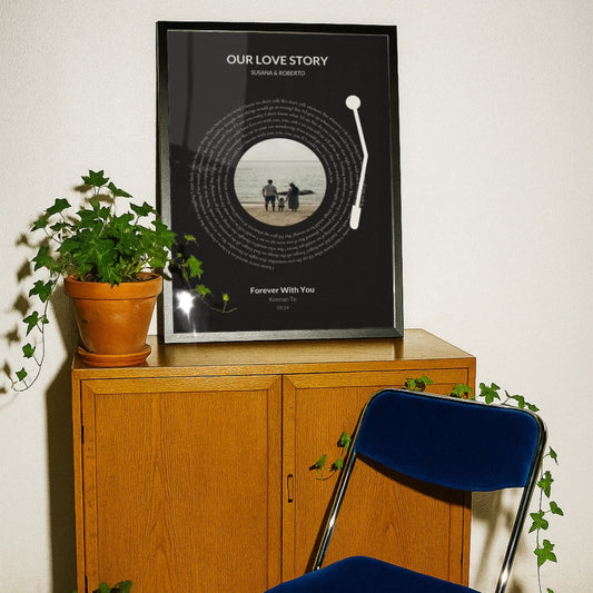
- Mix photos with art prints. Scaling up a personal photo to match the size of a fine art print gives it the same visual weight. The result is a compilation that feels both personal and designed. This trend toward personalized wall art has grown steadily because it creates walls that no one else can replicate.
Home design styles vary widely, and the frame and color choices that work in a farmhouse living room will look wrong in a mid-century modern space. Match your frame finishes to the dominant hardware and furniture tones in the room.
How to plan, preview, and hang a compilation like a pro
Hanging a wall art compilation without a plan leads to extra nail holes, crooked frames, and arrangements that look nothing like what you imagined. These steps eliminate most of those problems.
-
Trace each frame onto kraft paper. Cut out the shape, mark the hook position on the paper, and tape the templates to the wall with painter’s tape. Kraft paper templates let you test the full arrangement before committing to a single nail hole. Move them around until the layout feels right.
-
Mark your center height. Measure 57 to 60 inches from the floor and mark that point on the wall. This is the visual center of your entire compilation. Every template should be arranged so the grouping’s center aligns with this mark.
-
Apply the furniture clearance rule. The bottom edge of the lowest frame should sit 6 to 10 inches above the top of any sofa, console, or bed frame below it. This keeps the compilation visually connected to the furniture rather than floating above it.
-
Hang the anchor piece first. Once your templates are finalized, remove them one at a time and hang the actual frames. Start with the anchor piece at the center. Then work outward, hanging the pieces that sit directly beside or below the anchor next.
-
Use a cardboard spacer for consistent gaps. Cut a piece of cardboard to your chosen gap width, such as 2.5 inches. Use this spacer between frames as you hang each one. This is faster and more accurate than measuring frame-to-frame repeatedly.
-
Consider no-hole options for rental spaces. Command strips rated for the frame weight work well for lightweight prints. Leaning larger frames on a shelf or console is another option that requires no wall commitment at all.
The single most common hanging mistake is placing art too high. Lowering the centerline to 57 to 60 inches from the floor, even in a room with 10-foot ceilings, makes the art feel part of the room rather than hovering above it. This one adjustment has more impact than any other change you can make.
Pro Tip: Photograph your kraft paper template arrangement before removing the templates. Use that photo as a reference while you hang the actual frames.
Creative and trending ideas to personalize your compilation
The most memorable wall art compilations include at least one element that no one else has. These ideas push beyond the standard print-and-frame formula.
- Add dimensional elements. Woven wall hangings, bas-relief ceramic pieces, and sculptural objects add texture that flat prints cannot. One dimensional piece among framed prints creates depth and makes the whole wall more interesting to look at.
- Use digital downloads for exact sizing. Purchasing a digital print file lets you print at the exact dimensions your layout requires. This is the most practical way to fill an odd-sized gap in a planned compilation without compromising the spacing.
- Choose odd-number groupings. Arrangements of 5, 7, or 9 pieces feel more dynamic than even-numbered groupings. Even numbers tend to read as pairs, which can make a compilation feel static. Odd numbers create a natural visual flow.
- Use curated print sets. Many print sets are designed with cohesive themes and neutral palettes specifically for gallery wall use. These sets remove the guesswork from color matching and work especially well for first-time decorators.
- Mix modern and vintage frames intentionally. Pairing a sleek black metal frame with a worn gilt frame creates style contrast that reads as collected rather than mismatched. The key word is “intentional.” One vintage frame among modern ones is a design choice. Three different vintage styles competing with each other is not.
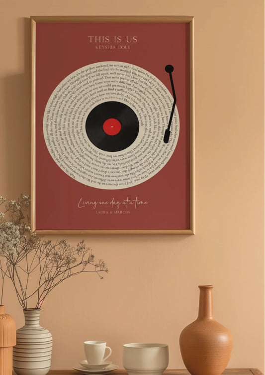
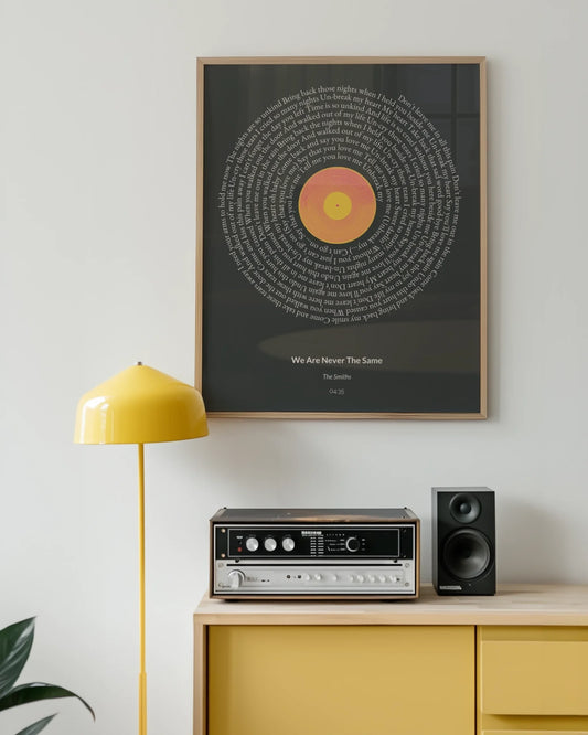
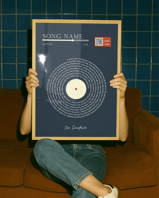
- Scale up a personal photo. A single large-format personal photo, printed at 16x20 or larger, carries the same visual authority as a fine art print. Wallfully’s custom photo prints make this easy, letting you turn a meaningful image into the anchor piece of your entire compilation.
For more ideas on trending wall art styles that blend personal expression with current design sensibilities, the range of options has never been wider.
Key Takeaways
The best wall art compilations succeed when a strong anchor piece, consistent 2-to-3-inch spacing, and a center height of 57 to 60 inches work together as a system.
| Point | Details |
|---|---|
| Start with an anchor piece | Choose one piece 50% larger than the rest and hang it first at center. |
| Keep spacing consistent | Maintain 2 to 3 inches between frames to unify the grouping visually. |
| Hang at eye level | Center the full arrangement at 57 to 60 inches from the floor. |
| Use kraft paper templates | Test your full layout on the wall before committing to any nail holes. |
| Personalize with purpose | Mix photos, prints, and dimensional pieces to create a wall no one else has. |
What I’ve learned from building gallery walls that actually work
The advice I give most often is also the advice most people ignore: slow down before you hang anything. I have watched people spend hours choosing prints and frames, then rush the hanging process and end up with a wall that looks nothing like what they planned. The kraft paper template step feels tedious. It saves you from a wall full of patched holes and a compilation that sits two inches too high.
The second thing I have learned is that organic arrangements beat perfect symmetry almost every time. A wall that looks like it was assembled by a machine feels cold. A wall with one piece slightly larger than expected, or one frame that leans vintage among modern ones, feels like a person lives there. Resist the urge to make everything match perfectly.
The walls I am most proud of are the ones that mix something personal with something collected. A printed map of the city where someone met their partner, hung next to a botanical print and a small abstract, tells a story. That combination is what separates a gallery wall from a furniture showroom display. Wallfully’s custom poster options make it straightforward to add that personal layer without sacrificing design quality.
Finally, give yourself permission to edit. A gallery wall is not permanent. Swap pieces in and out as your taste evolves. The best ones I have seen change over time, gaining new pieces and retiring old ones, the way a bookshelf does.
— Luanda
Wallfully makes building your perfect wall compilation easier
Choosing and arranging wall art is genuinely satisfying once you have a clear plan. Wallfully gives you the prints and the inspiration to build that plan with confidence.
Wallfully specializes in personalized art prints including song lyric posters, custom maps, photo collages, zodiac prints, and milestone pieces. Every order ships free, prints on eco-friendly materials, and arrives backed by a satisfaction guarantee. Whether you are building a gallery wall for your own home or putting together a meaningful gift for someone else, Wallfully’s curated collections and easy customization process give you exactly what you need to get started. Browse the full range at Wallfully and find the anchor piece your wall has been waiting for.
FAQ
What is a wall art compilation?
A wall art compilation is a curated grouping of artwork, prints, and decorative objects arranged together on a single wall to create one cohesive visual statement.
How far apart should frames be in a gallery wall?
The professional standard is 2 to 3 inches between frames. Wider gaps make pieces look isolated; tighter gaps look cluttered.
What height should I hang a gallery wall?
Center the entire arrangement at 57 to 60 inches from the floor, which aligns with average eye level. This rule applies regardless of ceiling height.
How do I choose a layout style for my wall art compilation?
Match the layout to the room’s existing style. Grid layouts suit minimalist spaces; salon style suits eclectic, personality-filled rooms. Asymmetric clusters work in almost any space.
What makes a good anchor piece for a gallery wall?
The anchor piece should be roughly 50% larger than the other pieces in the grouping. It is hung first, at the center of the arrangement, and every other piece is positioned around it.