Explaining Typography Posters: Visual Concepts & Decor
WallfullyTL;DR:
- Typography posters serve as visual diagrams that explain the anatomy and principles of letterforms. They enhance design literacy and can transform a space by making typographic concepts accessible and engaging. Effective posters prioritize clarity, contrast, and balanced design, complementing various interior styles from classical to modern.
Most people glance at a typography poster and think it’s just letters on a wall. But that assumption misses something genuinely fascinating. These posters often function as visual diagrams, breaking down the hidden architecture of type in ways that change how you see every word you’ve ever read. Whether you’re decorating a home office, shopping for a meaningful gift, or just curious about design, understanding what these posters actually explain turns a casual purchase into something far more intentional. This guide walks you through the anatomy, styles, and smart selection strategies so you can pick the piece that does more than fill blank space.
Table of Contents
- What are typography posters and why explain them?
- Anatomy explained: Key letter parts and spacing made visual
- Design best practices: Readable, striking, and practical
- Styles and trends: Classical vs modern approaches
- How to choose and use typography posters at home
- Rethinking typography posters: More than wall art
- Discover smart typography art for your space
- Frequently asked questions
Key Takeaways
| Point | Details |
|---|---|
| Structure unlocks clarity | Typography posters visually decode the anatomy of letters, making design basics easy to grasp. |
| Form impacts mood | The right type choices can transform your space by improving both style and readability. |
| Style fits personality | Choosing between classic and modern poster styles lets you match the vibe of your room or gift. |
| Educational and practical | These posters serve as both art and quick teaching tools, benefiting everyone—not just designers. |
What are typography posters and why explain them?
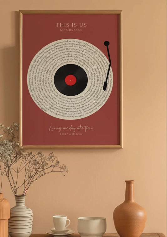
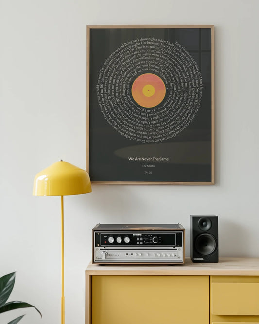
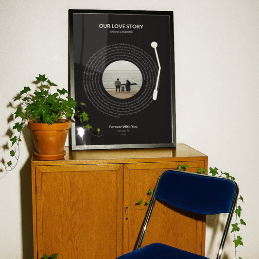
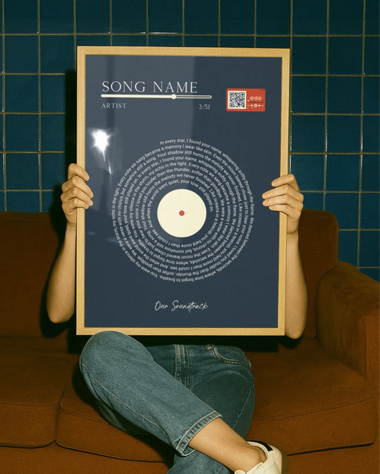
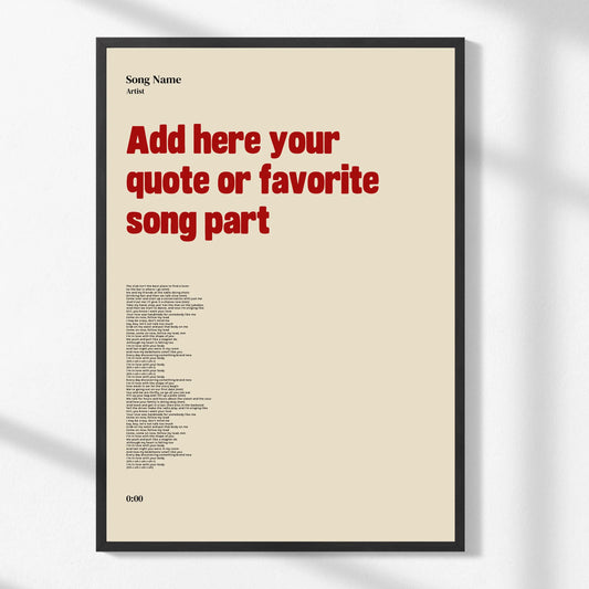
A typography poster isn’t just a print with a fancy font. At its core, an educational typography poster is a visual diagram that maps the anatomy of letterforms and key typographic terms, functioning as wall art and reference tool at the same time. Think of it like a labeled cross-section of something you thought you already understood, except the subject is the alphabet.
The distinction matters when you’re shopping. A general word art print might display a quote in a pretty font. An explanatory typography poster, by contrast, labels the baseline, marks the cap height, points to the x-height, and identifies the difference between a serif and a sans-serif structure. That educational layer is what separates purposeful typographic art from decorative letter prints.
These posters have grown in popularity because they appeal to a wide range of people:
- Design enthusiasts who want their walls to reflect their interests
- Home decorators looking for intellectually stimulating art that sparks conversation
- Educators and students who benefit from visual reference in workspaces
- Gift givers seeking something unique and thoughtful beyond typical framed prints
- Visual learners who absorb information better through diagrams than text alone
Part of their appeal is how they bridge the gap between beauty and function. Transforming your space with typography doesn’t require design training. A well-made poster makes the concepts self-evident, guiding your eye through terms like ascender, descender, counter, and bowl with crisp lines and clean labels.
“Typography posters explaining concepts are visual guides that diagram the anatomy of letterforms and key typographic terms, making abstract design principles immediately accessible.”
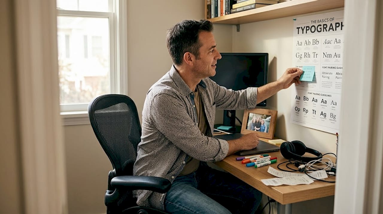
Beyond aesthetics, these prints work as quick-reference tools for anyone who works with text, layouts, or branding. And if you’re newer to decorating with art, the basics of decorating with posters can help you understand how a single well-chosen piece anchors a whole room.
Now that we understand these posters aren’t just for show, let’s break down their anatomy and what concepts they visually communicate.
Anatomy explained: Key letter parts and spacing made visual
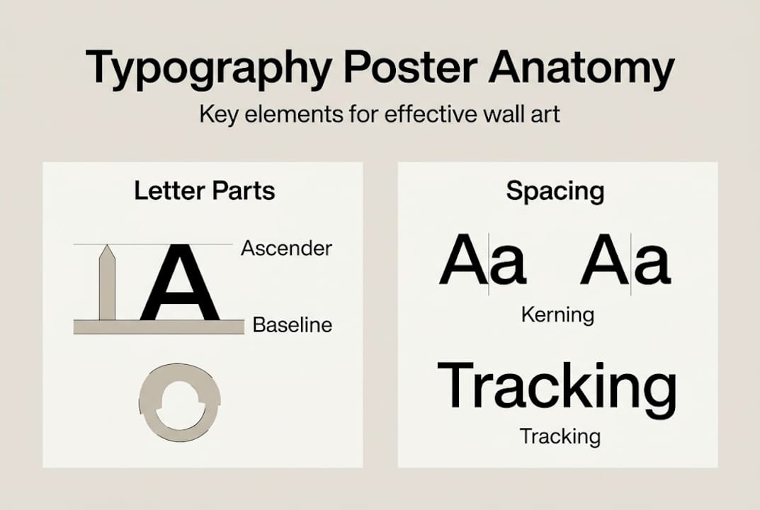
Open any well-designed typography poster and you’ll likely encounter a cluster of terms that look technical but are surprisingly intuitive once explained. Letter anatomy basics cover the same foundational concepts that professional designers rely on daily.
Here are the most common labeled elements you’ll find:
- Cap height — the distance from the baseline to the top of uppercase letters
- X-height — the height of lowercase letters like “x” or “a,” critical for readability
- Baseline — the invisible line that all letters sit on
- Ascender — the part of a lowercase letter that rises above the x-height, like in “b” or “h”
- Descender — the portion that drops below the baseline, like in “p” or “g”
Beyond height measurements, typography posters often diagram structural letter parts. The letterform components include stems (the main vertical strokes), bowls (the rounded enclosures in letters like “d” or “b”), and counters (the enclosed or partially enclosed space inside letters). Spacing metrics round out the picture:
| Term | What it means | Why it matters |
|---|---|---|
| Kerning | Space between two specific characters | Prevents awkward gaps or crowding |
| Leading | Vertical space between lines of text | Controls readability and rhythm |
| Tracking | Overall spacing across a word or block | Affects density and tone |
Visual hierarchy on these posters is deliberate. The best ones use size, weight, and placement to guide your eye from the broadest concept (the full letterform) down to the finest detail (a serif’s bracket or a hairline stroke). That layered structure mirrors good design thinking.
For custom poster inspiration, look for prints that keep diagrams clean and uncluttered. When too many terms compete for attention, the educational value collapses into visual noise.
Pro Tip: Choose a typography poster where each labeled element has room to breathe. Generous white space between annotations signals a designer who understands the very concepts they’re illustrating.
Understanding the terms is only half the story. Let’s see how expert designers turn these concepts into visually striking and readable art.
Design best practices: Readable, striking, and practical
Knowing what’s on a typography poster is one thing. Knowing whether it’s well-made is another. Design methodologies for effective typographic posters prioritize hierarchy, contrast, and readability, typically using no more than two fonts and generous spacing throughout.
Here’s a quick comparison of what separates strong designs from weak ones:
| Strong design | Weak design |
|---|---|
| High contrast (black on white or vice versa) | Low contrast, hard-to-read combos |
| Max 2 typefaces | 3 or more competing fonts |
| Ample spacing between elements | Crowded labels and annotations |
| Clear visual hierarchy | Flat, undifferentiated layout |
| Scalable from small to large print | Thin strokes that disappear when printed |
A few things to keep front of mind when evaluating or creating typography posters:
- Limit font choices. One font for labels, one for featured letterforms keeps the eye from bouncing.
- Make labels readable at distance. If you need to lean in to read an annotation, the poster fails its basic job.
- Maintain visual balance. Asymmetry can work brilliantly, but only when intentional and structured.
- Avoid data overload. A poster covering 25 terms is less useful than one that covers 8 terms exceptionally well.
One common mistake is using display fonts for body copy or annotations. Display fonts are built for headlines, not fine detail. At small sizes, they lose legibility fast. All-caps annotations can also disrupt reading rhythm, making the poster feel like it’s shouting rather than teaching.
For buyers, top poster design tips are worth reviewing before you commit to a print. A beautiful image in a thumbnail can look very different framed on your wall at full scale.
Pro Tip: High-contrast black and white palettes aren’t just classic, they’re scientifically easier to read. If you want color, limit it to one or two accent tones that highlight key terms rather than compete with them.
The basics and best practices set you up for success. But what sets classical and modern typography posters apart, and does style matter when picking your piece?
Styles and trends: Classical vs modern approaches
Typography poster design doesn’t live in a vacuum. It borrows heavily from movements that shaped visual communication over the last century. Understanding those influences helps you find art that feels right for your space and your taste.
Classical versus modern typography reflects real design philosophy differences rooted in Bauhaus, Art Deco, and the Polish school of poster design. Here’s how each camp tends to look:
- Classical: Structured grid, serif typefaces, symmetrical layouts, restrained color palettes
- Bauhaus-influenced: Geometric forms, sans-serif type, functional minimalism, bold primary colors
- Art Deco typography: Ornate letterforms, high contrast strokes, decorative elegance, vertical emphasis
- Modern/contemporary: Asymmetric compositions, expressive type hierarchies, mixed media textures
- Polish school inspired: Text as the dominant visual element, tight integration of image and type
One striking statistic worth knowing: over 95% of visual design is typography. That figure reframes the whole question of what makes a room feel designed versus simply furnished. A typography poster, then, isn’t an accessory to your decor. It’s the design itself.
For modern interiors, minimalist wall art tends to work best when the poster uses a clean sans-serif palette and a single focal letterform. For spaces that invite curiosity and detail, a classical diagram style with dense annotations adds depth without clutter.
If you’re exploring modern wall art for a Bauhaus-leaning room, geometric letterform posters feel cohesive. For something more playful and personal, minimalist zodiac posters blend typographic sensibility with personalized meaning.
So how do you put these insights into action for your home or as a thoughtful gift?
How to choose and use typography posters at home
Selecting the right typography poster is less about finding the prettiest one and more about matching purpose to place. Here’s a straightforward process:
- Define the room’s purpose. A home office benefits from educational, detail-rich posters. A living room often works better with a bold, stylistically striking piece.
- Identify your style preference. Review the classical versus modern breakdown above and note which aesthetic already dominates your space.
- Check readability at intended viewing distance. If the poster will hang across a room, labels need to be large enough to register without squinting.
- Choose educational depth. A poster with 6 to 10 labeled concepts hits the sweet spot between informative and overwhelming.
- Consider the recipient if gifting. For a design-curious friend, a detailed anatomy poster is a memorable choice. For someone who loves words without the technical angle, a bold typographic art print may land better.
Typography matters more than most people realize. Serif fonts increase perceived credibility by 18%, and poor typography leads to 38% abandonment in digital contexts. The same principles carry over to physical art: a poorly typeset poster simply feels less trustworthy and less beautiful, even if you can’t articulate why.
Mistakes to avoid: text that’s too small to read from three feet away, styles that clash with your existing decor, and layouts so busy they become visual stress rather than visual pleasure.
Creative wall art gift ideas for typography enthusiasts often pair well with personal touches. Explore custom posters for occasions that combine typographic elegance with milestone dates or names. And for something personal and cosmic, star map poster ideas offer a beautiful fusion of type and meaning.
You’ve got the practical tips. To close, let’s challenge some conventional views and share a unique take on why these posters matter.
Rethinking typography posters: More than wall art
Here’s a perspective most decor guides skip: hanging a typography poster isn’t a passive choice. It’s an act of design literacy. Every time you or a guest glances at a poster that labels a bowl, a counter, or a descender, something small but real happens. Visual vocabulary grows. Design intuition sharpens. The ability to notice what makes one typeface feel warmer or colder than another becomes a little more conscious.
Most mainstream decor focuses on color and texture while treating text as background noise. That’s a missed opportunity. A thoughtfully chosen typography poster makes a room more interesting to live in because it gives the eye something to learn, not just admire.
Good type shapes emotional response in ways most people never examine consciously. The wall art transformation that comes from a single strong typographic print can shift a room from generic to genuinely considered. And the custom poster examples that resonate most are always the ones that carry meaning beyond decoration.
Discover smart typography art for your space
If this guide has shifted the way you see type on a wall, the next step is finding art that earns its place. Wallfully specializes in personalized, high-quality wall art that fuses visual intelligence with genuine style.
From bold typographic prints to custom posters you can personalize with names, dates, or locations, every piece is printed on eco-friendly materials and ships free. Whether you’re decorating your own space or searching for a gift that says something real, curated typography posters at Wallfully give you art that informs and inspires. Browse the collections, use the live preview tool, and find the print that makes your wall worth looking at.
Frequently asked questions
What key elements are usually labeled on a typography poster?
Most explain x-height, cap height, baseline, ascender, descender, serifs, stems, and sometimes spacing metrics like kerning and leading.
Are typography posters only for designers or can anyone use them?
They work for anyone curious about type. As quick-reference visual guides, they’re equally useful for home decorators, students, and gift givers with no design background.
What’s the difference between classical and modern typographic poster styles?
Classical typically uses grids, serifs, and symmetry, while modern Bauhaus-inspired styles favor geometric, sans-serif type and asymmetric layouts influenced by movements like the Polish school.
Why does poster typography matter for readability?
Poor typography leads to 38% abandonment and serifs boost perceived credibility by 18%, meaning good type choices directly affect how clearly and persuasively information communicates.