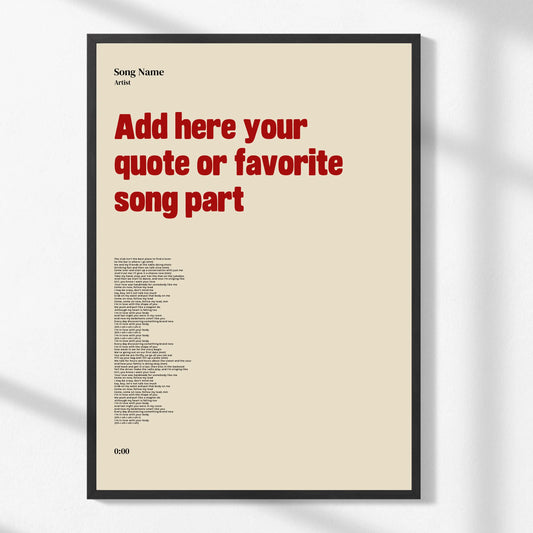

How to Choose Wall Decor Style: A Personal Guide
WallfullyTL;DR:
- Choosing wall decor style involves understanding your preferences and applying proper size and placement rules. It is essential to select artwork that reflects your lifestyle, room function, and personal taste, with accurate measurements and strategic placement. Personalizing your space with informed choices creates a cohesive and visually appealing environment.
Wall decor style is defined as the deliberate combination of personal taste, room function, and design principles to create a visually cohesive space. Knowing how to choose wall decor style is less about following trends and more about understanding what genuinely reflects you. The process starts with identifying your preferences through mood boards, then applying proven placement rules like the 2/3 proportion guideline and the gallery-standard eye-level height of 57–60 inches. Get those two things right, and the rest falls into place. This guide walks you through every step, from selecting wall art style to matching decor types to specific rooms.
How to discover and define your personal wall decor style
Your personal decor style is not something you find in a magazine. It is something you uncover by paying attention to what you are consistently drawn to across different contexts.
The most effective starting point is a mood board. A multi-step mood board process helps you identify common threads in your preferences across colors, textures, and furniture shapes. Collect images from anywhere: saved photos on your phone, pages torn from catalogs, screenshots of rooms you admire. Pin them together and look for patterns. If you keep gravitating toward natural wood tones, linen textures, and muted greens, that is your style speaking.
One counterintuitive but highly effective technique: articulate what you dislike before you focus on what you like. Dislikes are cognitively easier to name, and they quickly eliminate entire style categories. If you know you hate cold, minimalist spaces with chrome accents, you have already narrowed your field significantly.
Lifestyle factors matter just as much as aesthetics. A home with young children or pets needs decor that can survive real life. Delicate fabric wall hangings in a high-traffic hallway will look worn within months. Choosing art for home means choosing art that fits how you actually live, not how you wish you lived.
- Collect 20–30 images that appeal to you without overthinking it
- Look for repeating colors, shapes, or materials across those images
- Note what you actively dislike in rooms you find unappealing
- Filter your top choices through your real lifestyle, not an idealized one
- Use an anchor piece, a rug, a sofa, or a painting you already love, to build your palette outward
Pro Tip: If you already own one piece of art or furniture you love, use it as your anchor. Pull two or three colors from it and let those guide every wall decor decision in that room.
What are the key size, proportion, and placement rules?
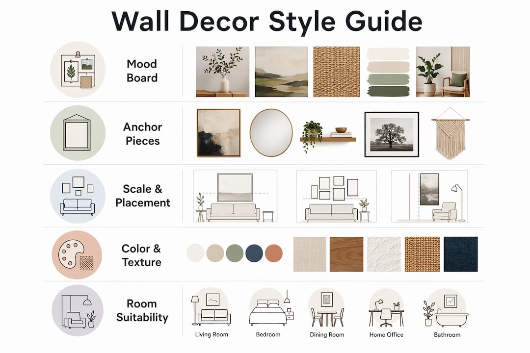
Scale and placement are where most people go wrong. A beautiful piece of art hung too high or too small for its wall will always look off, no matter how much you paid for it.
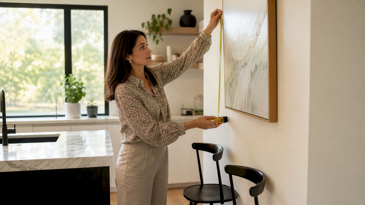
The gallery-standard eye level for artwork centers the piece at 57–60 inches from the floor. This is the height used in professional galleries because it aligns with average adult eye level. Apply it consistently and your walls will immediately look more intentional.
When hanging art above furniture, two measurements govern the result:
- Apply the 2/3 rule. The artwork’s width should be approximately two-thirds of the furniture width below it. A sofa that is 84 inches wide calls for art or a grouping that spans roughly 56 inches.
- Maintain clearance. Leave 6–12 inches between the top of the furniture and the bottom of the artwork. Less than 6 inches makes the art look like it is sitting on the furniture. More than 12 inches creates a disconnected gap.
- Space frames consistently. In gallery walls or grouped arrangements, keep 2–3 inches between frames. This spacing reads as intentional rather than random.
- Mock it up first. Cut paper templates to the exact size of each piece and tape them to the wall before you hammer a single nail. This step alone prevents the most common placement mistakes.
Pro Tip: Use a level and a measuring tape, not your eye. Professionals use precise measurements and gallery standards for a reason. Eyeballing placement is the fastest way to create a wall that looks slightly wrong without knowing why.
The table below summarizes the core placement standards at a glance.
| Placement factor | Standard guideline |
|---|---|
| Center height from floor | 57–60 inches |
| Art width relative to furniture | Approximately two-thirds of furniture width |
| Clearance above furniture | 6–12 inches |
| Spacing between grouped frames | 2–3 inches |
How do you choose wall decor for different rooms?
The best wall decor options for a living room are not the best choices for a bedroom or a kitchen. Each room has a different function, and the decor should serve that function.
Living rooms are the most flexible space in the home. Bold statement pieces work well here because the room is designed for social interaction and visual engagement. A large-scale canvas or a coordinated gallery wall both read confidently in a living room. Statement walls work best on walls at least 8 feet wide, with large-scale patterns that fill the space without crowding it.
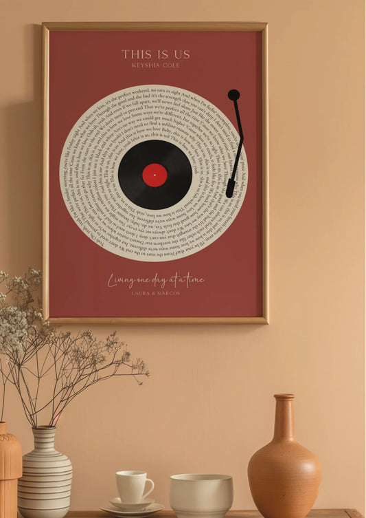
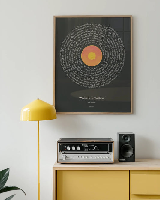
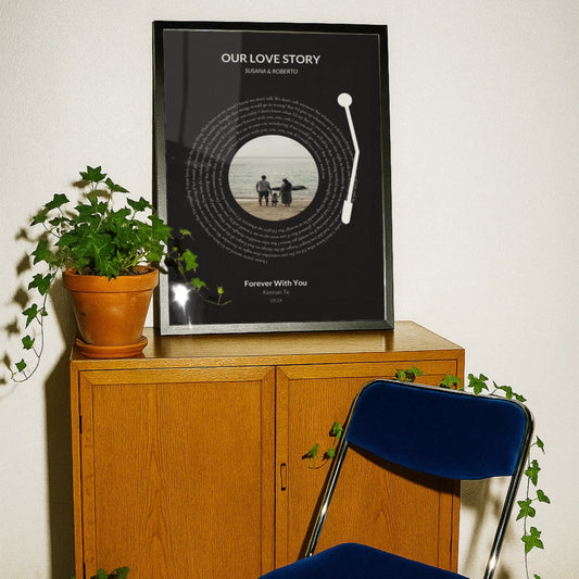
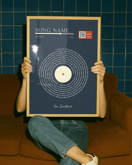
Bedrooms call for a different approach entirely. The goal is calm, not stimulation. Soft palettes, intimate-scale art, and personal imagery, such as a custom map of a meaningful location or a milestone print, create a space that feels restorative. Wallfully specializes in exactly this kind of personalized piece, from song lyric posters to photo collages that carry real emotional weight.
- Living rooms: bold statement pieces, gallery walls, large-scale art
- Bedrooms: calming palettes, personal imagery, intimate scale
- Kitchens: moisture-resistant materials, placed away from heat and cooking mess
- Dining rooms: adventurous color choices that complement cabinetry and furniture tones
Kitchens require practical thinking. Environmental factors like moisture, heat, and grease affect how wall decor holds up over time. Canvas prints and framed art should stay away from the stove and sink. Metal prints or sealed wood signs handle kitchen conditions far better than paper-based options.
Dining rooms offer the most creative freedom after living rooms. The space is used for meals and conversation, and slightly adventurous art choices, including colorful abstracts or bold typography, add energy without overwhelming daily function.
How do color, texture, and layering create a cohesive look?
Color coordination is the single most effective tool for making wall decor feel intentional rather than collected at random. The simplest approach: choose a neutral base for the room and introduce one accent color through your art. A room with warm white walls and natural wood furniture can carry a single piece with deep terracotta or forest green without the space feeling busy.
Visual weight in wall decor is determined by color vibrancy and contrast, not just physical size. A small, high-contrast black-and-white print can command more attention than a large, muted landscape. This means you can balance a wall using a mix of sizes as long as you account for color intensity.
Texture adds dimension that flat prints alone cannot provide. Wooden panels, fabric wall hangings, stone-effect tiles, and woven pieces all catch light differently throughout the day. Layering a framed print in front of a textured wallpaper section, or placing a small shelf with a sculptural object below a canvas, creates depth that a single piece never achieves. For more ideas on building this kind of layered look, the easy wall decor tutorials from Wallfully cover textured wallpapers, wooden panels, and statement art combinations in practical detail.
Lighting is the variable most people overlook. Warm light at 3000K enhances earthy tones like terracotta, amber, and olive. Cooler light intensifies blues and greens. The same piece of art can look entirely different under different bulbs. Test your lighting before committing to a color palette.
- Use neutrals as a base and one accent color pulled from your art
- Account for visual weight: high contrast reads as large regardless of actual size
- Layer textures, framed prints, sculptural objects, and fabric pieces for depth
- Test paint colors and art samples in your actual lighting over several days
- Use symmetry for a formal look; guided asymmetry for a relaxed, collected feel
Pro Tip: Before buying art, hold a color swatch or printed image against your wall at different times of day. Room undertones shift dramatically between morning and evening light, and what looks perfect at noon can clash by lamplight.
Key Takeaways
Choosing wall decor style comes down to three things: knowing your preferences, applying proven proportion rules, and matching decor to each room’s function and environment.
| Point | Details |
|---|---|
| Start with a mood board | Collect images, identify repeating patterns, and note dislikes to define your style quickly. |
| Use the 2/3 rule | Art width should be roughly two-thirds of the furniture width below it for proper scale. |
| Hang at gallery height | Center artwork at 57–60 inches from the floor to match standard adult eye level. |
| Match decor to room function | Kitchens need moisture-resistant materials; bedrooms benefit from calming, personal imagery. |
| Manage visual weight with color | High-contrast pieces command attention regardless of size; balance accordingly. |
What I have learned from years of styling walls
The biggest mistake I see is treating wall decor as the last step. People furnish an entire room, then try to find art that fits what is left. That approach almost always produces walls that look like an afterthought.
The rooms I find most compelling are the ones where the art was chosen first, or at least simultaneously with the furniture. When you select a piece you genuinely love and build the room around it, the space has a center of gravity. Everything else orbits it naturally.
Scale errors are the second most common problem. People consistently buy art that is too small for their walls. A piece that looks substantial in a store or online can disappear on a large wall. I always recommend going one size larger than feels comfortable. The room will thank you.
I also think people give up on their style too quickly. Style evolves. The pieces you love at 30 will not be identical to what you love at 40, and that is not a problem. Buy pieces that genuinely move you now, even if they do not perfectly match everything else. A wall that tells your real story, with a mix of sentimental pieces, travel finds, and custom prints, is always more interesting than a perfectly coordinated showroom. For a deeper look at how art choices affect the emotional atmosphere of a space, the wall art and mood guide from Wallfully is worth reading.
One last thing: do not underestimate lighting. I have seen beautiful art ruined by a single overhead bulb casting the wrong color temperature. A simple warm-toned picture light or a well-placed floor lamp can change everything.
— Luanda
Wallfully: where personalized wall art comes to life
Knowing your style is one thing. Finding art that actually expresses it is another.

Wallfully makes the gap between inspiration and finished wall much smaller. The platform lets you create custom wall art built around your real life: song lyric posters with your favorite track, custom maps of places that matter to you, photo collages, zodiac prints, and milestone pieces marked with names and dates. Every order ships free, prints on eco-friendly materials, and comes with a satisfaction guarantee. If you have done the mood board work and know what you want your walls to say, Wallfully gives you the tools to say it precisely. You can also browse the custom wall decor guide for step-by-step help turning your style preferences into finished pieces.
FAQ
What is the 2/3 rule for wall art?
The 2/3 rule states that artwork width should be approximately two-thirds of the furniture width below it. A sofa 84 inches wide calls for art or a grouping that spans roughly 56 inches.
How high should wall art be hung?
Art should be centered at 57–60 inches from the floor, which is the gallery standard for average adult eye level. When hanging above furniture, leave 6–12 inches of clearance between the furniture top and the artwork bottom.
How do I find my personal wall decor style?
Build a mood board with 20–30 images you are drawn to, then look for repeating colors, textures, and shapes. Identifying what you dislike is equally useful and narrows your options faster than focusing only on what you love.
Does lighting affect how wall art looks?
Warm light at 3000K enhances earthy tones like amber and terracotta, while cooler light intensifies blues and greens. Testing art samples in your actual room lighting over several days prevents color mismatches after purchase.
What wall decor works best in a kitchen?
Kitchens need moisture-resistant and heat-tolerant materials, so metal prints, sealed wood signs, and ceramic tiles outperform paper-based or canvas options. Place decor away from the stove and sink to extend its lifespan.