Photo printing quality: Achieve gallery-worthy results
WallfullyTL;DR:
- High-quality photo printing depends on critical factors like color management, file preparation, paper finish, and workflow, not just high DPI settings. Differences in print service equipment, color profiles, and paper choices significantly influence final results, making careful preparation essential. Following a disciplined workflow with calibrated monitors, correct color spaces, and test prints ensures consistently stunning prints suitable for display or gifting.
You hit print, wait for the page to slide out, and immediately feel that sinking disappointment. The colors look washed out, the shadows are muddy, and the detail you loved on your screen is simply gone. The frustrating truth is that “high DPI” alone does not guarantee a beautiful print. Achieving gallery-worthy results means understanding a handful of critical factors — color management, file preparation, paper finish, and workflow decisions — that together determine whether your photo lands on the wall proudly or gets tucked in a drawer.
Table of Contents
- What defines quality in photo printing?
- Color management: Why screen and print rarely match
- Paper finish and media: The texture you see and feel
- Preventing banding and loss of detail: The quality killer
- Your step-by-step workflow for flawless prints
- The truth most miss about photo printing quality
- Ready to elevate your photo prints?
- Frequently asked questions
Key Takeaways
| Point | Details |
|---|---|
| Color management matters | Use the right color space and ICC profile to match your screen and print colors. |
| Paper finish impacts results | Glossy, luster, and matte finishes all affect how your print looks and feels. |
| Workflow details prevent issues | Proper file preparation and media settings help avoid banding and loss of detail. |
| Resolution must fit print size | Ensure your image has enough pixels at 300 PPI for sharp, high-quality prints. |
| Test before large orders | Order test prints to calibrate your workflow and ensure satisfaction with your results. |
What defines quality in photo printing?
Print quality is not a single dial you can turn up. It is the combined result of several variables working together, and weakness in any one area pulls the whole result down. Think of it like a chain: color accuracy, sharpness, tonal range, paper choice, and the print service’s internal workflow all link together. Break one link and the final print suffers.
The reason this matters so much is that why quality prints matter goes beyond aesthetics. A print you plan to frame, give as a gift, or display on a prominent wall deserves to look as intentional as it feels. The core components of print quality include:
- Resolution and pixel density: Measured in pixels per inch (PPI) at the output size, this determines how much fine detail survives the translation from screen to paper.
- Color accuracy: How faithfully the printer reproduces the hues and tones in your original file, shaped by color profiles and calibration.
- Tonal range and contrast: The spread from the darkest shadow to the brightest highlight, and how smoothly the gradients between them are rendered.
- Paper and media quality: The surface you print on physically affects how ink sits, how light reflects, and how the finished piece feels.
- Print service workflow: The software, hardware, and quality controls a lab uses to process orders.
“Sharpness, detail retention, and color handling vary meaningfully between services, even for simple prints. Independent testing finds meaningful differences among major services, including noticeable variation in lighting and saturation at small sizes like 4×6 inches.”
This last point surprises many people. Two services can receive the identical file and produce noticeably different results because their equipment, ink systems, and color pipelines differ. Choosing a reputable lab is not a minor detail; it is a foundational quality decision.
Color management: Why screen and print rarely match
Here is something that confuses almost every new print buyer: your monitor and your printer speak entirely different color languages. Monitors emit light using an RGB (red, green, blue) model. Printers deposit ink using subtractive color mixing, typically CMYK (cyan, magenta, yellow, black). A color that looks rich and saturated on a backlit screen can appear flat and lifeless when reproduced with ink on paper because the two systems have different gamuts — the range of colors they can actually produce.
The practical fix lives in color management. A color profile (specifically, an ICC profile) is a mathematical description of how a particular device or color space represents color. When you convert your file correctly, you give the printer’s pipeline the right instructions to reproduce your intent as accurately as possible. Color matching workflow guidance consistently points to converting files to an appropriate color space rather than relying on brightness or vibrancy settings alone.
Comparison of common color spaces in consumer print workflows:
| Color space | Gamut size | Best for | Typical use case |
|---|---|---|---|
| sRGB | Smallest of the three | Standard consumer printing | Online labs, most home printers |
| Adobe RGB | Wider, especially in greens | Professional lab output | Advanced users, some pro labs |
| CMYK | Ink-based, press-specific | Commercial offset printing | Brochures, magazines |
For most people ordering prints online, sRGB is the right choice. Embed the sRGB profile when you save your file. If a lab offers its own ICC profile for download, use it — that profile is calibrated specifically to their equipment and paper combinations.
Pro Tip: Calibrate your monitor using a hardware colorimeter at least once every few months. An uncalibrated screen is one of the most common hidden causes of color mismatches, and no amount of file preparation will compensate for a monitor that displays colors incorrectly.
The guide to high-quality printing goes deeper into how color management applies specifically to personalized wall art and custom posters, where accurate color reproduction is especially critical for meaningful results.
Paper finish and media: The texture you see and feel
Even a perfectly prepared file with spot-on colors can look mediocre if it is printed on the wrong paper. Paper finish is one of the most underestimated variables in photo printing, and understanding it will immediately improve your results.
The three main finishes you will encounter are:
- Glossy: Delivers maximum color saturation, deep blacks, and vivid contrast. The tradeoff is high reflectivity — glare in bright rooms — and a tendency to collect fingerprints. Best for photos displayed under controlled lighting or stored in albums.
- Luster: A middle ground with a fine texture that diffuses light. You get most of the color punch of glossy without the glare or fingerprint problems. This is the standard “photo lab look” and works beautifully in most display situations.
- Matte: Soft, non-reflective surface that looks sophisticated and painterly. Blacks are slightly less deep than luster or gloss, but the surface is almost immune to glare and fingerprints. Ideal for bright rooms or prints that will be handled frequently.
Paper finish and quality considerations make a substantial impact on the final result. As research confirms, gloss, luster, and matte each have distinct trade-offs in glare, contrast, and handling characteristics that suit different display environments.
Paper finish attribute comparison:
| Attribute | Glossy | Luster | Matte |
|---|---|---|---|
| Color saturation | Highest | High | Moderate |
| Glare resistance | Low | Medium | High |
| Fingerprint resistance | Low | Medium | High |
| Black depth | Deepest | Deep | Softer |
| Best display setting | Dim/controlled light | Any | Bright rooms |
Beyond finish, the base weight and quality of the paper stock matters too. Paper choice can make a substantial difference in the final output; cheaper papers can limit quality even when ink and printer settings are perfect. If you are ordering a print meant to last years on a wall or be treasured as a gift, do not let paper quality be the compromised variable.

Preventing banding and loss of detail: The quality killer
Banding refers to those visible stripes or “steps” that appear in areas that should be smooth, like a clear blue sky or a soft portrait background. It is one of the most jarring quality failures in photo printing, and it almost always traces back to workflow errors rather than hardware limitations.
Common causes of banding and loss of detail:
- Excessive JPEG compression: Every time you save a JPEG at low quality, you throw away tonal data. Banding appears most clearly in gradients because the compressed file simply does not contain enough color steps.
- Incorrect or missing ICC profiles: Without the right profile, the printer’s color pipeline guesses, and smooth tonal transitions can collapse into visible steps. Inaccurate profiles or linearization issues are a confirmed cause of gradient banding.
- 8-bit vs. 16-bit files: An 8-bit file contains 256 tonal steps per channel. A 16-bit file contains 65,536 steps. For large prints with smooth gradients, the difference is visible.
- Resampling at the wrong stage: Upscaling a low-resolution image to meet a print size creates new pixels through interpolation — a process that invents data rather than capturing it, often producing soft areas or artifacts.
- Wrong media type setting: Printing on luster paper while the printer thinks it is printing on glossy will apply the wrong ink volume and dot pattern.
Pro Tip: Save your print-ready files as TIFF or high-quality PNG whenever possible. If JPEG is required by your lab, choose quality 10 or higher (on a 0 to 12 scale) to preserve as much tonal data as possible. For smooth gradients, working in 16-bit and only converting at the final export stage preserves detail that would otherwise be lost.
Avoiding print issues is far easier with a systematic approach than it is to fix after the fact. Order a small test print before committing to a large or expensive run, especially for prints you plan to gift or frame.
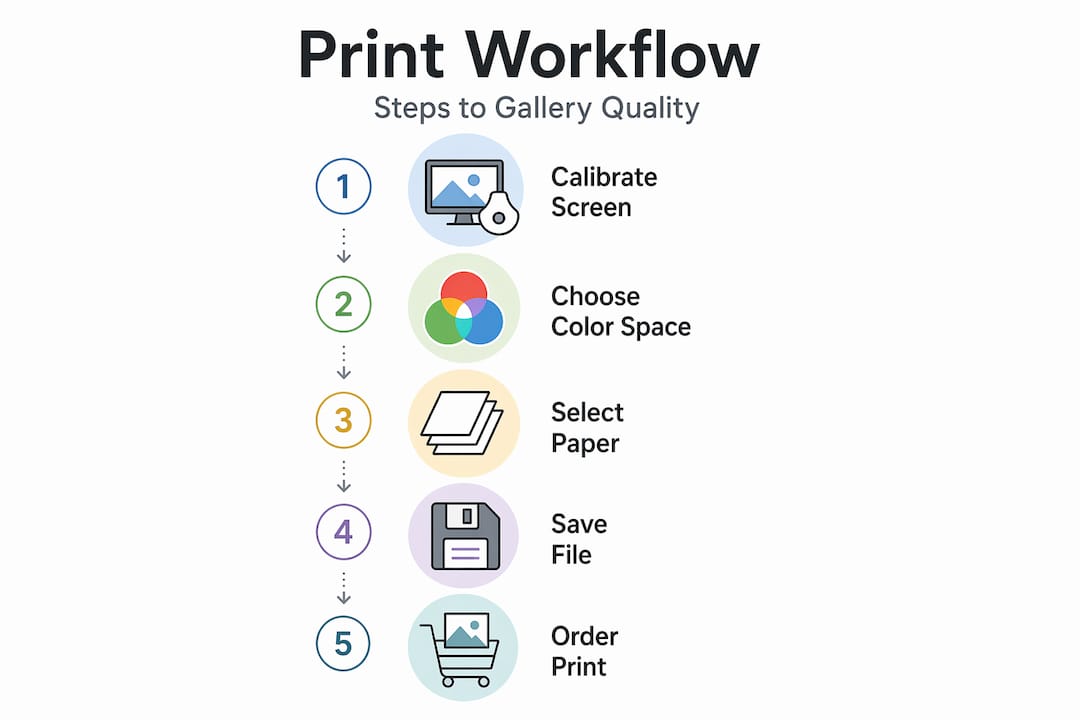
Your step-by-step workflow for flawless prints
Pulling everything together into a repeatable process removes guesswork and dramatically improves your consistency. Here is a practical end-to-end workflow built on all the principles covered above.
- Start with a high-resolution file. Aim for 300 PPI at your output dimensions. For an 8x10 print, that means at least 2400 x 3000 pixels in your source file. Check this before you do anything else.
- Edit in a calibrated environment. Use a color-calibrated monitor and work in a room with neutral, consistent lighting. Edits made under warm or shifting light will not translate to print accurately.
- Convert to sRGB and embed the profile. Unless your specific lab instructs otherwise, sRGB is the safest and most compatible color space for consumer print workflows.
- Download and use your lab’s ICC profile. Many professional labs publish ICC profiles for their specific printer and paper combinations. Apply it as a soft-proof in your editing software to preview how the final print will look.
- Check for banding before exporting. Zoom into any gradient areas — skies, backgrounds, skin tones in soft light. If you see steps now, address them before printing.
- Export at the highest quality your lab accepts. TIFF is ideal; high-quality JPEG is acceptable. Avoid re-saving JPEG files multiple times.
- Match your paper and media settings on the order form. Select the correct paper finish and confirm your file dimensions match the print size you are ordering.
- Review the digital proof if one is offered. Many labs provide a layout preview. Use it to check cropping, margins, and overall composition before approval.
Pro Tip: The photo collage workflow applies these same principles to multi-image layouts, where consistent color across different photos adds an extra layer of complexity worth planning for in advance.
The truth most miss about photo printing quality
Here is the uncomfortable reality that most tutorials skip: the biggest predictor of print quality is not your equipment or your budget. It is your attention to the details in the workflow steps above.
People spend money upgrading to “premium” services or expensive paper without ever addressing their color space settings or file resolution. The result? A beautifully textured paper carrying a poorly prepared image. The paper and the service become scapegoats for problems that were introduced long before the file reached the printer.
Conversely, people who follow a disciplined preparation workflow — calibrated monitor, correct color space, appropriate ICC profile, high-quality export format — consistently get excellent results even from mid-range services. The preparation is the product. No lab, no matter how sophisticated, can recover detail that was not in your file to begin with.
There is also a culture of gadget chasing in the print world. New printer models, exotic inks, and specialty papers are constantly marketed as the key to better results. Rarely is that true. The fundamentals of color management have not changed meaningfully in decades. What has changed is how accessible the knowledge and tools are.
You do not need specialized software to get professional results. Photoshop, Lightroom, and even free tools like GIMP support color profile embedding and soft proofing. The knowledge matters far more than the software license.
Finally, test before you commit. Order a small print, examine it critically, and adjust. Personalized wall art guidance follows this same principle: understanding your choices before ordering a large, meaningful piece protects both your investment and the emotional value of the final product.
Ready to elevate your photo prints?
Everything you have learned in this guide — from color management to paper finish selection to banding prevention — comes together in a professional printing workflow designed to deliver results you will want to display and share.

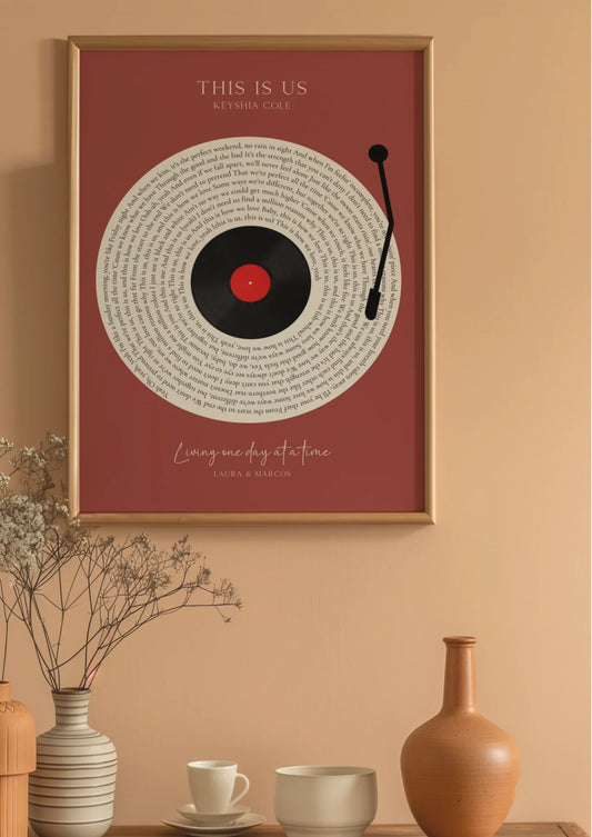
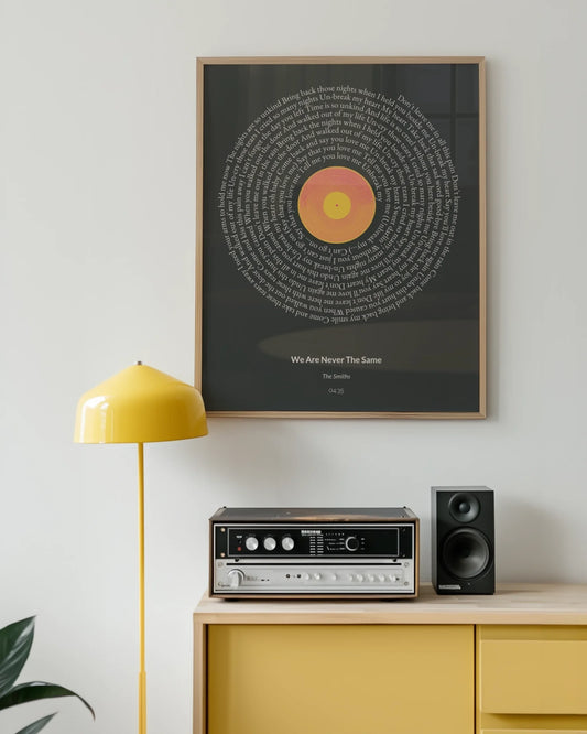
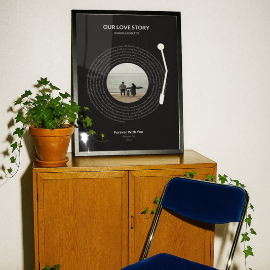
At Wallfully, every personalized print is produced with quality-first materials and a guided customization process that removes the common guesswork. From song lyric posters to photo collages and milestone prints, you get a real-time preview before you order, eco-friendly materials, and free shipping with every order. If you are ready to turn your images and memories into prints worthy of any wall or gift, explore the full collection and put these quality principles to work today.
Frequently asked questions
Why do my printed photos look dull or different from the screen?
Screens and printers use fundamentally different color systems. Converting to sRGB and embedding the correct ICC profile gives the printer’s color pipeline the right instructions to reproduce your intended colors as faithfully as possible.
Which paper finish is best for framing photos in bright rooms?
Luster or matte finishes are the best choice because they minimize glare and reduce fingerprint visibility. Luster offers the best balance between color richness and glare control for most well-lit display environments.
How do I avoid banding or lines in photo prints?
Save files at high quality, avoid re-compressing JPEGs, and ensure your color profiles are applied correctly throughout your workflow. Inaccurate ICC profiles and insufficient bit depth in the export file are two of the most common technical causes of visible gradient steps.
Does expensive paper always mean a better print?
Not automatically. Paper choice makes a real difference, but it must be matched to your printer’s settings and color profiles. A premium paper used with mismatched settings can actually produce worse results than a standard paper configured correctly.