
How to Create a Home Gallery Wall That Looks Curated
WallfullyThe fastest way to create a home gallery wall is to tape out the footprint on the floor, pick one anchor piece, mock the full arrangement with paper templates on the wall, then hang the anchor first and build outward. That sequence alone separates a gallery that looks collected from one that looks like a yard sale.
Before you touch a hammer, gather three things:
- Measurements: wall width, furniture width below it, and ceiling height
- Frames and prints: every piece you’re considering, physically in the room
- Tools: tape measure, level, pencil, kraft paper, scissors, and painter’s tape
Pro Tip: Place your anchor piece slightly off-center rather than dead center. It gives the eye somewhere to travel and makes the whole arrangement feel less like a diagram.
Key Takeaways
A curated home gallery wall comes down to one sequence: plan the footprint against your furniture, pick a strong anchor piece, mock the arrangement with paper templates, and hang from the anchor outward using consistent spacing and the 57-inch center rule.
| Point | Details |
|---|---|
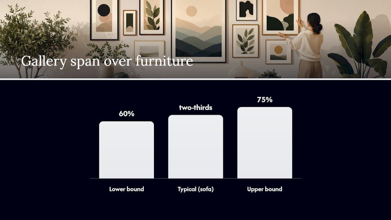
| Plan on the floor first | Tape a boundary matching 60%–75% of furniture width and arrange every frame inside it before touching the wall. |
| Use paper templates | Trace each frame, mark the hanging point, tape to the wall, and live with the arrangement before committing to nails. |
| Apply the 57-inch rule | Center the whole composition at 57–60 inches from the floor, not each individual frame. |
| Keep spacing consistent | Use 2–3 inches between frames and a cardboard spacer to hold that gap throughout the arrangement. |
| Renters have real options | 3M Command strips hold up to 16 lbs per set; picture ledges need only two screws and allow easy rotation. |
| Wallfully for anchor pieces | Custom prints from Wallfully, with optional framing and free shipping, give you a meaningful, ready-to-hang anchor piece. |
Table of Contents
- How do you choose the right wall for a home gallery?
- How to plan your gallery layout before hanging anything
- Which layout style works best for your collection?
- What are the spacing and height rules that actually work?
- What tools and hardware do you actually need?
- How do you hang the gallery step by step?
- Renter-friendly options: picture ledges, leaning frames, and adhesive systems
- How do you make a mixed collection look cohesive?
- Common mistakes and how to fix them fast
- What designers actually say about gallery walls
- A note from the writer
- Wallfully makes it easy to add a meaningful anchor piece
- Sources
How do you choose the right wall for a home gallery?
The best gallery walls have two things in common: a clear sightline and a natural relationship to furniture. The wall above a sofa is the classic choice because the sofa anchors the arrangement visually and gives you a furniture width to size against. Hallways and stair runs work well too, especially for linear or staircase layouts where the architecture does half the compositional work. The wall directly opposite an entry point is underused but powerful since it’s the first thing anyone sees when they walk in.
Avoid walls with too many interruptions: outlets, switches, and windows that break the field make spacing nearly impossible to keep consistent. Direct sunlight is the other deal-breaker. UV exposure fades prints and photographs faster than almost anything else in a home environment, so a wall that gets afternoon sun through an uncovered window is a poor long-term choice. If the only available wall gets strong light, diffused natural light or dedicated picture lighting (a simple plug-in picture light or a recessed track) is worth adding before you hang anything.
Structurally, know what you’re working with. Drywall is the most forgiving: standard picture hooks hold 20–50 lbs, and a stud finder locates the framing behind it for heavier pieces. Plaster walls are denser and more brittle, so pilot holes and plaster-rated anchors matter more. Concrete or brick requires masonry anchors and a hammer drill. Knowing your wall type before you buy hardware saves a frustrating trip back to the hardware store.
How to plan your gallery layout before hanging anything
Lay every frame and print on the floor inside a taped boundary that matches your wall footprint. This is the step most people skip, and it’s the reason most gallery walls need to be rehung. The floor is forgiving. The wall is not.
Size the footprint against your furniture first. According to WallMockup, a gallery arrangement above furniture should span roughly 60%–75% of the furniture width for balanced proportion. For a sofa of typical width, plan your arrangement to cover about two-thirds of its width. Mark those boundaries on the floor with painter’s tape, then arrange your pieces inside them.
Once the floor arrangement looks right, switch to paper templates:
- Lay each frame face-down on kraft paper and trace the outline.
- Mark the exact hanging point on the paper (measure from the top of the frame down to where the wire or hook sits at full tension, then mark that spot on the template).
- Cut out each template and label it with the frame name or dimensions.
- Tape the templates to the wall in your planned arrangement using painter’s tape.
- Step back to your main viewing distance, at least 8–10 feet, and live with the arrangement for a few hours or overnight.
The paper-template method reliably prevents unnecessary nail holes and is the core no-fail technique professionals use. Sightline issues you’d never catch from up close become obvious when you look at the templates from across the room. Adjust the templates freely until the arrangement feels right, then mark the nail points through the paper.
Pro Tip: Take an overhead photo of your floor mockup before you start taping templates. It gives you a precise reference when you’re working at the wall and can’t see the whole arrangement at once.
Which layout style works best for your collection?
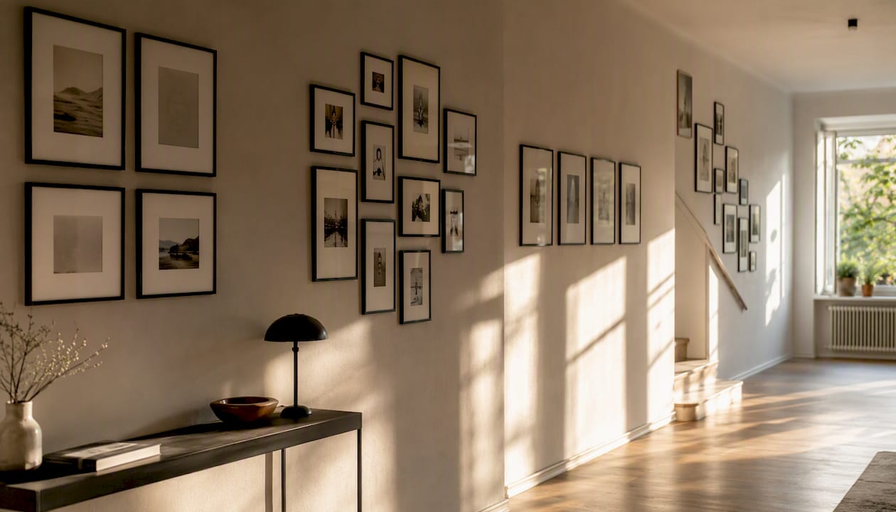
Professional framers and designers rely on four layout formulas: symmetrical grid, salon cluster, linear axis, and architectural/staircase. Choosing the right one before you start arranging saves hours of rearranging.
| Layout style | Best for | Visual effect | Hanging precision needed |
|---|---|---|---|
| Symmetrical grid | Matching prints, same-size frames | Ordered, graphic, modern | High — every gap must be equal |
| Salon cluster | Mixed sizes, collected pieces | Layered, personal, eclectic | Medium — anchor controls the eye |
| Linear axis | Hallways, narrow walls, series prints | Clean, directional, architectural | Medium — alignment to one axis |
| Staircase | Stair runs, ascending walls | Dynamic, follows the architecture | Medium-high — follows the rake |
The grid works when your frames are identical or nearly so. It reads as intentional and graphic, but it punishes inconsistency: one frame even slightly off-level or one gap a quarter-inch wider than the rest will catch every eye in the room.
The salon cluster is the most forgiving and the most personal. You anchor it with one dominant piece, then build outward in all directions, mixing sizes and orientations. It suits a collection assembled over time far better than a purchased set.
Linear arrangements follow a single horizontal or vertical axis, which makes them natural for hallways and stair walls where the architecture already provides direction. The staircase variation simply follows the rake of the stairs, with frames ascending at roughly the same angle as the steps.
Pro Tip: For salon and cluster layouts, place the anchor piece slightly off-center rather than at the exact midpoint. The eye reads a perfectly centered anchor as static; a slightly offset one pulls the viewer through the rest of the collection.
What are the spacing and height rules that actually work?
The standard for gallery wall centers comes from museum practice: the optical center of the whole composition should sit at about 57–60 inches from the floor, not the center of any individual frame. That means if your arrangement is 30 inches tall, the top edge hangs at roughly 72–75 inches and the bottom edge at 42–45 inches. Apply the rule to the group, not to each piece separately.
Spacing between frames follows a simple standard. Consistent spacing of 2–3 inches between frames is what makes a mixed group read as a single composition. Tighten to 1.5–2 inches for a dense salon look, or open up to 4–6 inches in a large room where the wall can absorb more breathing room. The number matters less than keeping it consistent throughout the arrangement.
The nail-height formula for wire-hung frames: measure from the top of the frame down to where the wire sits at full tension, then subtract that number from your target center height. That gives you the nail position on the wall. For a frame whose wire sits 3 inches below the top, with a target center at 57 inches, the nail goes at 57 inches plus half the frame height minus 3 inches.
| Measurement | Standard value | Notes |
|---|---|---|
| Composition center height | 57–60 in from floor | Apply to the group’s optical center |
| Spacing between frames | 2–3 in | Tighten to 1.5–2 in for salon; open to 4–6 in for large rooms |
| Arrangement width vs. furniture | 60%–75% of furniture width | Above a 90-in sofa: 54–67 in wide |
| Minimum viewing distance | 8–10 ft | Step back to this distance to assess balance |
What tools and hardware do you actually need?
The essential toolkit is shorter than most people expect: tape measure, pencil, level (a 24-inch torpedo level works for most arrangements; a laser level is faster for long linear runs), scissors, kraft paper, painter’s tape, and a hammer. A small cardboard spacer cut to your target gap width, say 2.5 inches, lets you set consistent spacing without measuring every gap individually.
Hardware is where wall type and frame weight determine the choice. For standard drywall and frames under 20 lbs, a simple picture hook with a hardened nail is reliable and leaves a small hole. For frames between 20 and 50 lbs, a hook rated for that weight or a toggle bolt anchor is the right call. For anything heavier, screw directly into a stud.
A stud finder like the Zircon StudSensor e50 locates the framing behind drywall quickly and accurately. Hanging into studs gives significantly higher load capacity than drywall anchors alone, which matters for large, heavy frames or mirrors that anchor a salon arrangement.
For renters and lighter frames, 3M Command Picture Hanging Strips hold up to 16 lbs per set and remove cleanly from smooth, prepared surfaces. They work well for frames under 8–10 lbs individually and are ideal for frequent rotation. Surface prep matters: wipe the wall with isopropyl alcohol before applying, press firmly for 30 seconds, and wait an hour before hanging.
Picture ledges are the third option and the most flexible. They require only two screws per ledge, hold multiple frames without individual hanging hardware, and let you swap pieces without touching the wall again.
How do you hang the gallery step by step?
Once your templates are taped and the nail points are marked, the actual hanging goes faster than the planning.
- Double-check every template position from your main viewing distance before touching a hammer.
- Mark the nail point on the wall through the paper template with a pencil or by tapping a nail lightly through the template.
- Remove the templates one at a time, starting with the anchor piece.
- Hammer the hook or nail for the anchor piece and hang it. Level it before moving on.
- Work outward from the anchor, hanging adjacent pieces and checking level after each one.
- Use your cardboard spacer to confirm gaps as you go rather than measuring each one.
- Once all frames are up, step back to your viewing distance and check the overall balance.
- Add rubber bumpers to the bottom corners of each frame to prevent tilting on the wall.
The paper-template method means you’re confirming positions you’ve already decided, not making decisions under pressure with a hammer in your hand. That shift in mindset alone makes the hanging feel controlled rather than chaotic.
Pro Tip: After hanging, adjust your room lighting before you declare the gallery finished. A picture light or a directional lamp aimed at the arrangement can change how the whole wall reads, especially in the evening.
Renter-friendly options: picture ledges, leaning frames, and adhesive systems
Renters have more options than most realize. Picture ledges are the most practical: install two screws per ledge at your target height (center the ledge arrangement at the same 57–60 inch optical center rule), then layer frames of varying depths along the ledge. You can add, remove, or rearrange pieces without touching the wall again. For display methods like ledges and leaning frames, the key is varying frame depth and size so the ledge reads as layered rather than flat.
Leaning large frames against the wall, on a console or shelf, adds depth and a relaxed quality that hung arrangements can’t replicate. Lean one or two larger pieces and hang the smaller ones above for a mixed approach that reads as intentional.
3M Command strips work well within their limits. The 16-lb-per-set rating applies to smooth, clean surfaces with proper prep. Textured walls, fresh paint under 7 days old, and wallpaper all reduce adhesion significantly. For a rotating or seasonal gallery where you expect to swap pieces every few months, Command strips on lighter frames are genuinely practical. For anything you plan to leave in place for years, a small nail hole is a better long-term choice.
How do you make a mixed collection look cohesive?
The fastest way to unify a diverse collection is to pick one shared design thread and hold it consistently. Black frames with white mats is the most reliable default: it works across photography, illustration, and abstract prints, and it reads as intentional even when the subject matter varies widely. When you want to mix frame finishes, limit yourself to two: black and natural wood, or brass and white, rather than four or five different metals and tones.
For choosing wall art that fits a room’s palette and narrative, pull one or two colors from your existing room palette and look for those tones in the prints themselves, the mats, or the frames. A recurring color accent, even a small one, ties pieces together without requiring them to match.
Dimension is what separates a flat arrangement from one that feels alive: include one textile element from discount home decor fabric, like a framed fabric panel or woven piece, for texture contrast.
- Mix shadow boxes with flat frames to create depth variation.
- Add one small shelf or ledge within the arrangement for a small object, a plant cutting, or a ceramic piece.
- Include one textile element, a framed fabric panel or a woven piece, for texture contrast.
- Keep at least 20% of the wall space as negative space so the pieces have room to breathe.
Pro Tip: Before adding a new piece to an existing gallery, hold it up against the wall and ask whether it earns its place or just fills a gap. Filling gaps is how galleries get cluttered. Earning a place is how they stay curated.
Common mistakes and how to fix them fast
Wrong height. The most common error is hanging the arrangement too high, often because people center individual frames at eye level rather than centering the whole composition at 57–60 inches. Fix: measure the optical center of the group and adjust the highest piece down until the group center hits the target.
Inconsistent spacing. Eyeballing gaps produces gaps that vary by an inch or more, which reads as careless even when the individual pieces are beautiful. Fix: cut a cardboard spacer to your target gap and use it between every pair of frames during hanging.
No anchor. A gallery without a dominant piece tends to feel like a collection of equally weighted objects competing for attention. Fix: identify the largest or most visually weighted piece and make it the anchor, then arrange everything else in relation to it.
Overfilled wall. More pieces do not make a stronger gallery. Fix: remove the two or three pieces that contribute least to the arrangement and see if the wall reads better. It almost always does.
For the final quality check: step back 10–15 feet, check that every frame is level, run your cardboard spacer between frames to confirm gaps, and look at the arrangement from both sides of the room. For heavy or valuable pieces, a professional framer or art installer is worth the cost. They carry the right anchors, know how to handle plaster and concrete, and carry liability for the work.
What designers actually say about gallery walls
The conventional wisdom is that you need a plan before you buy a single frame. Designers push back on that, and they’re right to.
A gallery assembled gradually, one piece at a time as you find things that genuinely matter to you, reads as more personal and more expensive than a grid of matching prints bought as a set. The matching set announces itself immediately. The curated collection makes people ask where each piece came from.
The off-center anchor principle reinforces this. A perfectly centered arrangement reads as planned and static. An anchor placed slightly off-center, with the collection growing organically around it, reads as discovered. That’s the difference between a gallery that looks like a design decision and one that looks like a life.
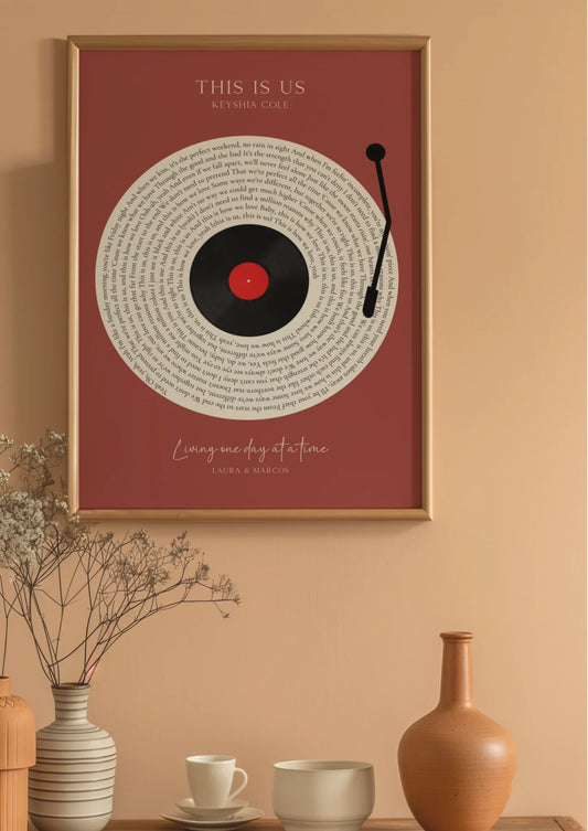
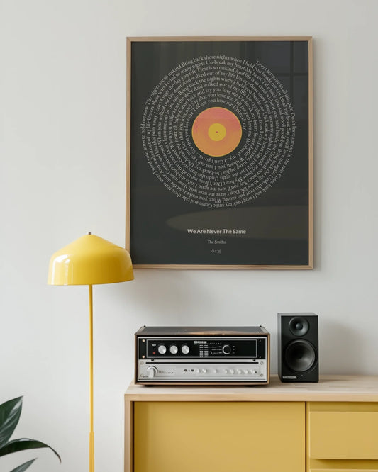
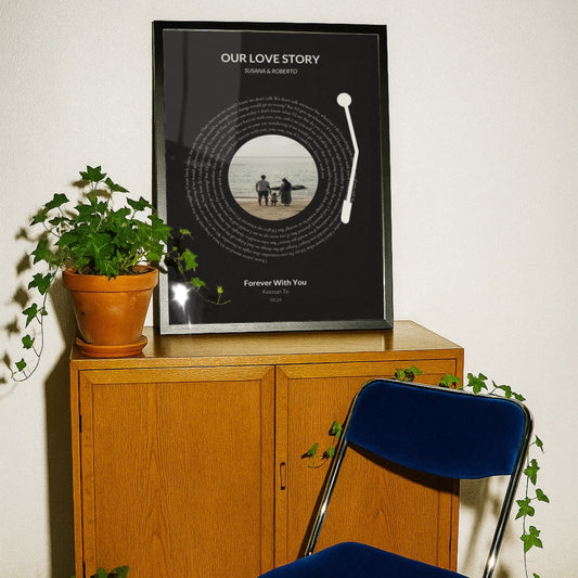
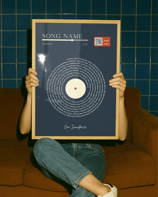
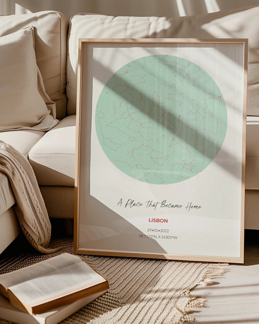
Building a collection over time also means you can add meaningful, personalized pieces as anchors or fills rather than buying whatever fills the space. A custom print of a location that matters to you, a song lyric from a first dance, or a star map from a significant date carries more visual weight than its physical size suggests, because the story behind it is legible to anyone who knows it.
A note from the writer
Gallery walls intimidate people more than they should. The planning steps look long on paper, but in practice, the floor mockup and paper templates take about an hour, and the actual hanging goes faster than most furniture assembly. Once you understand why they work, you’ll know exactly when to break them.
Start with what you already have. Hang it. Live with it. Add one piece when you find something that earns its place. That’s how the best gallery walls actually get built.
Wallfully makes it easy to add a meaningful anchor piece
The hardest part of building a gallery wall isn’t the hanging. It’s finding a piece that actually means something and looks like it belongs. That’s where Wallfully comes in.

Wallfully lets you create custom prints built around the details that matter to you: a location map of a place you love, a star map from a date worth remembering, a song lyric from a moment you want to keep. Every print is made with eco-friendly materials, ships free, and comes with a satisfaction guarantee. Optional framing means you can order a ready-to-hang anchor piece without a separate trip to a frame shop. Use the preview tool to see exactly how your print looks before you order, so there are no surprises when it arrives.
If you’re ready to add a personalized piece to your gallery, start your custom print at Wallfully and have it in hand before your templates go up.
Sources
These are the sources used to build this guide. Each one is worth bookmarking for a specific part of the project.
- Home Gallery Walls 2026: Complete Setup
- How to Style a Gallery Wall: Layout & Spacing | Frame Today
- How to Hang a Gallery Wall: A Step-by-Step Guide | LivingFinds
- How to plan a gallery wall layout | WallMockup