
12 Print Ready Minimalist Poster Ideas with Luanda's Custom Tips
WallfullyA minimalist poster idea is any composition built around one dominant visual hook surrounded by deliberate empty space. That’s the whole rule: pick a single focal point, size it up, and give it room to breathe instead of filling the frame. The templates below turn that principle into printable concepts, plus a quick workflow to get from idea to finished file.
TL;DR:
- Focus on one dominant visual element with ample negative space to ensure clarity and impact in the design.
- Limit yourself to one or two typefaces and a maximum of two color accents to maintain simplicity and visual hierarchy.
- Use simple grids, rule of thirds, or asymmetry to create modern and balanced compositions that draw attention effectively.
- Test the design at thumbnail and full size to confirm the hierarchy and focal point are easily recognizable from a distance.
- Personalize minimalist posters with subtle details like monograms or accent colors pulled from meaningful images or locations to add character without clutter.
Table of Contents
- 12 Minimalist Poster Ideas to Steal for Your Next Project
- The Design Rules Behind Every Good Minimalist Poster
- How to Design a Minimalist Poster in Five Steps
- Templates and Tools to Get Started Fast
- Luanda’s Customization and Print Tips
- Balancing Minimalism With Personality
- Turn Any of These Ideas Into a Printed Poster
- Sources
- FAQ
12 Minimalist Poster Ideas to Steal for Your Next Project
Each of these works because it commits to one idea instead of hedging with three. Pick one, adjust the details, and you have a starting layout.
- Text-only statement poster. One bold headline, huge margins, nothing else competing for attention.
- Two-font typographic poster. Pair a heavy sans serif for the headline with a light one for a subtitle. The contrast in weight does the work color usually does.
- Single continuous line art. One unbroken line forms a face, a mountain, or a body. The empty background is the point.
- Geometric duo-tone composition. Two shapes, two colors, no more than that. Circles and rectangles read as intentional; anything busier reads as clutter.
- High-contrast black-and-white silhouette. A person, a skyline, an animal, rendered flat against pure white or pure black.
- Minimal icon-style movie or event poster. Reduce the entire story to one symbol: a single prop, a shadow, a shape everyone recognizes.
- Centered quote poster. Large type for the quote, tiny attribution tucked at the bottom. The size difference creates hierarchy without a single design trick.
- Product showcase on a muted backdrop. One object, soft neutral background, generous space around it, like a print ad stripped down to its essentials.
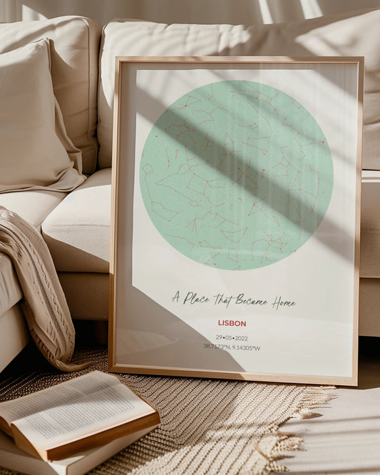
- Personalized map or location print. A single accent color marks the pin, the route, or the coordinates against a clean line-drawn map.
- Milestone or calendar poster. One date rendered large, everything else (names, small text) reduced to supporting role.
- Negative-space silhouette. Cut the subject out of a solid color block instead of drawing it. The absence of ink becomes the image.
- Full-bleed photo with a tiny caption. Let one photograph fill the page edge to edge, then add a single line of type in a corner.
For more on the typography-specific approach, typography posters work particularly well as gifts because the message itself becomes the decor.
The Design Rules Behind Every Good Minimalist Poster
Minimalism as a movement started in the U.S. in the 1960s, built on simple geometric forms and a deliberate economy of means, and that same restraint is what separates a poster that looks confident from one that looks unfinished, according to Tate. The goal was never “less for the sake of less.” Sotheby’s describes it as a focus on form, material, and space, where every remaining element earns its place. Strip a poster down without that discipline and you get empty, not minimal.
A few rules make the difference:
- Give it one unmistakable hook. Size, contrast, or isolation should make one element impossible to miss first.
- Treat negative space as active, not leftover. It directs the eye toward the hook and keeps the poster from feeling cluttered or, oddly, from feeling flat.
- Limit yourself to one or two typefaces. Set headline sizes for how far away someone will actually stand.
- Pick one or two color accents. High contrast (black on white) or a near-monochrome palette with a single pop color both work; three or four competing colors rarely do.
- Use a simple grid or the rule of thirds. A little asymmetry reads as modern; dead-center everything reads as a template.
Icons8’s guide to minimalist poster design ties these principles directly to hierarchy and grid structure, and its practical takeaway holds up: a poster without a clear anchor point just looks underdesigned, no matter how clean the palette is.
Pro Tip: Squint at your layout, or shrink it to a thumbnail on your screen. If you can still tell what the focal point is, the hierarchy works. If everything blurs into the same gray blob, something needs to get bigger or disappear.
How to Design a Minimalist Poster in Five Steps
You don’t need design school for this. You need a process that forces decisions early instead of piling on elements later.
- Pick one idea and one message. Choose from the concepts above and decide, in one sentence, what the poster needs to communicate.
- Block the layout with a simple grid. Mark where the primary hook sits, usually on a third, not dead center.
- Choose fonts and sizes for real viewing distance. A poster read from six feet away needs a headline you can read at that distance, not just on your monitor.
- Finalize color and spacing, then test small. View the design at thumbnail size and at full size. Practical poster guides consistently point to one clear focal point and brief headline copy as the difference between a poster that reads instantly and one that makes viewers work, according to Made Good Designs. Keep your headline short enough to scan quickly.
- Export for the right medium. For print, use a high-resolution file with appropriate margins and color settings optimized for printing. For web, a compressed RGB file is fine.
Even a stripped-down poster needs a job to do. Applying a classic structure like AIDA (attention, interest, desire, action) keeps a minimalist layout from becoming aimless, since the design still has to grab attention and point toward a single message, per Icons8.
Templates and Tools to Get Started Fast
You don’t need to build a layout from scratch every time. A few starting points cover most of the ideas above:
- Editable templates give you a working grid and placeholder text you swap out, which is faster than starting from a blank canvas.
- SVG line art and icon sets work well for the single-line and icon-concept ideas since they scale cleanly at any print size.
- Royalty-free photo libraries supply the full-bleed image concepts without licensing headaches.
- Vector editors (Illustrator, Affinity Designer, Inkscape) handle precise geometric and line-art work.
- Layout apps (Canva, Figma) are faster for text-led and quote poster templates.
- Print-prep exporters check resolution and bleed before you send a file to print, catching low-resolution images before they become blurry posters.
Luanda’s Customization and Print Tips
Personalization is where a good minimalist idea becomes a specific, meaningful print. A subtle monogram in the corner, a single custom date sized to match the rest of the hierarchy, or one accent color pulled from a map location. All of these add personality without breaking the one-hook rule.
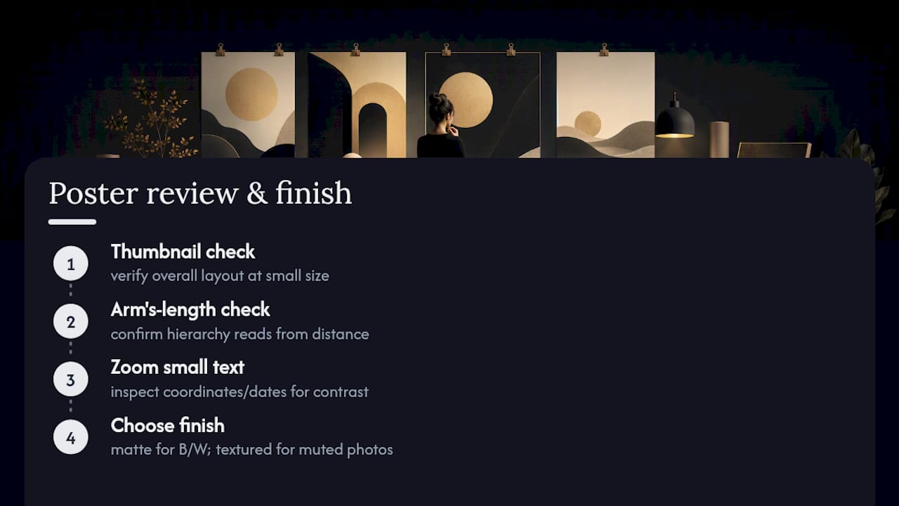
On production, matte finishes tend to suit high-contrast black-and-white designs, while a slightly textured paper stock adds warmth to muted, photo-led posters. If you’re choosing minimalist zodiac posters or a similar personalized piece, preview it before ordering: check the layout at thumbnail size, at arm’s length, and zoomed in on any small text. Coordinates and dates need higher contrast and slightly larger type than feels necessary. Small type has a way of disappearing once it’s actually printed.
Balancing Minimalism With Personality
Stark, all-white minimalism works in a modern space with clean lines. A warmer version, cream backgrounds, a serif instead of a geometric sans, fits a room with wood tones and texture better. Minimalist posters also hold up fine inside a gallery wall as long as one piece stays the visual anchor. Try this: take any idea above and replace its single accent color with one pulled from a photo you love. Small swap, instant personality.
— Luanda
Turn Any of These Ideas Into a Printed Poster
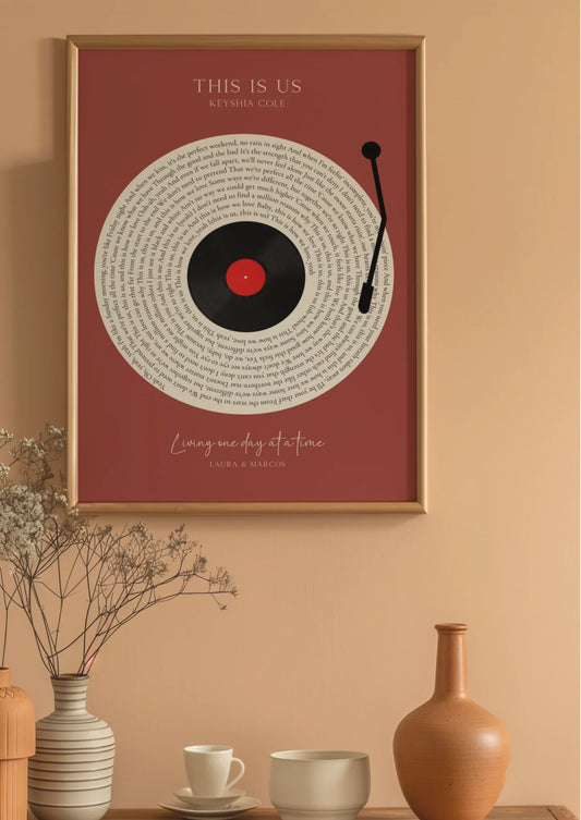
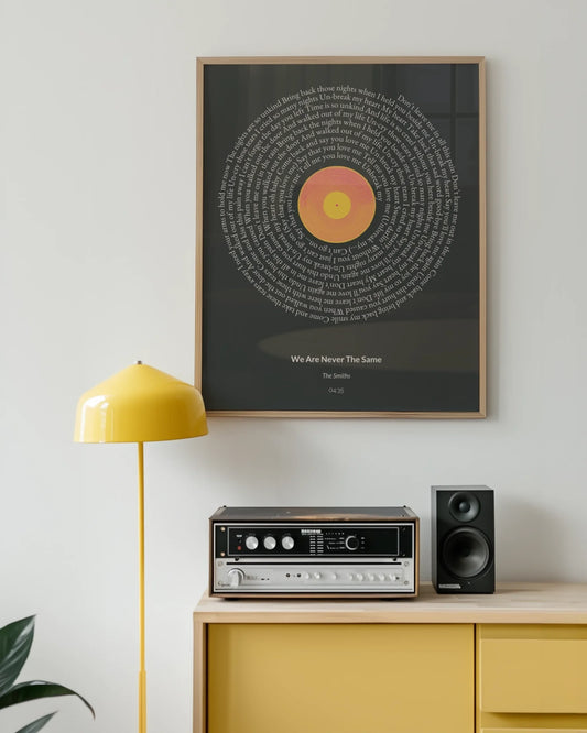
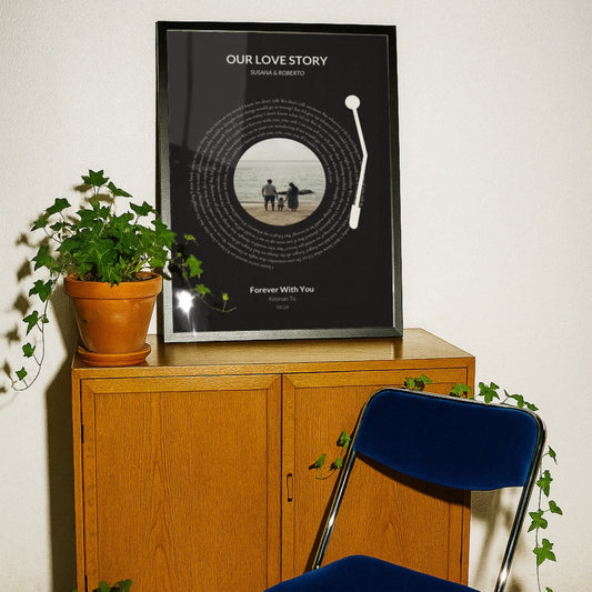
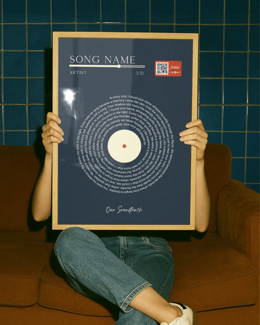
Sketching a concept is one thing. Getting it onto your wall without fighting file formats, print resolution, or a design app you’ve never opened is another. A guided customization tool lets you build a personalized poster (song lyrics, a map of a meaningful place, a milestone date, a photo collage) with a live preview before you commit to anything.
That preview step matters most for the exact ideas covered here, since a text-only or quote poster lives or dies on spacing and type size, and you want to see that at full scale before it’s printed. Prints on eco-friendly materials with framing options are available if you want a finished piece rather than a bare print. Personalized posters can work well as wedding or anniversary gifts, baby milestone keepsakes, or custom maps to commemorate special occasions. Start building your custom poster and preview your layout before you order.
Sources
- Minimalism | Tate
- Minimalism | Sotheby’s
- Minimalism in poster design: when it began and how to do it right today | Icons8
- 12 Poster Design Principles That Actually Work (With Examples)
FAQ
What makes a good minimalist poster?
A clear single focal point, generous negative space, one or two typefaces, and a restrained color palette, usually one or two accent colors against a plain background.
What are some minimalist poster styles?
Common styles include typography-led layouts, geometric abstraction, continuous line art, and high-contrast black-and-white or silhouette compositions.
What are some simple poster ideas?
A bold text-only statement, a centered quote with small attribution, a single-object product shot, or a personalized map with one accent color all work as fast, printable concepts.
Can you give me an example of minimalist art?
A single continuous line forming a portrait against a blank background, or a geometric shape rendered in just two colors, both count as minimalist art in the poster context. Wallfully’s personalized minimalist wall art collection applies the same principle to custom prints built around one photo, date, or location.