
Photo Collage Poster Checklist: Your Complete Guide
WallfullyTL;DR:
- A photo collage poster checklist guides you through decision-making to create professional-looking prints. Proper preparation of images, layout design, and finish selection are essential to avoid common printing mistakes. Following these steps ensures your personalized poster is vibrant, accurate, and visually balanced for display.
A photo collage poster checklist is a step-by-step tool that guides you through every decision, from image resolution to final finish, so your personalized poster looks professional rather than rushed. The most common reason collage posters disappoint is skipping preparation: blurry images, wrong layouts, and poor finish choices are all preventable. This guide covers the full process, including 300 DPI print standards, design tools like Adobe Photoshop and Canva, and material choices like matte versus glossy finishes. Follow this checklist and you will avoid the mistakes that ruin otherwise great photos.
1. What are the essential materials and tools for a photo collage poster checklist?
The right tools determine whether your collage looks polished or pieced together. Before you start cutting or clicking, gather everything on this list.
Paper and surface options:
- Photo paper: satin, matte, or glossy depending on your display environment
- Canvas: standard or granite canvas for a more durable, textured result
- Cardstock: useful for physical collages that need structure
Adhesives:
- Modge Podge and glue sticks provide strong bonds without wrinkling photos. Clear Elmer’s Glue also works well for flat, physical collages.
Cutting tools:
- Craft knife and cutting mat for clean, straight edges
- Scissors for curved or freeform shapes
- Paper trimmer for batch cutting to consistent sizes
Design software:
- Adobe Photoshop and Canva are the two most widely used tools for poster layouts. Photoshop gives you full control over resolution and layers. Canva offers drag-and-drop templates that work well for beginners. Snipinsta is a solid option for quick online collage building.
Protective finishes:
- Matte laminate or spray for a non-reflective surface
- Gloss laminate for richer color saturation
Pro Tip: Match your tools to your project scale. A single 12x18 inch poster needs different adhesive and cutting precision than a wall-spanning multi-panel collage. Buy accordingly before you start.
2. How to select and prepare photos for print quality
Photo selection is where most collage projects succeed or fail before a single design decision is made. Follow these steps to prepare images that hold up at print size.
-
Set a minimum resolution. Digital images need at least 1000px on the longest side. For professional prints, your image must be 300 DPI at the final physical print size. A photo that looks sharp on screen can print blurry if the DPI is too low.
-
Understand screen versus print resolution. Screen resolution runs at 72–96 DPI. 300 DPI at physical print size is the gold standard for sharp posters. Never judge print quality from a monitor preview alone.
-
Curate for consistent lighting. Mix warm and cool-toned photos and your collage will look disjointed. Choose images shot in similar lighting conditions, or apply a consistent filter in Lightroom or Canva to unify the look.
-
Crop to consistent aspect ratios. Cropping photos to uniform ratios like 1:1 or 4:5 prevents odd gaps and keeps the grid clean. Inconsistent crops are the fastest way to make a collage look amateur.
-
Use an image resizer before importing. Tools like Adobe Photoshop’s Image Size dialog or free web tools let you upscale or downscale images without quality loss. Always resize before placing images into your layout, not after.
-
Remove distracting backgrounds. For freeform or mosaic layouts, clean backgrounds make each photo stand out. Canva’s background remover and Photoshop’s Select Subject tool both handle this quickly.
-
Organize your photo library before designing. Sort images into folders by theme, color, or time period. This step saves significant time once you are inside your design software.
Pro Tip: Always export a test PDF at full print size and zoom in to 100% before sending to print. Color shifts and soft edges that are invisible at thumbnail size become obvious at actual print dimensions.
3. Which layout styles optimize visual impact?
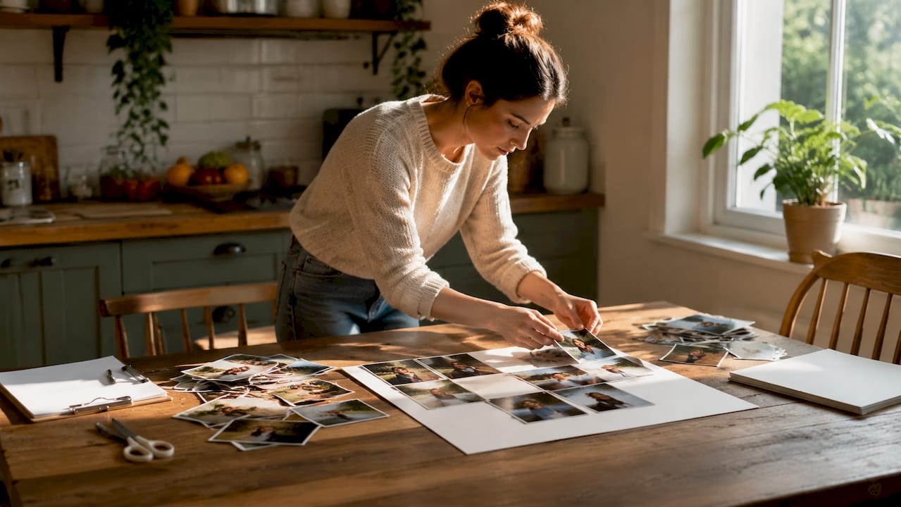
Layout is the architecture of your collage. The structure you choose controls where the viewer’s eye travels and how the story reads.
Common layout types:
- Grid: Equal-sized photos in rows and columns. Clean, modern, and easy to execute. Best for large photo sets where consistency matters.
- Mosaic: Photos of varying sizes arranged to fill space without gaps. Creates visual energy and works well for event recaps.
- Stacked: Photos layered with slight overlaps. Adds depth and a scrapbook feel.
- Freeform: No fixed structure. Photos are placed at angles and sizes based on visual instinct. Highest creative freedom, highest risk of looking chaotic.
Grid, mosaic, and freeform layouts each serve different storytelling goals. The rule of thirds guides photo placement for better visual flow: divide your canvas into nine equal sections and place focal points at the intersections.
Design principles to apply:
| Principle | How to apply it |
|---|---|
| Visual hierarchy | Place your most important photo largest and near the center or top third |
| White space | Leave breathing room between photos to prevent a cluttered look |
| Color balance | Distribute bright and dark images evenly across the layout |
| Text placement | Add titles or captions in corners or along borders, never over faces |
| Borders and frames | Use thin uniform borders to separate photos and add structure |
Background color matters more than most people expect. A white background reads as clean and modern. A black background makes colors pop but can feel heavy at large sizes. Match the background to the mood of your photos, not just your personal preference.
4. What are the critical printing and finishing steps?
Printing is where preparation either pays off or falls apart. This section covers the prepress checklist items that printers check before they run your file.
Bleed and safe zones:
Designers use a 1/8 inch bleed beyond the trim line and keep all critical elements inside a safe zone. Without bleed, cutting the poster to size can expose white edges. Without a safe zone, text or faces near the edge get trimmed off.
File preparation:
- Embed all fonts before exporting. Unembedded fonts revert to system defaults at the printer.
- Flatten all transparencies. Layered transparency effects can shift or disappear in print.
- Export as a PDF rather than a JPEG or PNG for print submissions. PDFs preserve color profiles and layer data.
Final review:
Inspect the exported PDF rather than relying on your design app’s preview. On-screen previews miss color shifts and transparency issues that show up in the final file. Zoom to 100% and check every corner.
Finish comparison:
| Finish type | Best for | Watch out for |
|---|---|---|
| Matte | Bright rooms, high-traffic areas, gifts | Slightly less color vibrancy |
| Glossy | Dark rooms, photography showcases | Fingerprints, glare under direct light |
| Satin | Balanced option for most environments | Less dramatic than either extreme |
| Canvas | Gallery-style display, long-term decor | Higher cost, heavier weight |
Matte finishes reduce glare and fingerprints, making them the better choice for interactive or brightly lit display posters. Gloss enhances color vibrancy but shows every smudge. Granite canvas adds durability and a textured look that works well for long-term wall art.
Pro Tip: If your poster will hang in a room with direct sunlight or overhead spotlights, choose matte every time. Gloss under direct light creates a mirror effect that makes the image nearly impossible to see from certain angles.
Key takeaways
A successful photo collage poster depends on three non-negotiable foundations: 300 DPI image resolution, a deliberate layout structure, and a finish matched to the display environment.
| Point | Details |
|---|---|
| Resolution is non-negotiable | Use 300 DPI at final print size and at least 1000px on the longest side to avoid blurry results. |
| Layout drives the story | Choose grid, mosaic, stacked, or freeform based on your photo set and the mood you want to create. |
| Bleed prevents white edges | Add a 1/8 inch bleed beyond the trim line and keep critical elements inside the safe zone. |
| Finish matches the environment | Matte works best in bright or high-traffic spaces; gloss suits darker, controlled display settings. |
| PDF review catches hidden errors | Always inspect the exported PDF at 100% zoom before sending to print. |
What I have learned from making collage posters the hard way
I have seen more collage projects go sideways at the printing stage than at the design stage. The design looks great on screen, the layout feels balanced, and then the print arrives looking washed out or cropped wrong. Almost every time, the problem traces back to one skipped step: the final PDF review.
Most beginners trust the design app preview. That is the mistake. Design software renders colors differently than a print file does. Canva, in particular, can display transparency effects that simply do not survive the export process. The only way to know what your printer will see is to open the exported PDF in a separate viewer, zoom to 100%, and check every edge and every face.
The second thing I would tell anyone starting their first collage poster is to commit to a theme before selecting photos. Not a vague idea like “family memories,” but a specific visual theme: same season, same color palette, same event. When you design a photo collage with a clear theme, every layout decision becomes easier because you have a filter for what belongs and what does not.
On finish choice: I default to matte for almost every project. Matte holds up better as a gift because the recipient can handle it without leaving fingerprints. It also photographs better if the recipient wants to share it. Gloss looks stunning in a controlled studio environment. In a real home with real lighting, it often disappoints.
The last thing most guides skip is iteration. Do not commit to a layout after one draft. Export a low-resolution preview, print it on regular paper at home, and tape it to the wall. Step back ten feet. That distance reveals spacing problems and visual weight imbalances that you will never catch on a 13-inch laptop screen.
— Luanda
Create your collage poster with Wallfully
Wallfully makes the entire process of creating a personalized photo collage poster straightforward, from uploading your images to choosing your finish and size. The platform walks you through each step with live previews so you can see exactly how your layout will look before it prints. Wallfully uses eco-friendly materials and high-quality printing to deliver results that hold up as long-term wall art or meaningful gifts. Every order ships free and comes with a satisfaction guarantee. If you want a collage poster that looks as good in person as it does on screen, explore Wallfully’s custom posters and start building yours today.
FAQ
What resolution do photos need for a collage poster?
Photos need a minimum of 1000px on the longest side, and your file must be set to 300 DPI at print size for sharp results. Images that look clear on screen can print blurry if the DPI is too low.
What is bleed and why does it matter for poster printing?
Bleed is an extension of your design beyond the trim line, typically 1/8 inch, that prevents white edges from appearing after the poster is cut. Keep all critical elements like faces and text inside the safe zone to avoid accidental trimming.
Should I choose matte or glossy for a photo collage poster?
Matte finishes reduce glare and resist fingerprints, making them better for bright rooms and gifts. Glossy finishes boost color vibrancy but show smudges and create glare under direct light.
Which design tools work best for photo collage posters?
Adobe Photoshop gives you full control over resolution, layers, and color profiles. Canva offers templates and a simpler interface for beginners. Both are widely used for collage poster layouts and produce print-ready files when set up correctly.
How do I avoid color shifts when printing my collage poster?
Export your final design as a PDF and review it in a separate PDF viewer at 100% zoom before sending to print. On-screen design previews do not always reflect the final print file, and color shifts are easiest to catch in the exported PDF.