Print Quality Standards Explained for Design Professionals
WallfullyTL;DR:
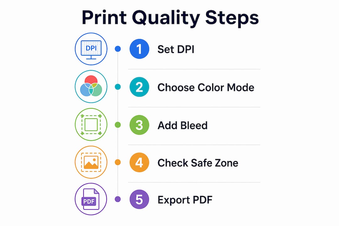
- Print quality standards set technical benchmarks such as resolution, color mode, and file format for accurate and consistent prints. Understanding DPI and pixel dimensions is essential, with 300 DPI being the standard for small-format prints and lower resolutions acceptable at greater distances. Creating files in CMYK with embedded profiles, adding bleed and safe zones, and using PDF/X formats ensure reliable, high-quality print results.
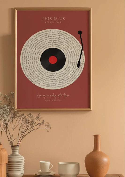
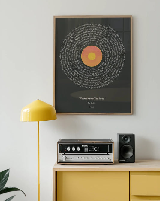
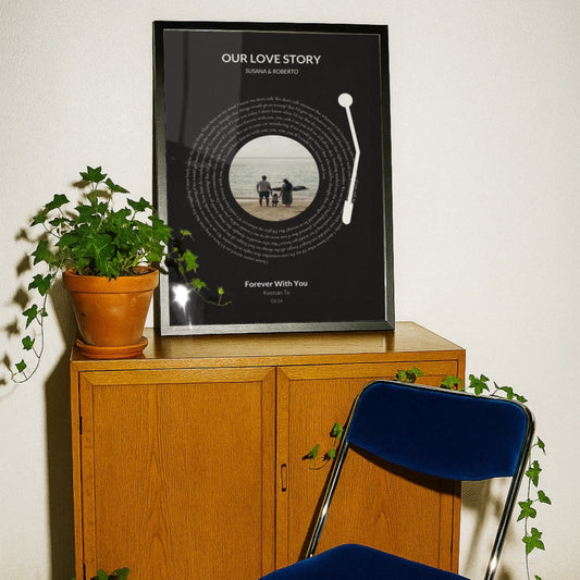
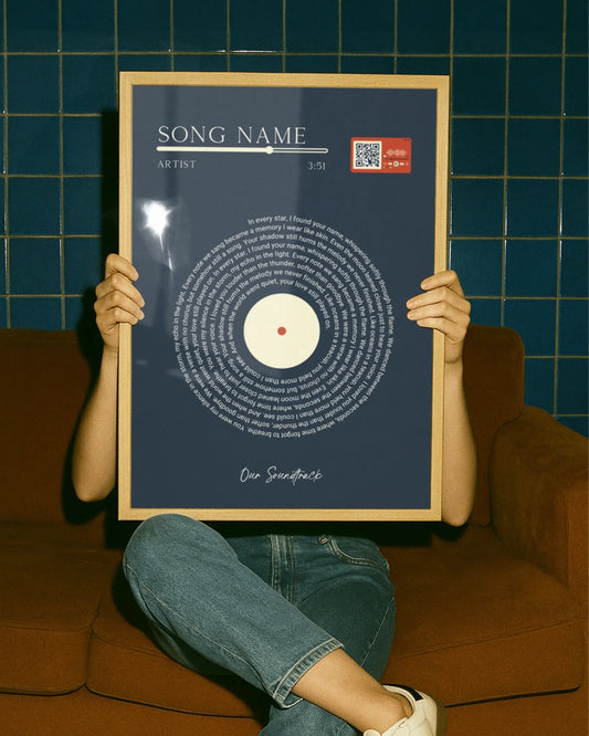
Print quality standards are defined as the technical benchmarks a file must meet for a printer to reproduce it accurately, sharply, and with consistent color. These standards cover resolution measured in DPI, color mode (CMYK versus RGB), bleed and safe zone dimensions, and file format requirements. Explaining print quality standards matters because most blurry, dull, or poorly cropped prints trace back to file preparation errors, not printer faults. Designers who understand these criteria produce work that survives the jump from screen to paper without surprises. Wallfully applies these exact standards to every custom poster and personalized wall art print it produces.
What resolution and DPI criteria define professional print quality?
300 DPI at final print size is the gold standard for handheld printed materials like brochures, business cards, and custom posters. That number means 300 dots of ink per linear inch, which is dense enough for the human eye to read as a smooth, continuous image at normal reading distance.
Large format prints follow a different rule. Lower resolutions of 100–150 DPI are acceptable for banners and trade show displays because viewers stand several feet away. At that distance, the eye blends individual dots just as effectively as it does at 300 DPI up close.
Pixel dimensions determine whether your image actually hits 300 DPI at the intended print size. Divide the pixel width of your image by the intended print width in inches. A 3,000 pixel wide image prints at exactly 300 DPI on a 10-inch wide poster. Drop that same file onto a 20-inch canvas and the effective DPI falls to 150, which is borderline for a piece people will hold.
Upsampling an image by increasing DPI in software does not add real detail. The software invents pixel data by averaging neighboring colors, which produces a blurry result that looks worse than the original low-resolution file. Genuine sharpness comes only from starting with a high-resolution original.
Vector graphics scale infinitely without quality loss, making them the right choice for logos and line art. Raster images under 300 DPI cause pixelation and jagged edges that no amount of software correction can fix.
| Print type | Recommended DPI | Typical viewing distance |
|---|---|---|
| Business cards, brochures | 300 DPI | 12–18 inches |
| Custom posters (A3 and smaller) | 300 DPI | 18–36 inches |
| Large format prints (24 inches and wider) | 100–150 DPI | 3–10 feet |
| Billboards and exterior signage | 25–72 DPI | 10+ feet |
Pro Tip: Always check the pixel dimensions of your image before placing it in a layout. Multiply the intended print width in inches by 300 to get the minimum pixel width you need.
How do color modes like CMYK vs RGB affect print quality?
Professional printers require CMYK rather than RGB color mode because printing presses mix cyan, magenta, yellow, and black inks. Screens emit red, green, and blue light. These are fundamentally different systems, and submitting an RGB file forces the printer’s software to convert it automatically.
Automatic RGB-to-CMYK conversion produces unpredictable color shifts. Vivid blues often turn purple. Bright greens go muddy. Neon colors that look electric on screen have no CMYK equivalent and will print as flat, muted versions of themselves. Designers who discover this after receiving a print run face costly reprints.
The fix is simple: create and proof files in CMYK from the start. Color profiles like ISO Coated v2 define exactly how CMYK values map to physical ink on coated paper stock. Embedding the correct ICC profile in your file tells the printer’s rip software how to interpret your colors, which removes guesswork from the reproduction chain.
Common pitfalls include placing RGB images inside a CMYK document and assuming the layout application will handle the conversion cleanly. It often does not. Each placed image should be converted to CMYK individually in a photo editor before placement, so you can see and approve the color shift before the file goes to press.
Key steps for reliable color output:
- Convert all images to CMYK in a photo editor before placing them in your layout
- Assign and embed the correct ICC profile (ISO Coated v2 for coated stock, ISO Uncoated for uncoated)
- Soft-proof your document using the printer’s color profile to preview the output on screen
- Avoid spot colors unless your printer explicitly supports them for that job
- Check that no RGB objects remain by running a preflight check in Adobe Acrobat or your layout application
Pro Tip: Embed your ICC color profile and flatten all transparencies before exporting. Unflattened transparencies interact unpredictably with CMYK overprint settings and can produce color banding on press.
What are bleed, safe zones, and margin requirements in print design?
Bleed is the extra artwork that extends beyond the trim line of a printed piece. Print files require 0.125 inch (3mm) of bleed on all sides to prevent white slivers from appearing at the edges after cutting. Cutting machines are accurate but not perfect, and a 1–2mm shift in any direction will expose bare paper if no bleed is present.
The safe zone is the opposite boundary. Critical content must sit 3–5mm inside the trim line to avoid accidental cropping. Text, logos, faces, and any element the viewer needs to read should never touch or cross this boundary. Designers who place a headline flush with the trim line risk losing letters on every copy.
| Print product | Bleed required | Safe zone from trim |
|---|---|---|
| Business card | 0.125 in (3mm) | 0.125 in (3mm) |
| A4 / Letter poster | 0.125 in (3mm) | 0.2 in (5mm) |
| Large format poster | 0.125 in (3mm) | 0.2 in (5mm) |
| Folded brochure | 0.125 in (3mm) | 0.2 in (5mm) |
The bleed area and the safe zone serve opposite purposes. Bleed pulls artwork outward past the cut line so the background fills the edge. The safe zone pulls content inward away from the cut line so nothing important gets trimmed. Both must be set up simultaneously in your document from the moment you create the file.
A practical way to check both: export a low-resolution PDF proof and draw a rectangle at the trim line. Everything inside the safe zone boundary should be readable. Everything outside the trim line should be pure background color or pattern with no text or key imagery.
What file formats and preparation steps optimize print quality?
Choosing the right file format is the final step that locks in all the work done on resolution, color, and layout. The wrong format can undo every other preparation step.
-
Export as PDF/X-1a or PDF/X-4. PDF/X-1a and PDF/X-4 are industry-standard formats that guarantee embedded fonts, CMYK color space, and controlled transparency handling. PDF/X-4 supports live transparencies and is preferred for complex layouts. PDF/X-1a flattens everything and is the safer choice for older print workflows.
-
Use TIFF for standalone images. TIFF files use lossless compression and support CMYK, making them the preferred format when submitting individual images rather than full layouts. JPEG compression introduces artifacts that become visible at print resolution.
-
Embed or outline all fonts. Embedding or outlining fonts before export prevents font substitution at the print provider’s end. If a font is missing from the printer’s system, the software substitutes a default typeface, which changes spacing, line breaks, and the entire look of the design.
-
Flatten transparencies. Unflattened transparency layers interact unpredictably with overprint settings and can produce unexpected color patches or white gaps in the final print.
-
Set black text to overprint. Black text on colored backgrounds should overprint rather than knock out. Knockout black creates a white halo around each letter when the press plates shift even slightly during a run. Overprint prevents this by printing the black ink directly on top of the background color.
-
Run a preflight check. Adobe Acrobat Pro and most professional layout applications include preflight tools that flag missing bleeds, RGB objects, unembedded fonts, and low-resolution images before the file leaves your computer. Running this check takes two minutes and catches errors that would otherwise cost a full reprint.
Treating print-ready file preparation as a separate discipline from digital design, with its own checklist and review step, is what separates professionals who get consistent results from designers who are always surprised by their prints.
Key Takeaways
Mastering print quality guidelines means applying the right DPI, CMYK color mode, bleed settings, and PDF/X file standards before a file ever reaches the printer.
| Point | Details |
|---|---|
| Resolution starts at 300 DPI | Use 300 DPI for handheld prints; 100–150 DPI is acceptable for large format viewed from distance. |
| CMYK is non-negotiable | Create files in CMYK from the start to avoid unpredictable color shifts during conversion. |
| Bleed and safe zones both matter | Add 0.125 in (3mm) bleed and keep critical content 3–5mm inside the trim line. |
| PDF/X formats lock in quality | PDF/X-1a and PDF/X-4 embed fonts, color profiles, and transparency settings for reliable output. |
| Preflight before every export | A preflight check catches missing bleeds, RGB objects, and unembedded fonts before they become print errors. |
What I’ve learned after years of watching prints go wrong
Most print failures I’ve seen were not the printer’s fault. The frustration with dull or blurry prints almost always traces back to a file that was never truly print-ready. A designer spent hours on a beautiful layout, exported it as a screen-optimized JPEG in RGB, and was genuinely shocked when the colors came back flat and the edges showed white slivers.
The mistake I see most often is treating print as a final step rather than a constraint that shapes every decision from the beginning. Color mode, resolution, and bleed are not things you fix at export. They are things you set when you create the document. Changing them at the end is like trying to repaint a car after it’s been assembled. You can do it, but the result is never as clean.
The single habit that changed my results most was communicating with print providers before starting a project. A five-minute conversation about their preferred color profile, bleed requirements, and file format saves hours of rework. Print providers want to give you a great result. They just need a file that meets their specifications.
Understanding print standards also gives you creative confidence. When you know exactly what the printer needs, you stop second-guessing your colors and start making bolder choices. The technical knowledge becomes invisible infrastructure that supports the creative work.
— Luanda
Wallfully’s approach to print-ready quality
Designers who want to see print quality guidelines applied in practice will find it useful to look at how Wallfully handles custom poster production. Wallfully builds photo printing quality checks directly into its ordering process, so the technical standards covered in this article are enforced before a file goes to press.

Every Wallfully order includes a live preview so you can confirm colors, layout, and text placement before committing to print. The platform uses eco-friendly materials and ships every order free, with a satisfaction guarantee. For designers who want to skip the preflight anxiety and see exactly what their finished piece will look like, Wallfully’s custom prints offer a reliable path from concept to wall.
FAQ
What DPI is required for professional print quality?
300 DPI at the final print size is the standard for handheld printed materials. Large format prints viewed from a distance can use 100–150 DPI without visible quality loss.
Why do prints look different from what I see on screen?
Screens display color using RGB light, while printers use CMYK inks. Submitting an RGB file causes automatic conversion that shifts colors unpredictably, especially vivid blues and greens.
What is bleed and why does every printer ask for it?
Bleed is 0.125 inch (3mm) of extra artwork beyond the trim line. It prevents white edges from appearing after the paper is cut, since cutting machines shift slightly on every pass.
What file format should I use for print-ready files?
PDF/X-1a or PDF/X-4 are the correct formats for print. Both embed fonts and color profiles, which prevents font substitution and color errors at the printer’s end.
How do I check my file before sending it to a printer?
Run a preflight check using Adobe Acrobat Pro or your layout application. It flags missing bleeds, RGB color objects, unembedded fonts, and low-resolution images before the file leaves your computer.